
brainstorm
-based on words, thoughts and ideas around the theme of forces.
artist research
|
The first artist I will be looking at the work of is
Guy Tal. |
Guy Tal is a professional artist, public speaker, author and artist; as well as a photographer.
Within the artists photography, he wants to express a sense of discovery and create 'superficial beauty' on top of the natural stunning views.
|
His work features expressive looking land and dramatic lighting as he is fascinated by the way these places have evolved and formed the shape they are today, as in contrast to them hundreds of years ago.
|
The purpose for his work however is not just to capture the pure beauty natural landscapes but to express something meaningful to him as he can appreciate the views through his own 'personal knowledge, feelings and experiences' as a photographer. So his photography is not just something to be admired from a
superficial point of view, but something to look at with deep meaning and purpose. |
Here are two of his photographs I thought were especially inspiring;
|
|
|
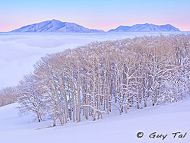
This photograph of Guy Tal's particularly interested me. The pinky-violet haze in the background gives the picture a warm magical feel. All the colours in the image are warm and softly blended together which gives the effect of a calm and relaxed mood. This is especially reflected by the the snow in the background, looking almost like fluffy clouds drifting above the trees; almost heaven- like.
|
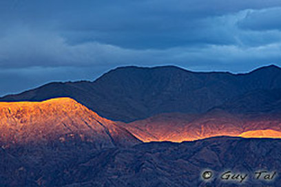
The dramatic lighting in this especially stands out to me. The fiery sunshine glimmering down on the mountains stands out from the other elements in the photograph as it is in contrast with the cool colours in the sky and themountains in the background. This makes the
image look artificial as the viewer is unaware as to where the light source is coming from. By looking at the deep blue, cloudy sky portrays a completely different atmosphere than the warm light that floods the middle of the image. As an overall effect, this too builds on a magical looking landscape that is almost unbelievable. |
|
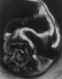
The artist I have next decided to look at the work of is Edward Weston. |
Edward Western, born on 24th March, 1886, spent a large bulk of his childhood in Chicago and educated at Oakland Grammar School.
|
At the age of 16 was when Weston first started to get into photography and began taking photos at local parks and his aunt's farm, when later creating a carrier out of photography.
|
The artist is most famous for his natural forms and rural landscapes. Between the years of 1927-30 he experimented with rich textures and shapes seen in close-ups of peppers, seashells and cut in half cabbages.
To create these rural landscapes, the artist first shot rocks and trees as a starting point. |
Below I have analysed two photographs from the artist I liked the most.
|
|
|
|
|
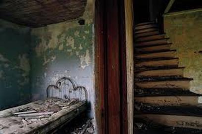
The artist I have next decided to look at the work of is
Eugene Richards The Blue Room |
Eugene Richards is a photographer, writer and filmmaker, born in Dorchester, Massachusetts.
He has studied photography with Minor White; also a photographer of the same style. |
The artists work appears in huge magazines such as The New York Times and LIFE.
|
The Blue Room, is a study of abandoned houses in rural America. His photographs have been exhibited in over forty galleries in America and are highly recognisable.
|
I found three of the photographer's images particularly inspiring:
|
|
|
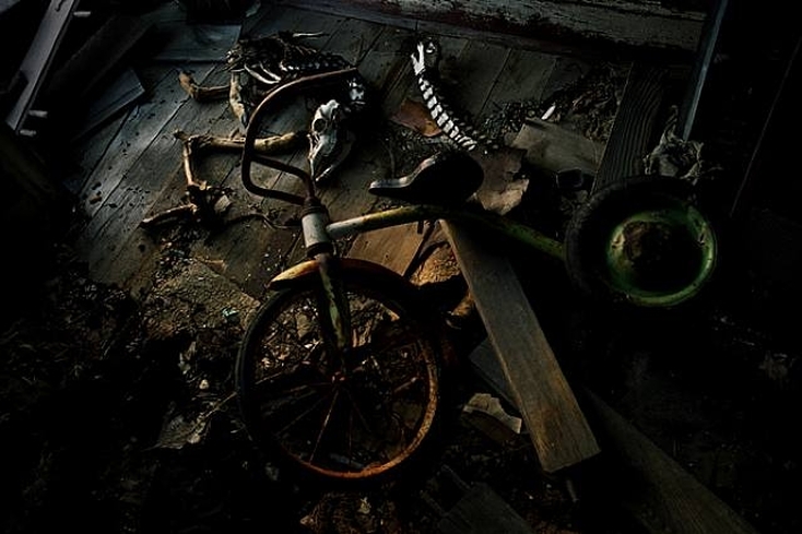
The way the warm light highlights the middle of the photo is contrasted with the gloomy, cold looking shadows entices the viewer into the photograph.
This implies a sense of discovery, decay and excitement as skulls, bones and a rusty bike are unusual subjects to photograph together. So for them to be emerging out of darkness allows to the viewers imagination as to what else lies on the dusty wooden floor. |
From interpreting these three photographs by Eugene Richards, I have come to a conclusion that a major theme in all of them is this sense of discovery and drawing the viewer in by unknown dark shadows.
|
1st response
Force Of Nature: Around the school.
This response will focus on the battle between man-made objects such as walls, buildings and posts which are being literally taken over by plants, flowers and branches.
This response will focus on the battle between man-made objects such as walls, buildings and posts which are being literally taken over by plants, flowers and branches.
|
|
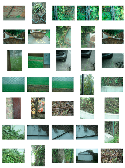
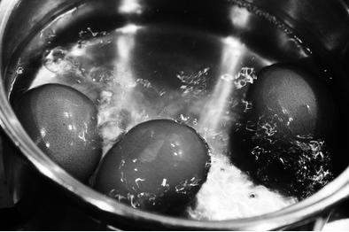
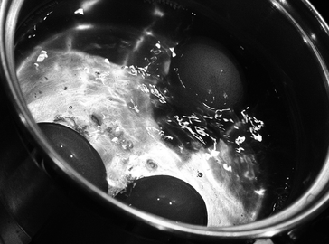
These are my personal favourites from the shoot around the school which I feel portray the force of nature on the man-made the strongest.
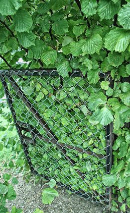
An army of vibrant green leaves are overpowering a rusty metal gate.
|
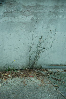
Delicate spidery fronds creeping up where concrete meets concrete. A small opportunity for life to appear. The dry, dead leaves are scattered beneath the weed and work together with the bland greyness of the ground. This gives the photo a feel of abandonment as if just left there without care or nurture.
|
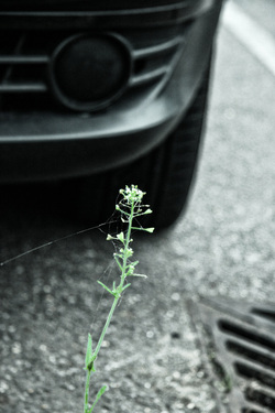
There is a high level of contrast here. The elegant plant is a healthy, pail green and rising up-right to the top of the image. This is juxtaposed with the side of a rough, industrial looking car and pavement which seen to be almost completely black and white compared to the flower.
|
|
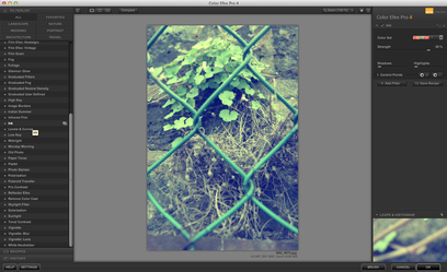
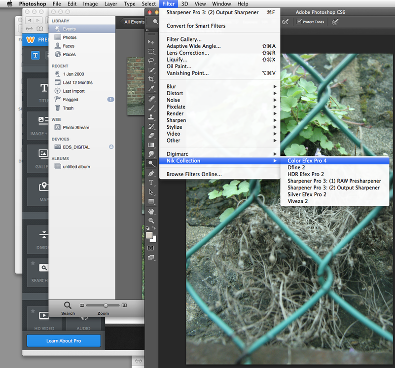
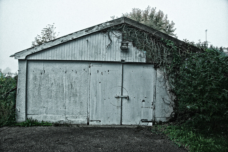
I used Photoshop to enhance the photograph on the left. Here are my screen-shots of the process I went through.
|
|
The regimented shed is full of industrial-looking lines and geometrical shapes which is then contrasted with the messy, tangled branches looking as if bursting out from inside the shed itself, rather than weaving around it. The bolt attached to the dirty door adds to this illusion- holding in the branches possibly.
|
|
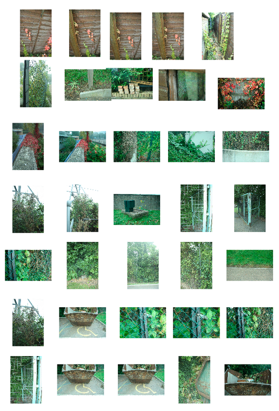
I then searched around my local environment and looked for places that show the true force of nature and the battle that it faces to reclaim its natural territory.
For inspiration, I looked at the work of Nadav Kander 'Half Life', who is a photographer, director and artist based in London. He is most known for his landscape and portraiture work |
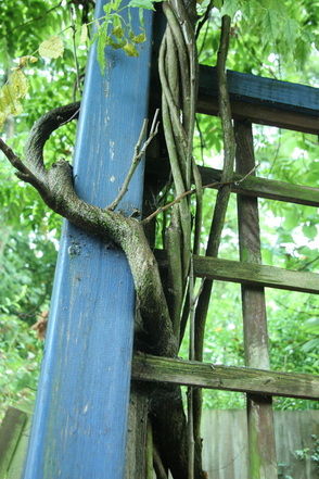
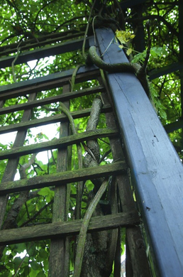
Branches of a creeper clinging around a painted blue wooden post, weaving in and out. Although all the colours are vibrant, there is a contrast between the artificial blue man-made post and the array of natural greens in the background.
|
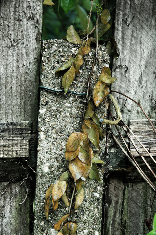
Although decaying, the vibrant golden toned leaves are creeping over the combination of concrete and wooden textures.
A close-up of the photo on the right. |
I then took a close up. marrons, lime greens and bright reds of branches and leaves, fringing the photograph; almost creating a colourful frame for the drab wooden fence.
|
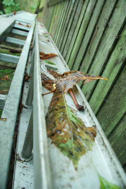
First-point perspective. Combination of vertical and horizontal lines, made by the fence panels and ladders, creating an interesting contrast with the scattered, casually fallen leaves. Looking almost as if falling down the ladder; from the perspective the photo is taken at.
|
The significance of photographing this was the fact that although both the painted wooden post and the weaving branches both reflect nature and share the same material, it represents Man V. Nature in a way that on the surface a viewer would be able to identify the post was a man-made object by its shape or colour, and the branches to be natural due to the same reasons.
|
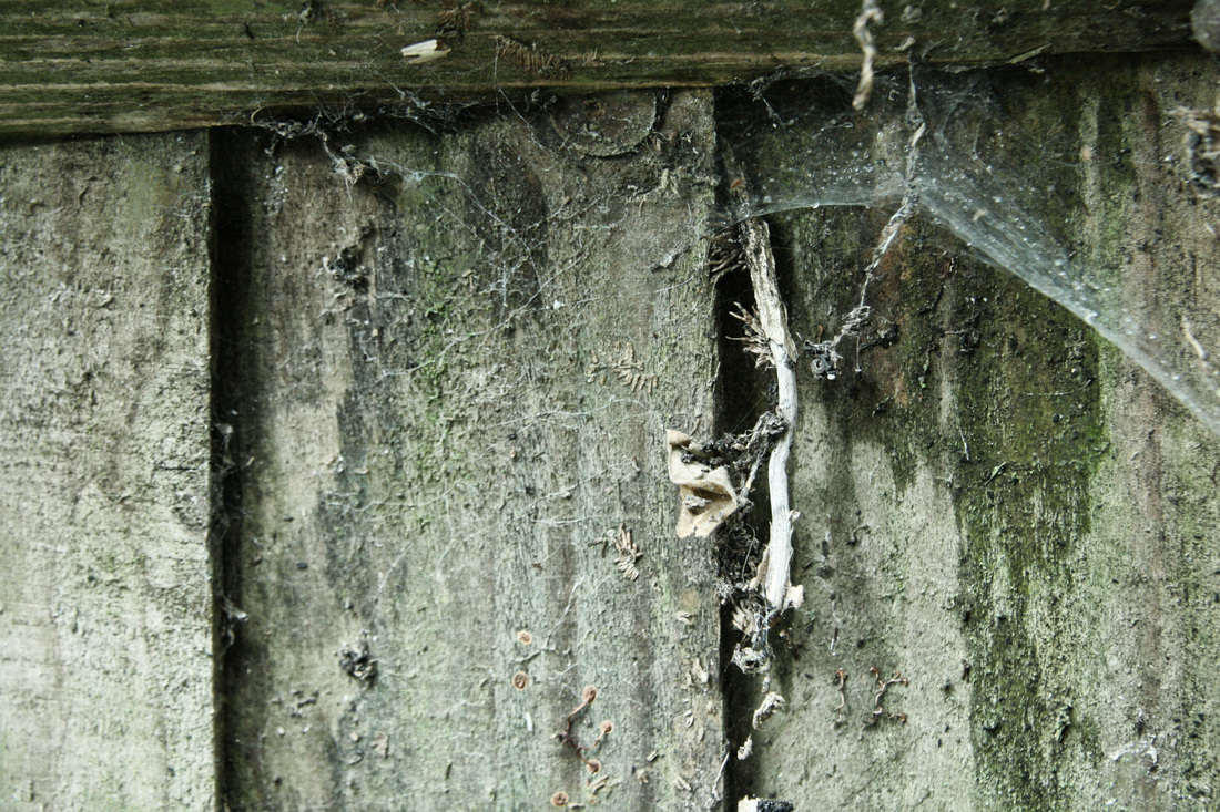
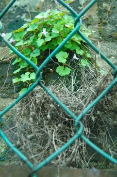
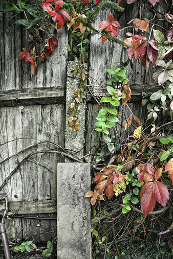
An air of dusty decay. A dead plant attempts to creep though a gap in the old fence. This exhibits the power of nature over a man-made object.
|
aplied forse
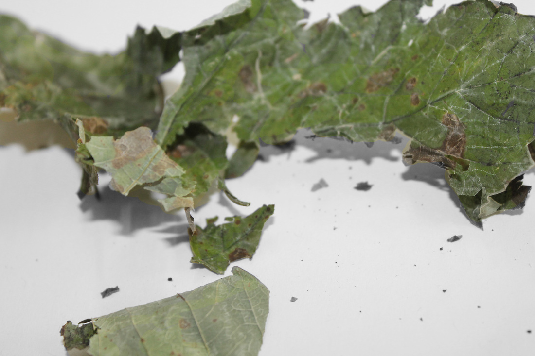
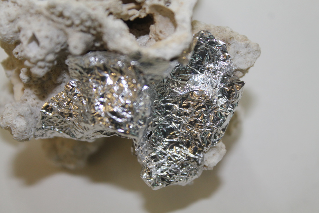
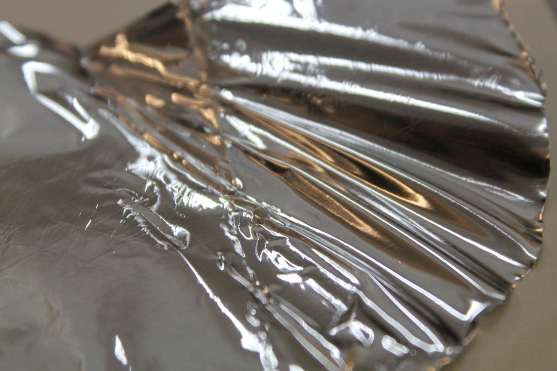
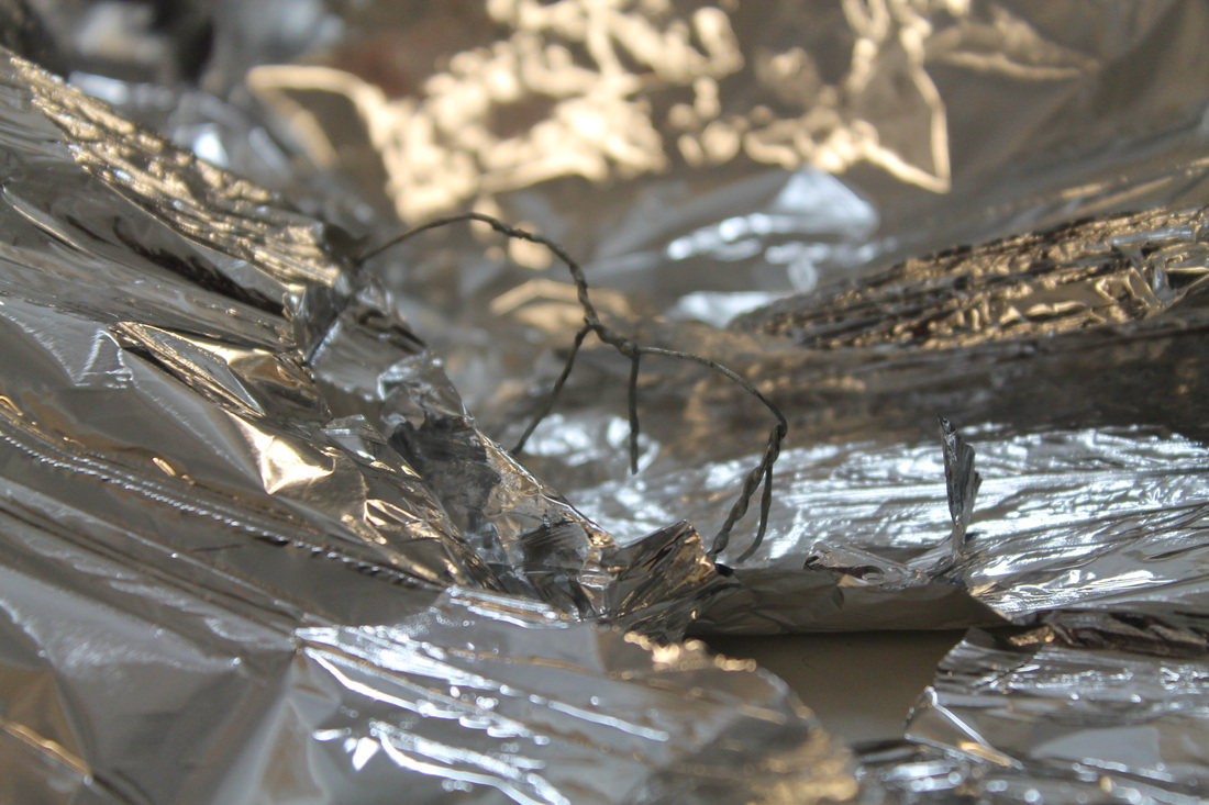
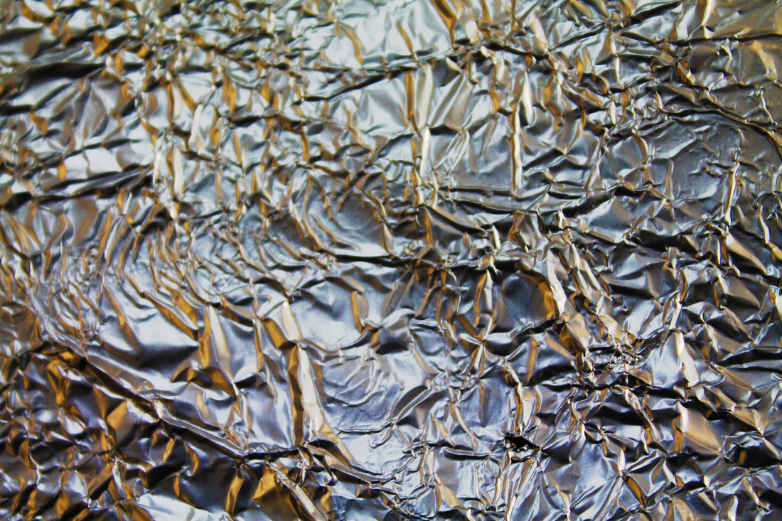
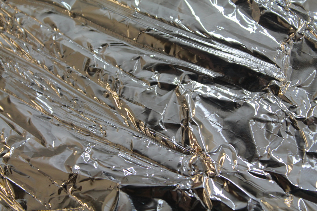
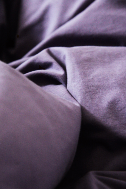
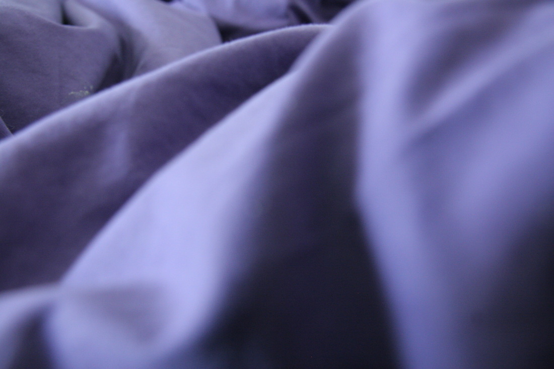
In order to relate to the theme force, I experimented with different textures, materials and surfaces and how they look when crumpled up or stretched.
The key words I tried to express in this shoot are: pressing, crushing, pulling, prising and stretching.
These were my photographs from the lesson:
The key words I tried to express in this shoot are: pressing, crushing, pulling, prising and stretching.
These were my photographs from the lesson:
|
|

|
|
|
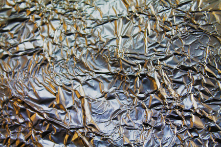
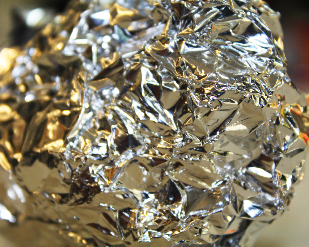
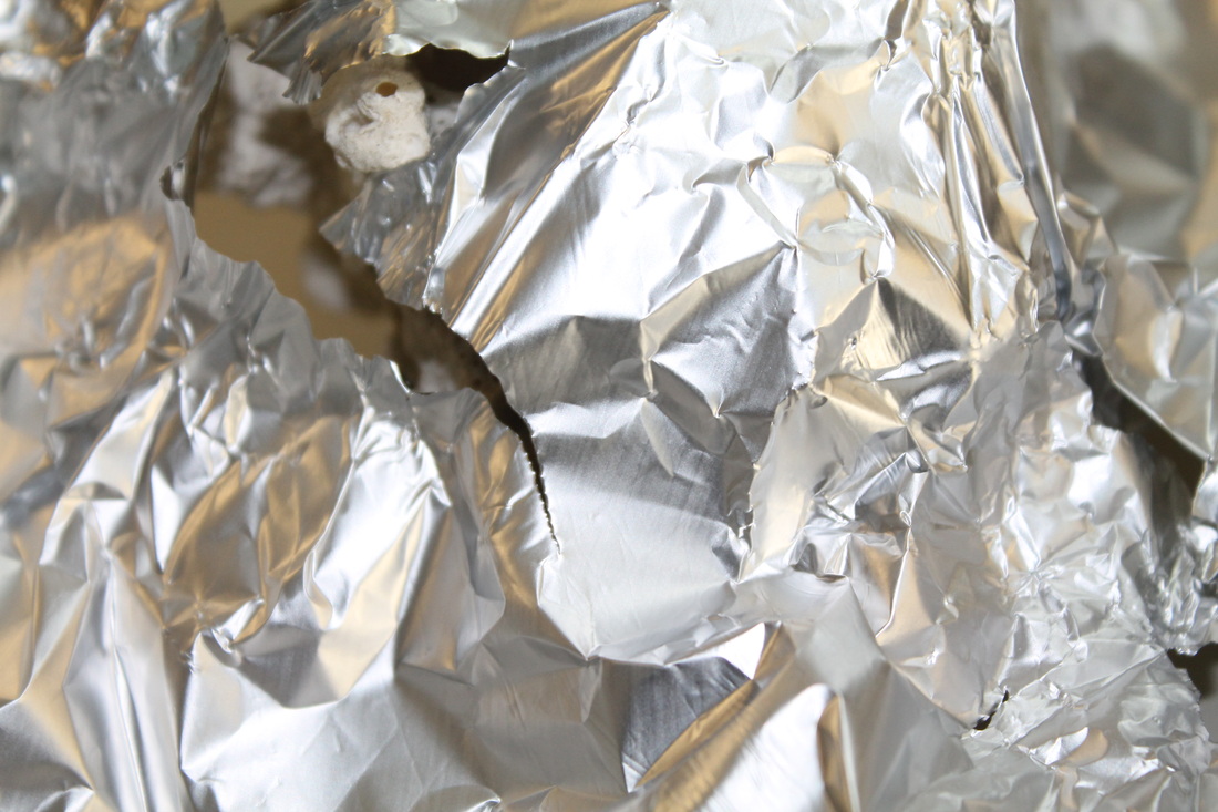
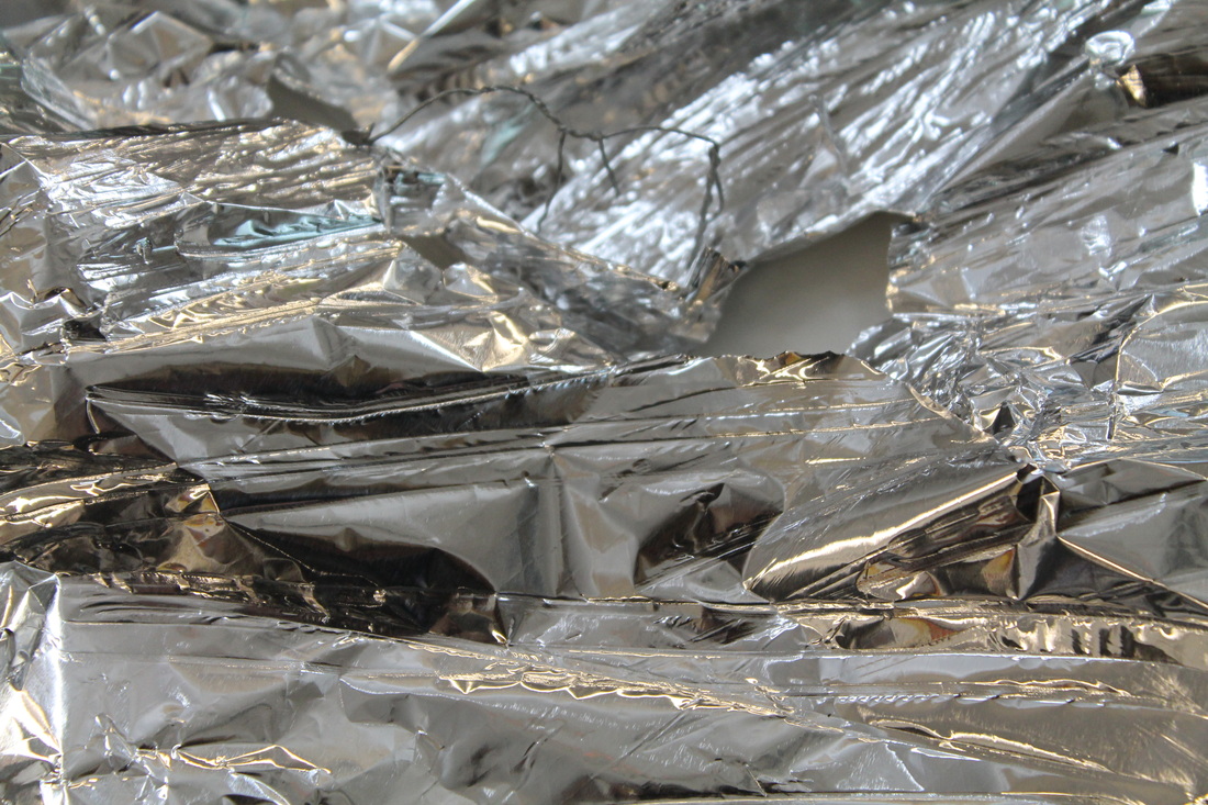
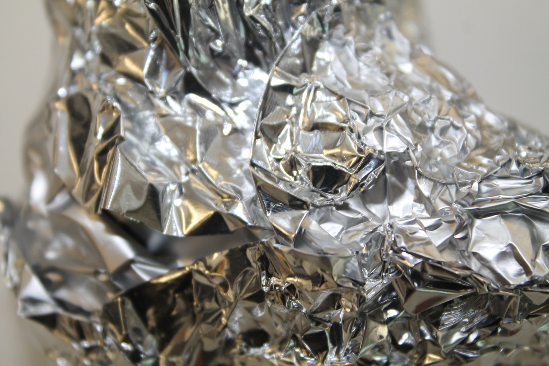
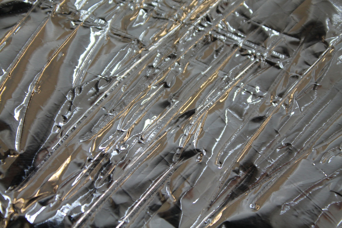
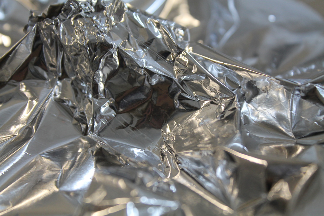
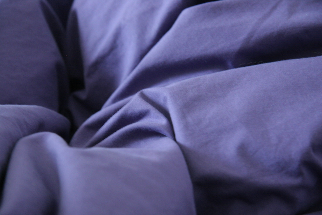
This was one of my personal favourites, as it reflects the idea that from the most basic of material (tinfoil) can create interesting looking forms, folds and crumples. I really liked the way the warm light hit the surface of the tinfoil also, highlighting the detail in the creases and adding a sense of depth and contrast to the image. As a result of this it appears abstract and almost electric, possibly on fire.
|
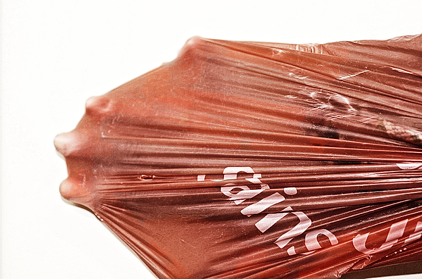
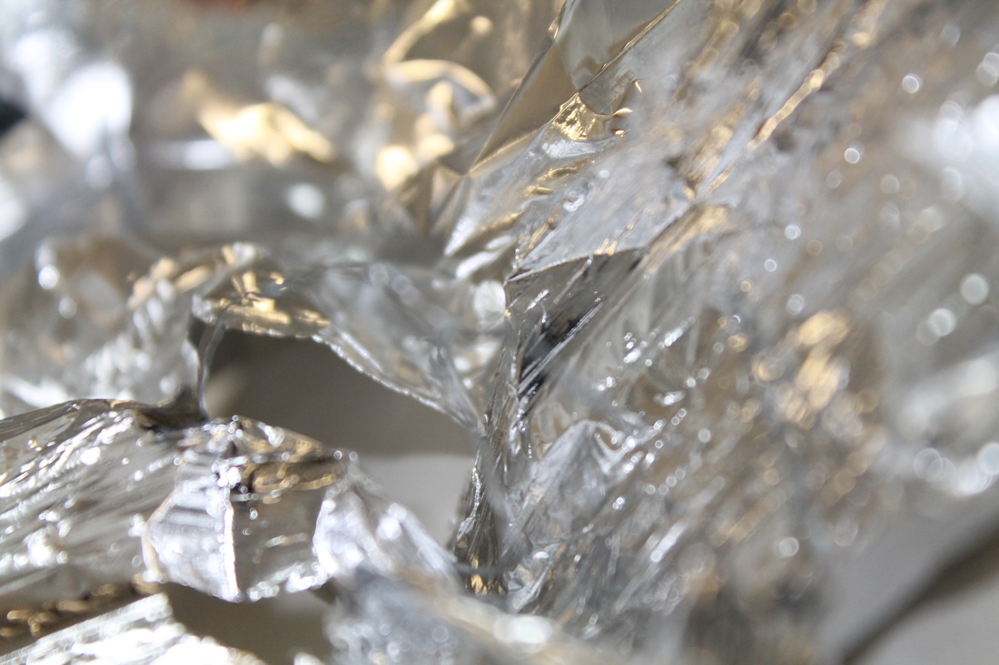
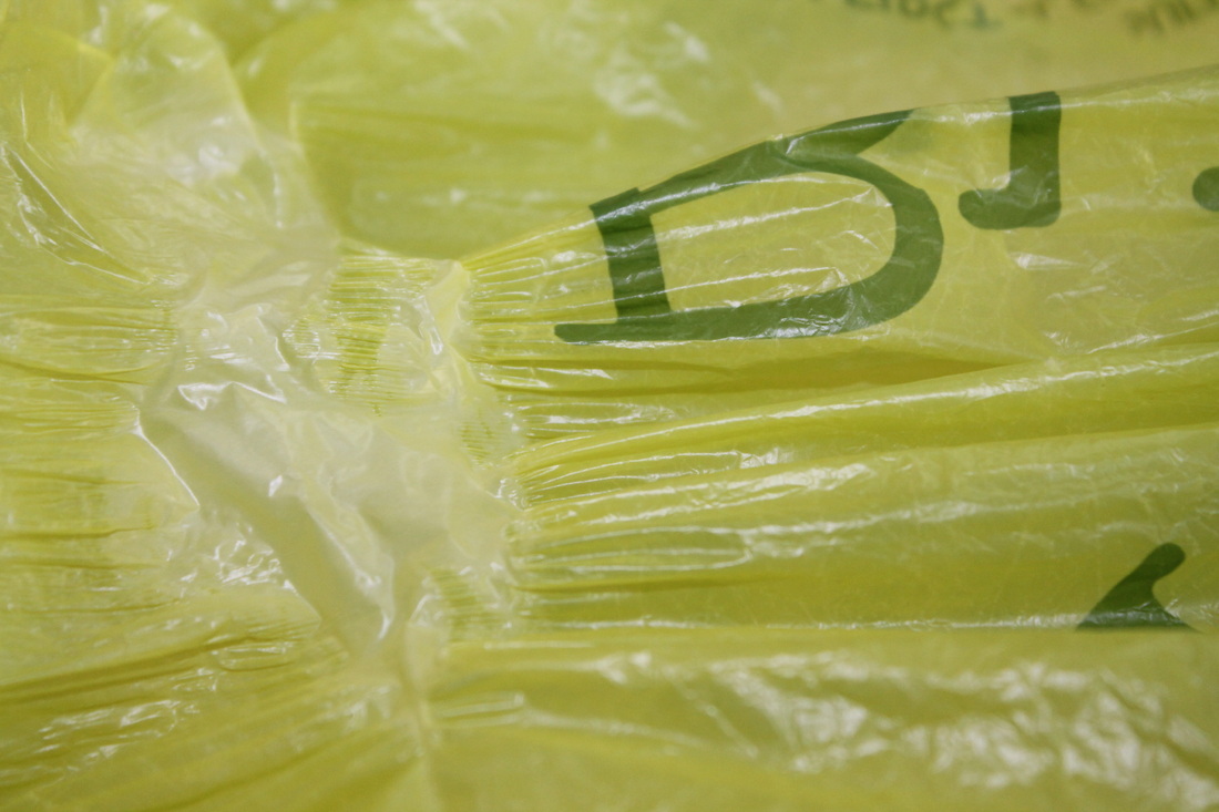
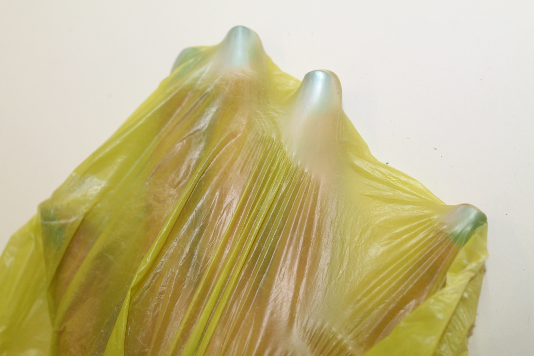
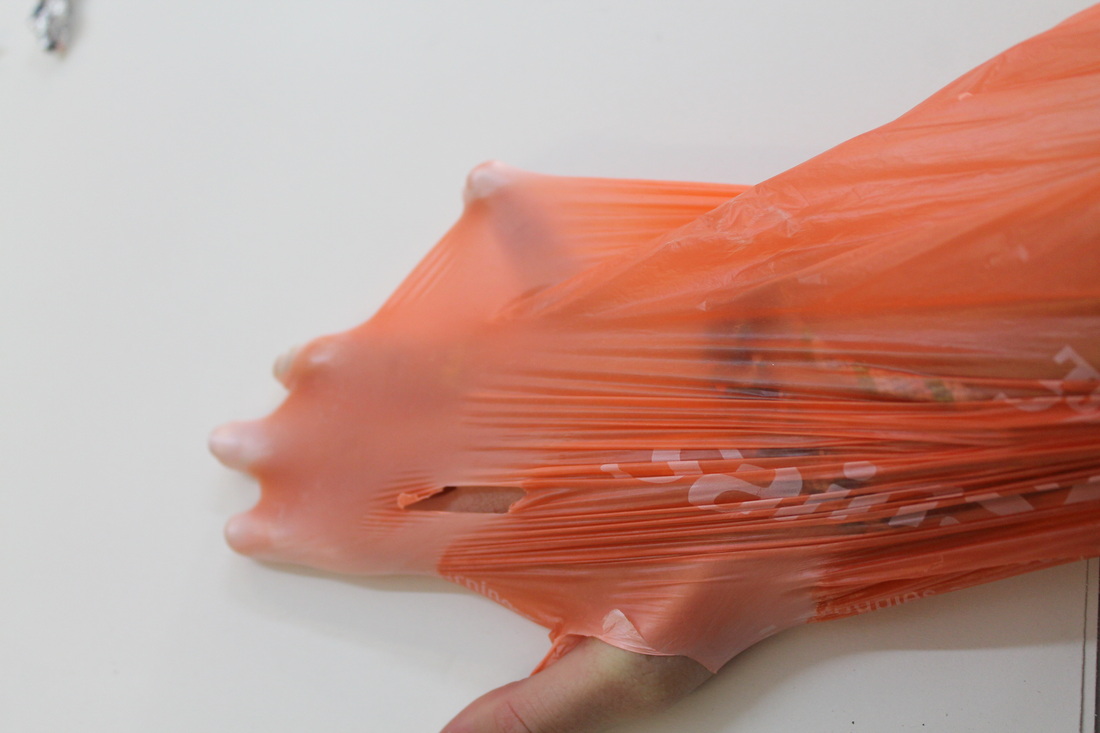
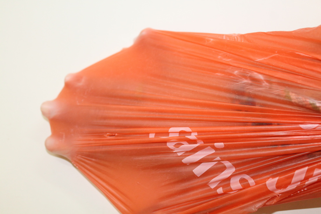
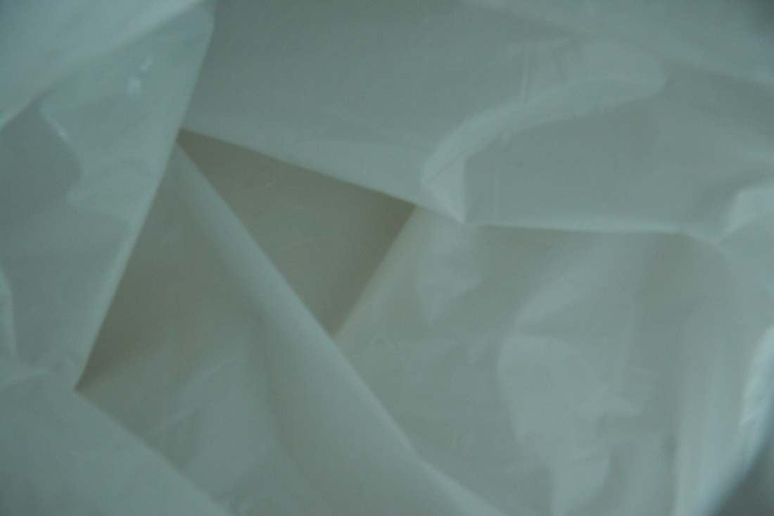
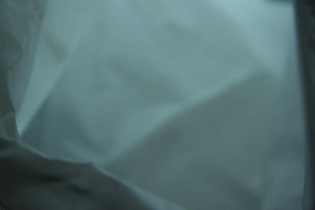
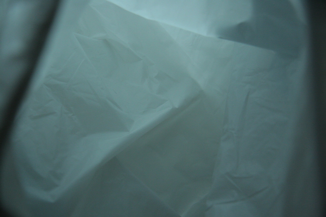
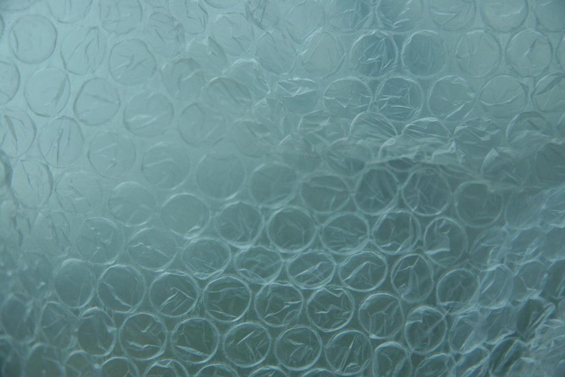
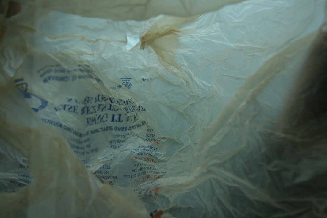
I also chose to analyse this photograph; as I feel it most represents the theme of force. The way the stretched plastic appears thick at one end, and then gradually fading out, getting weaker and weaker further down until the plastic is thin and stretched out.
|
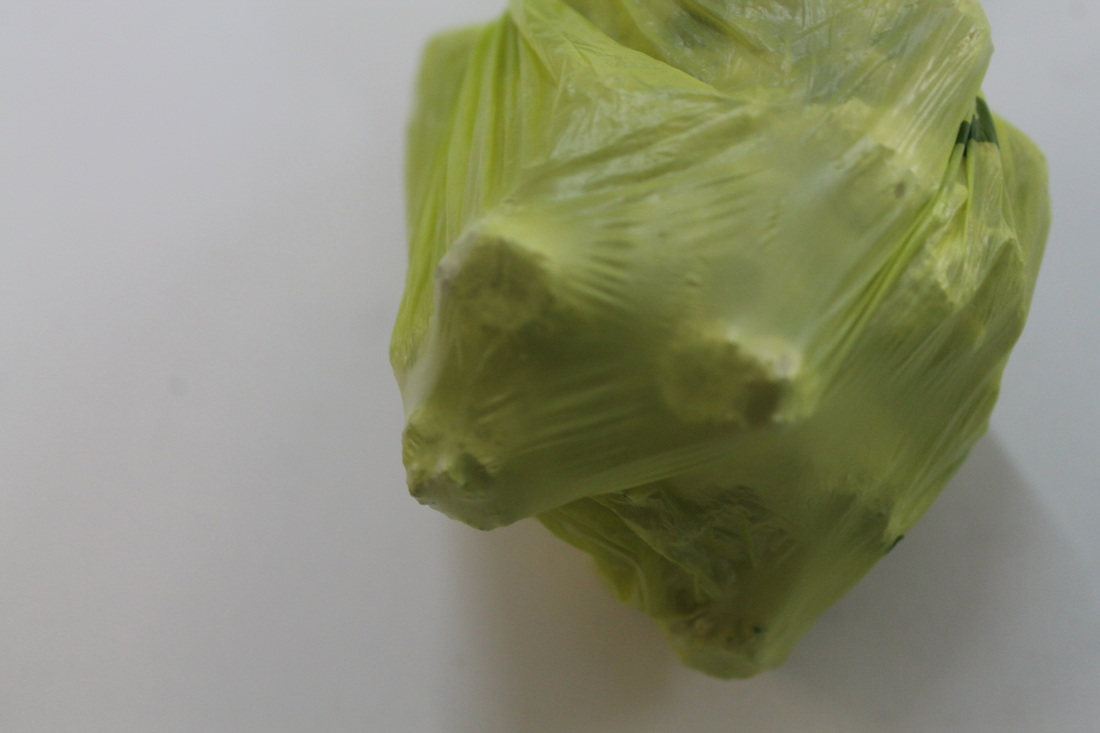
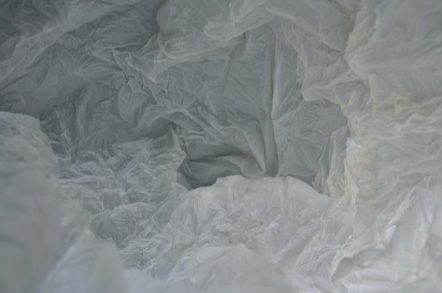
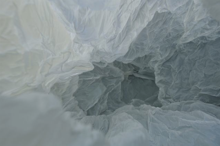
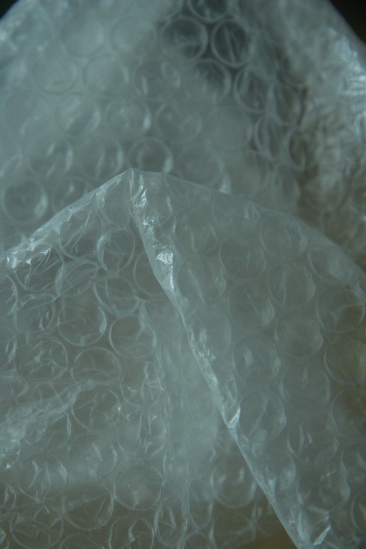
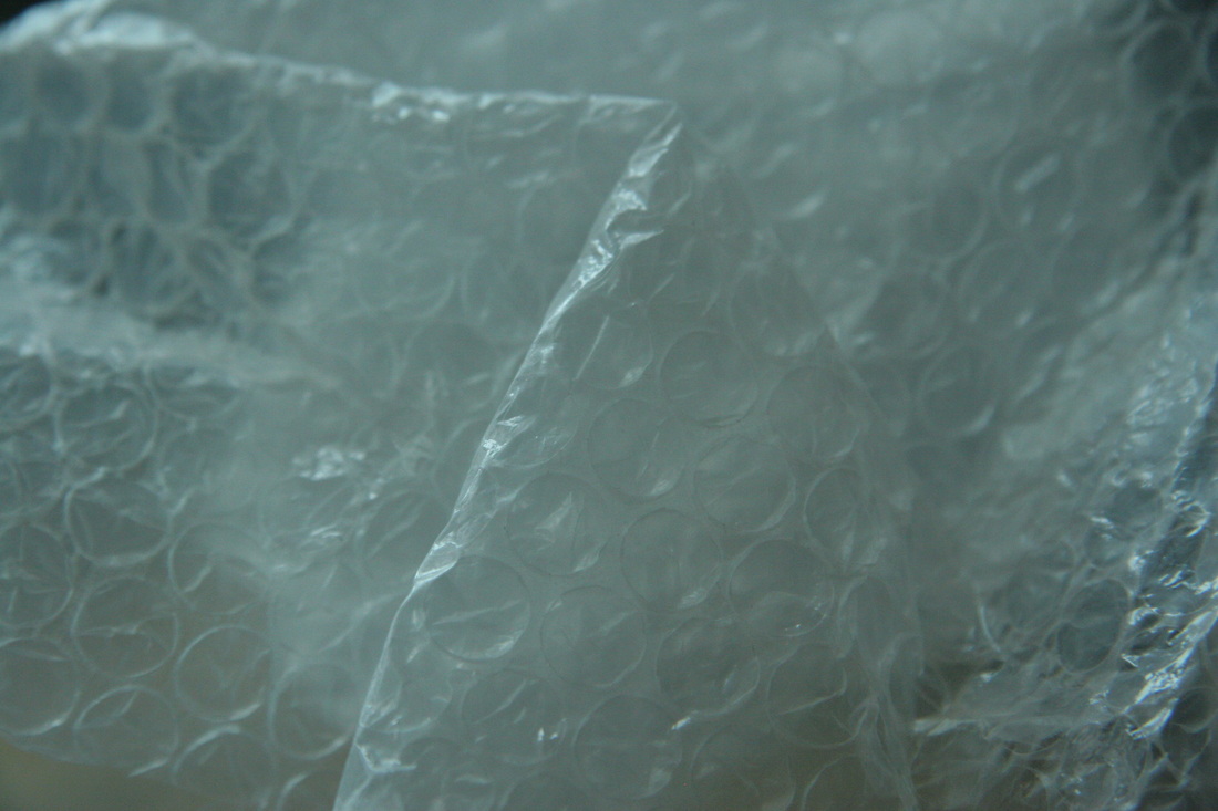
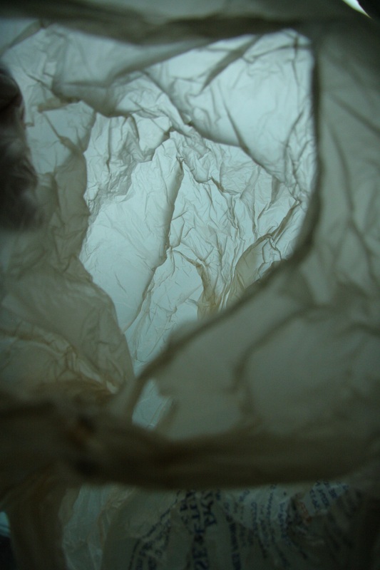
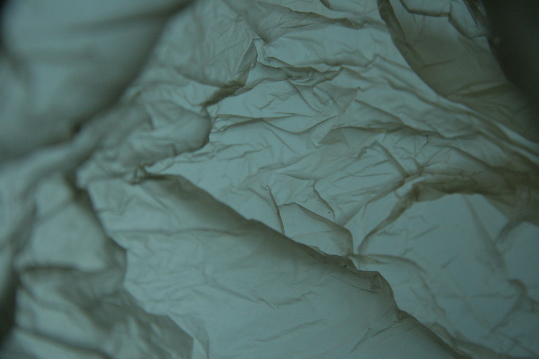
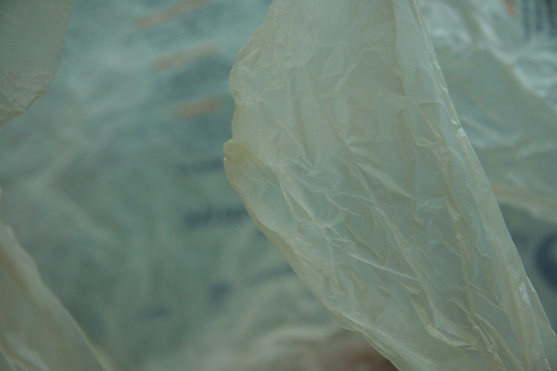
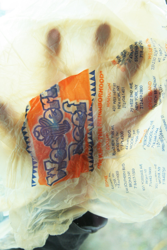
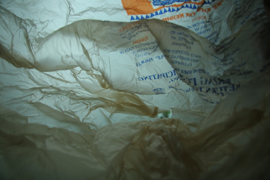
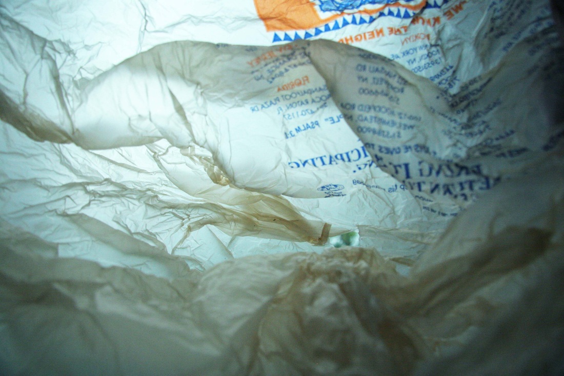
Francois Delfosse
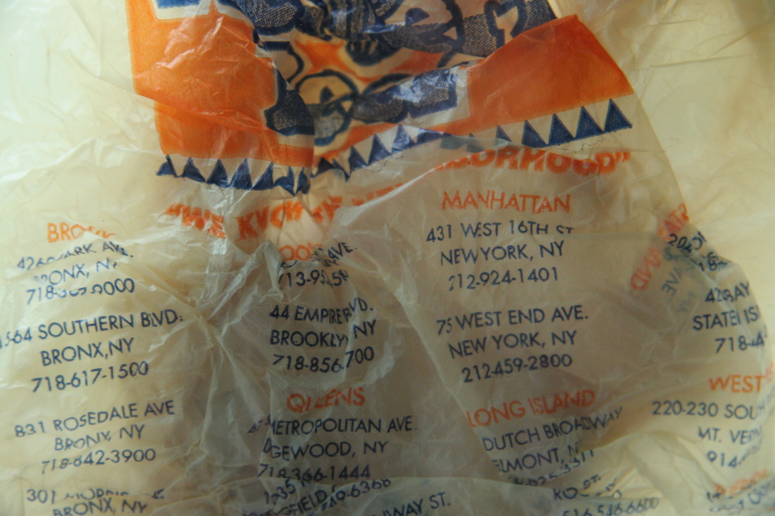
Francois Delfosse is a photographer that takes photos inside crumpled up, used plastic bags. His work is mostly abstract and resemble a glacier cave in the North of the South Pole.
Francois Delfosse is a photographer that takes photos inside crumpled up, used plastic bags. His work is mostly abstract and resemble a glacier cave in the North of the South Pole.
|
|
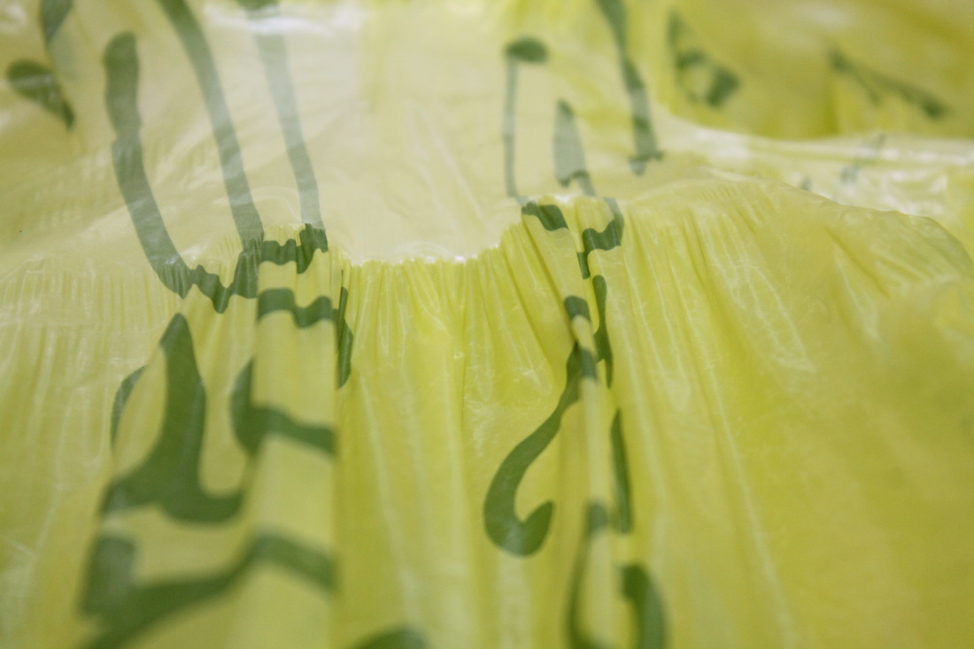
To extend my response, I took more photos to illustrate applied force from found objects and used plastic bags (inspired by Francois Delfosse).
These are my photos:
These are my photos:
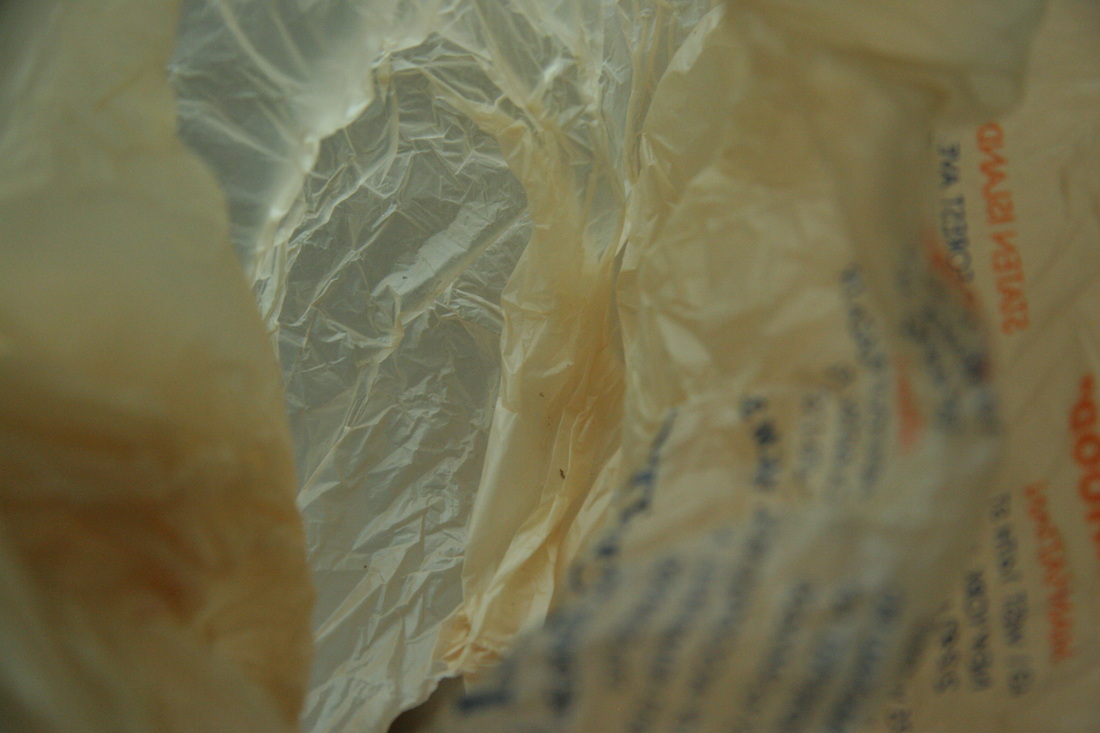
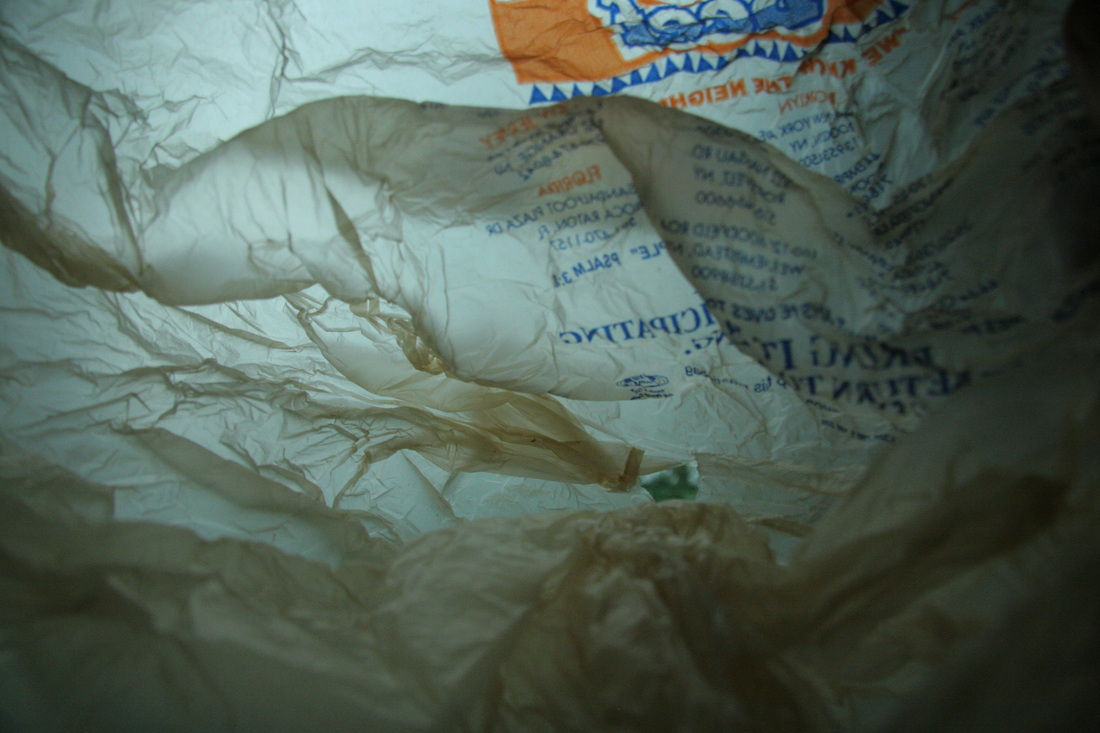

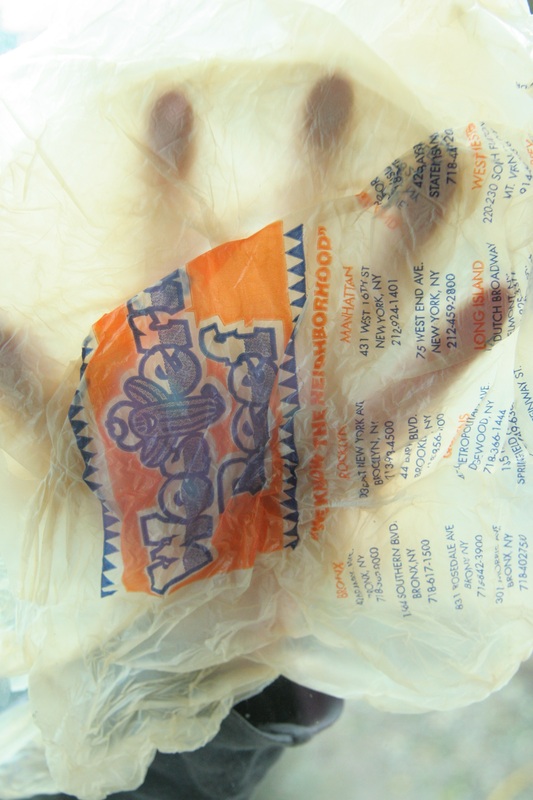
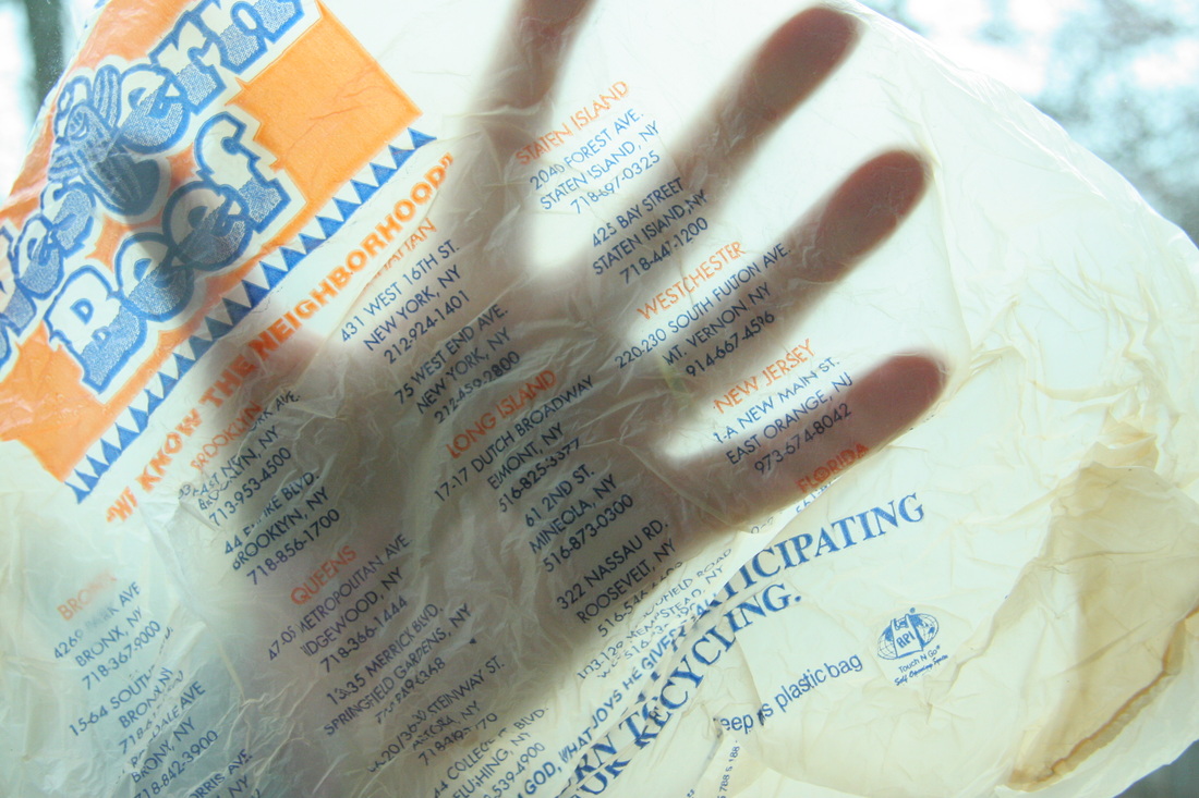
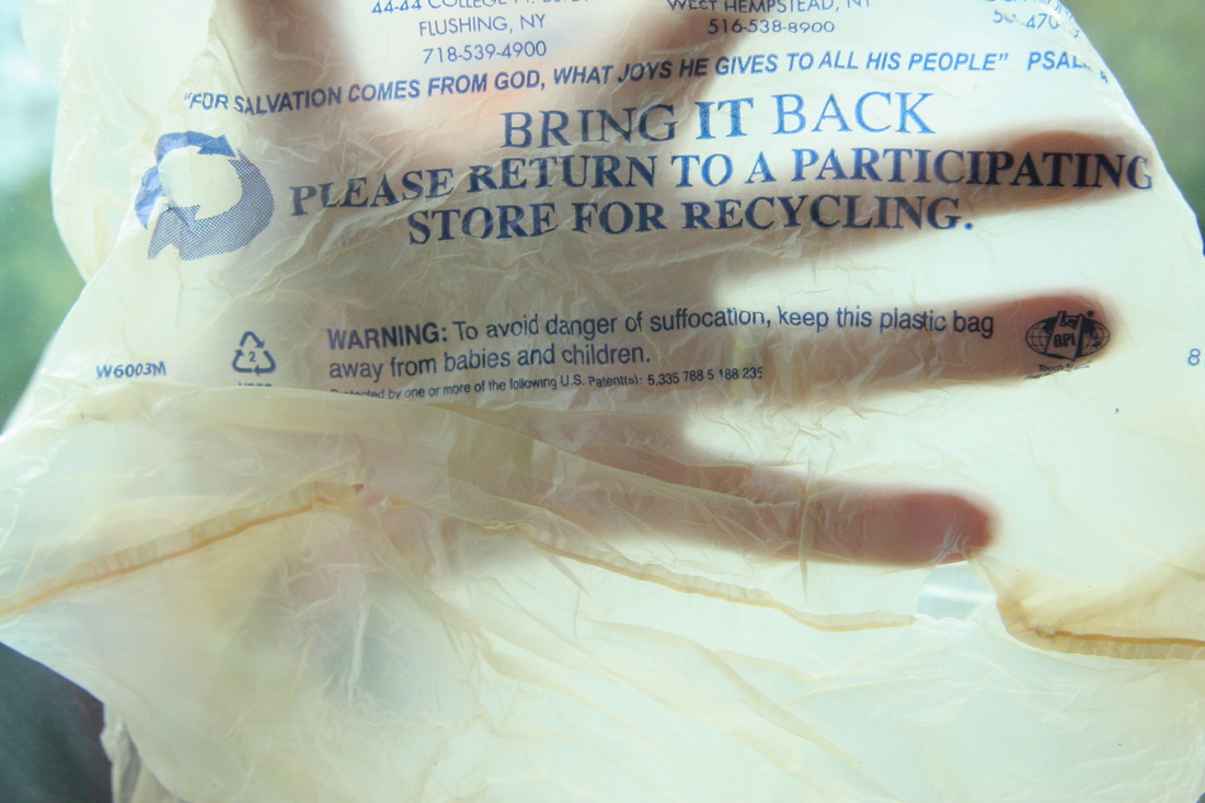
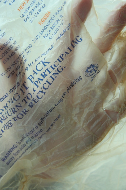
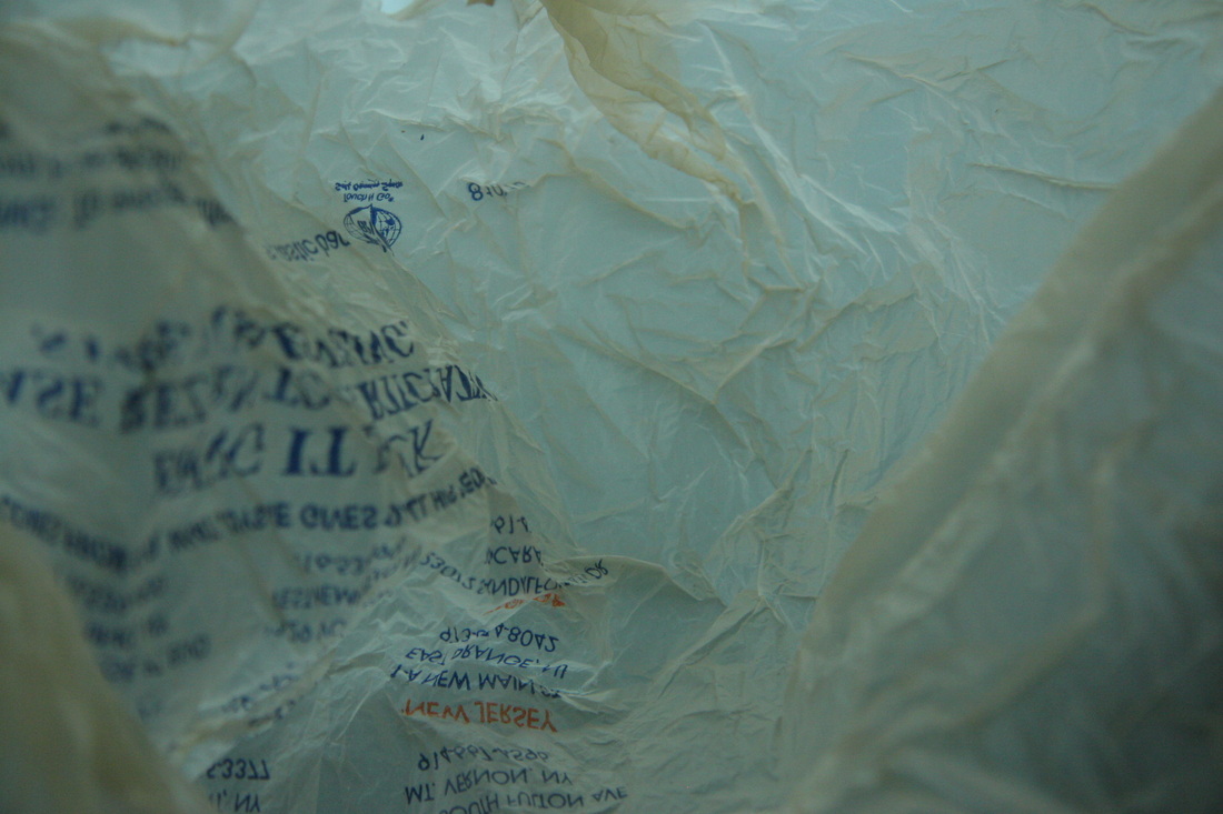
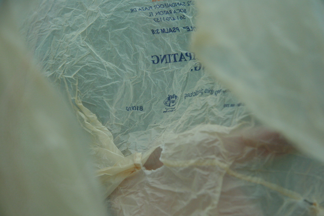
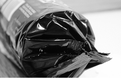
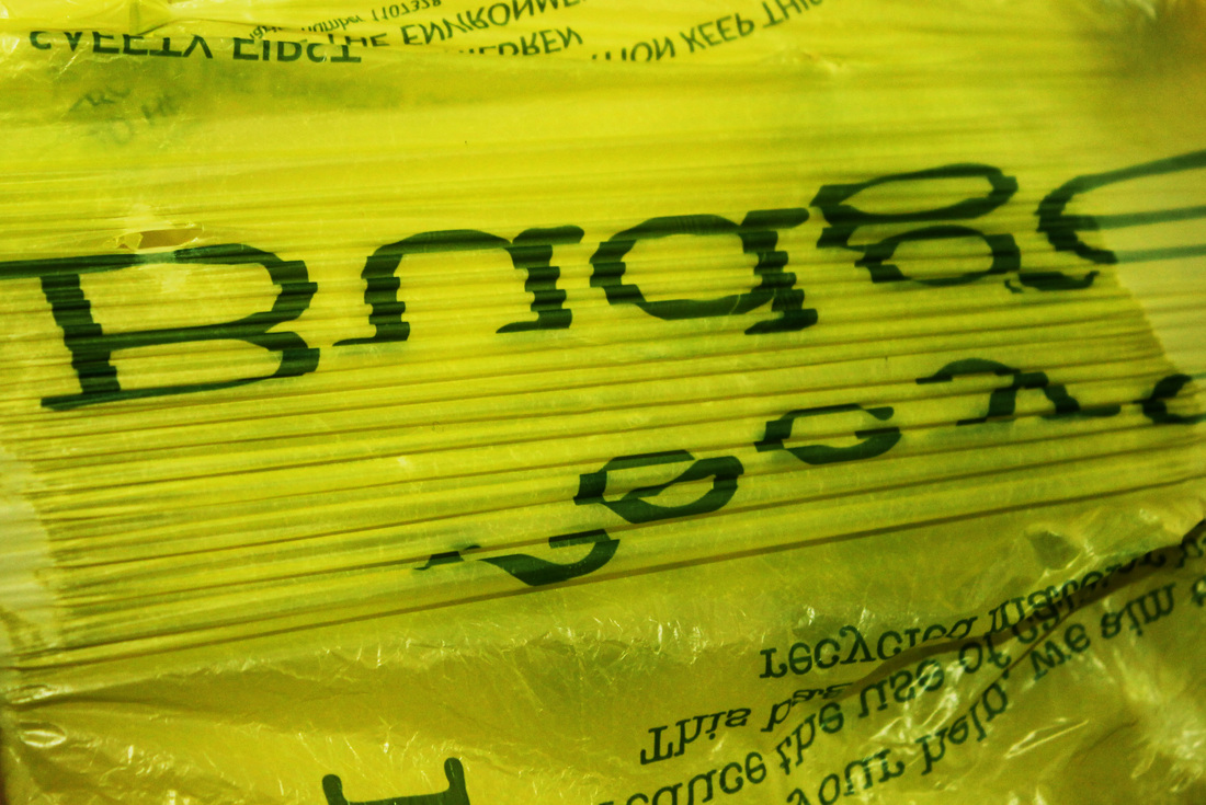
I was mainly attracted to the faded blues and peachy colours, contrasted with harsh black writing.
www: With this photograph, I intended to capture the abstract outline of the flour bag which I think I was successful in creating. ebi: The image focuses on the creases and text on the bag, however the top is out of focus. I would have liked to capture this part of the paper bag as it holds interesting patterns and rips- illustrating the theme of forces. |
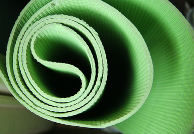
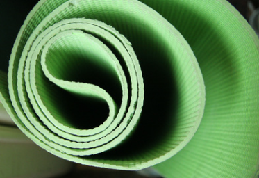
The shape and tones of this object particularly interested me. This is illustrated in the defined edges of the exercise mat, emphasising the force of every curve and twist. A high level of contrast is also found in the image; ranging from extreme dark shadows to bright green where natural sunlight shines on it.
|
|
|
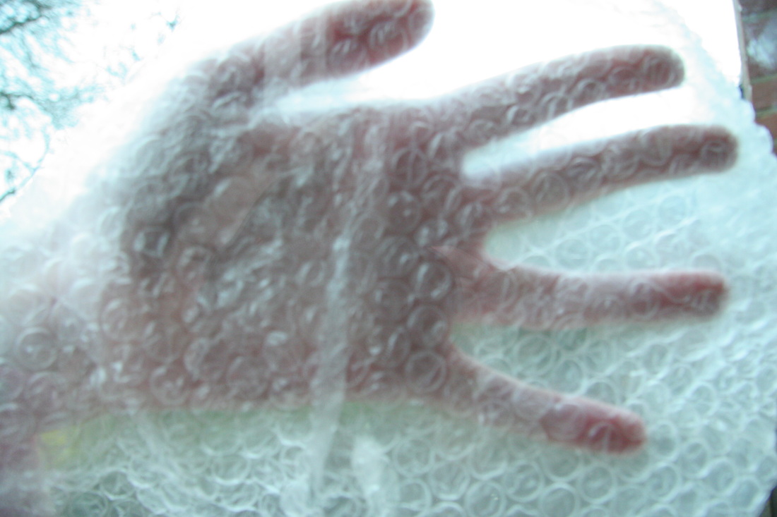
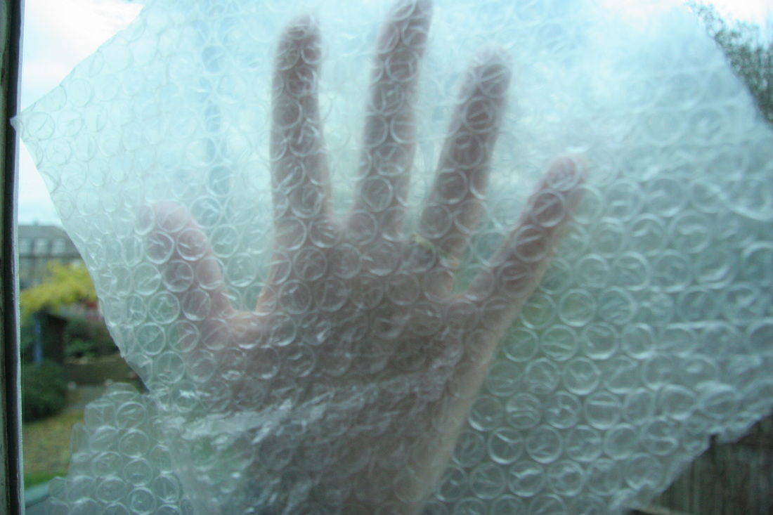
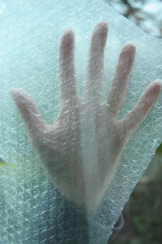
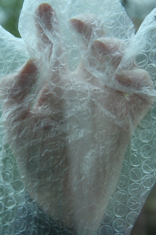
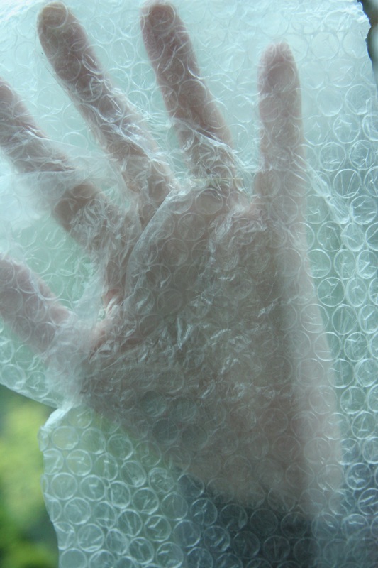
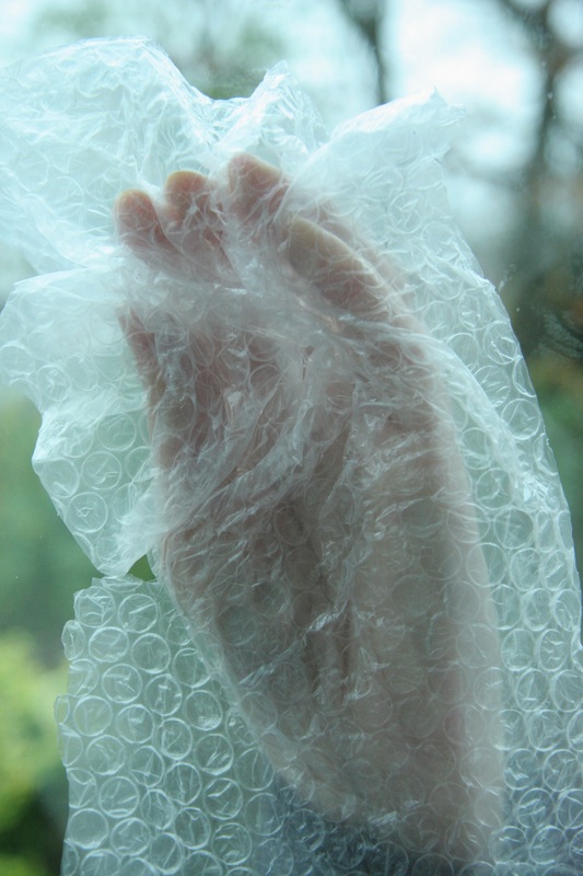
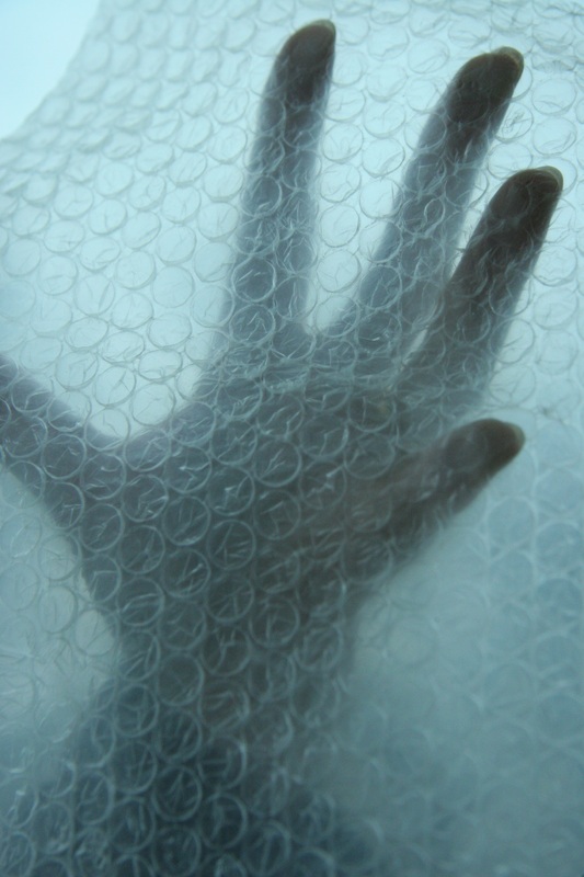
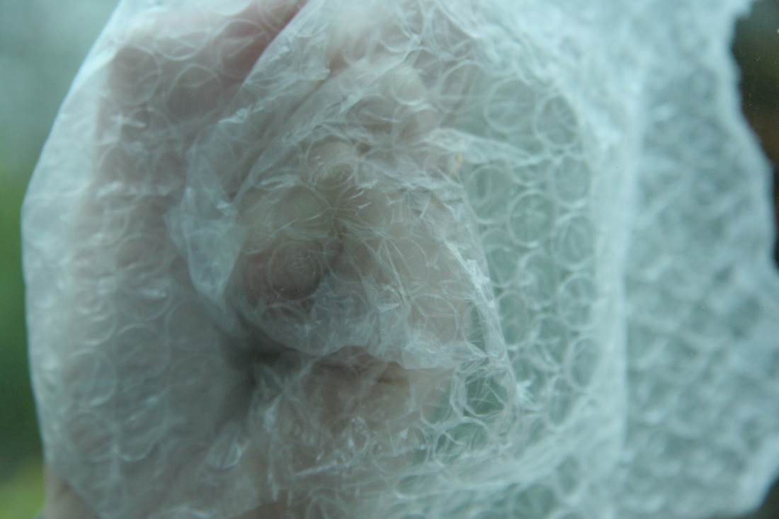
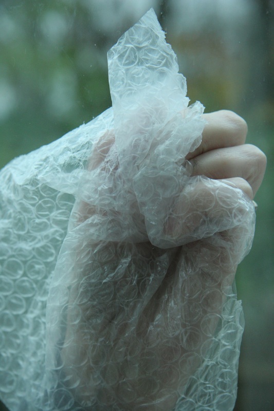
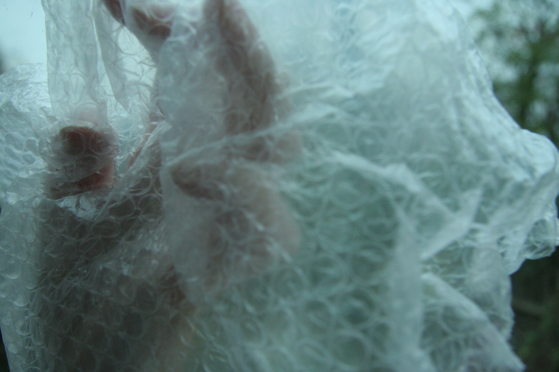
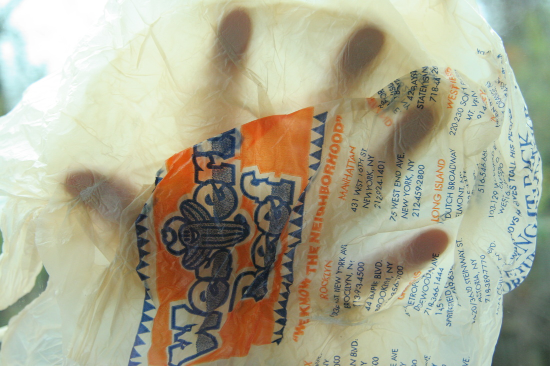
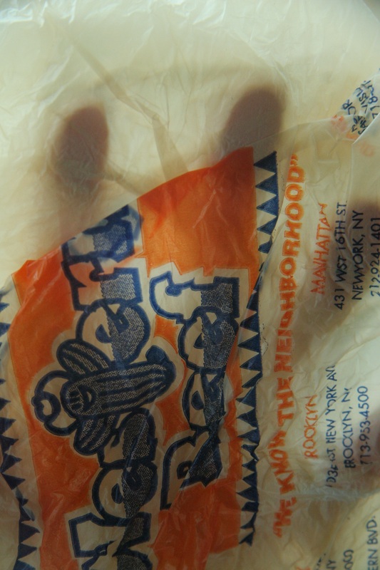
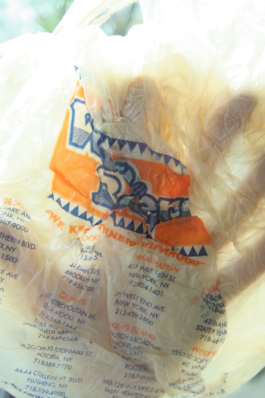
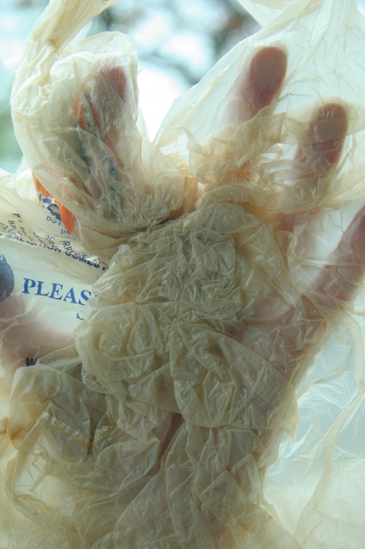
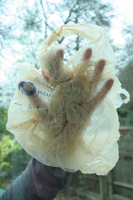
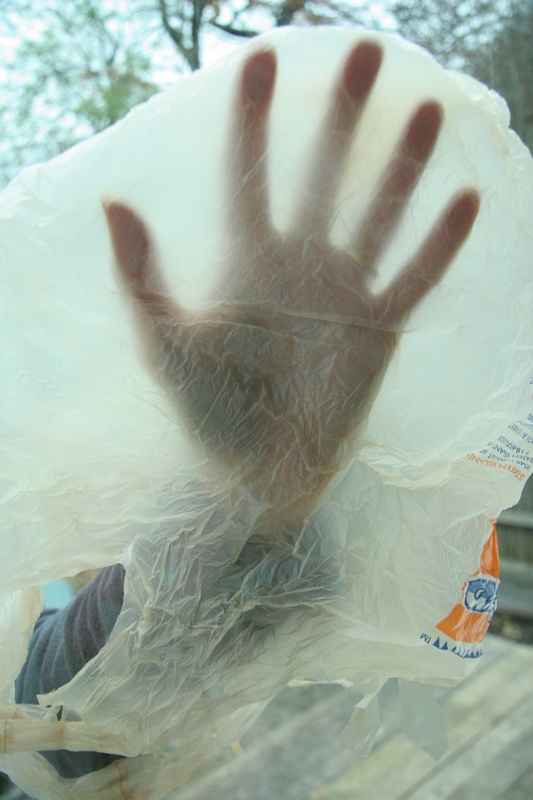
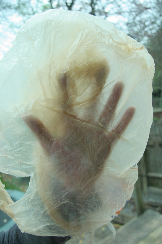
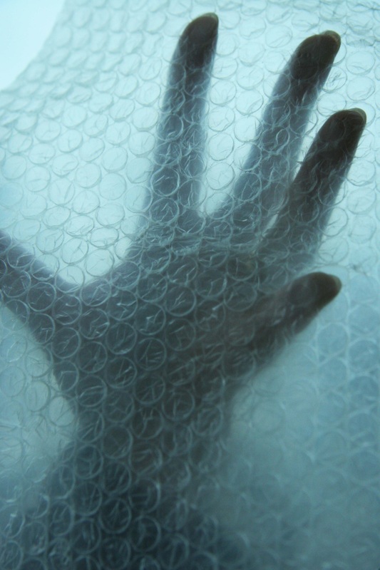
I really like the fact that with different coloured plastic bags, the overall colour of the photo completely changes. For example, in the first photo I used a slightly orange-tinted plastic bag, and with the second, bubble wrap. How transparent the photos were also interested me. The hand is visible from behind the different materials.
before
|
After
|
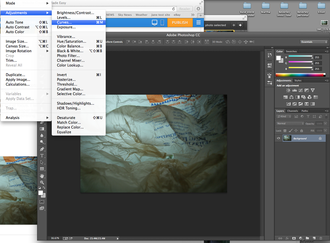
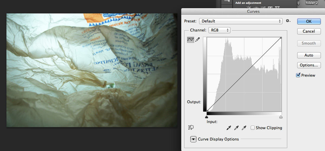
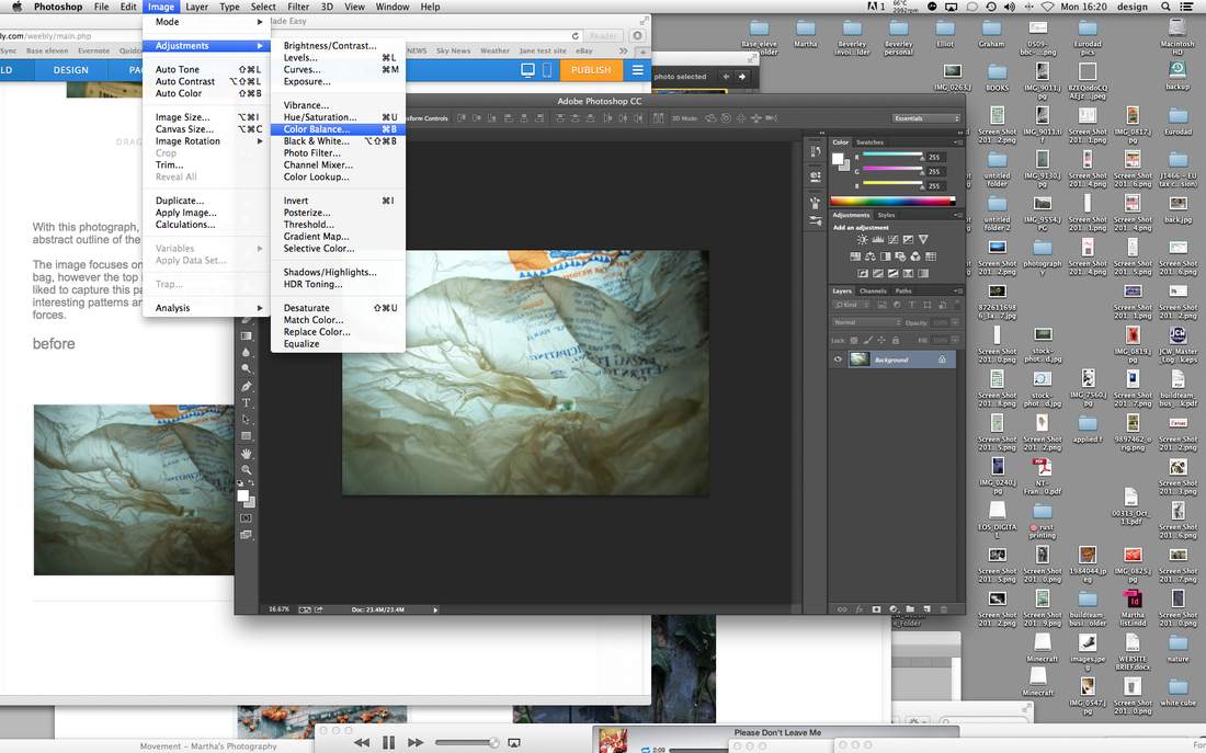
To enhance my photograph, I edited it in photoshop. Here is the process I used:
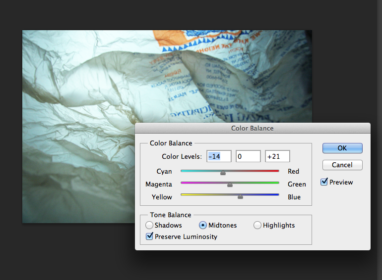

|
|
|
|
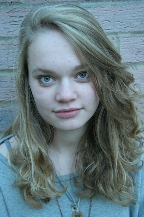
This was one of the original photographs I took to manipulate.
|
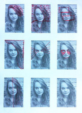
Thought process: I printed out many copies of the original photo and experimented with different ideas by scratching and drawing onto them with purple and red pen.
|

|
John Stezaker is an artist and photographer, born in Worchester, England in 1949.
|
|
|
|
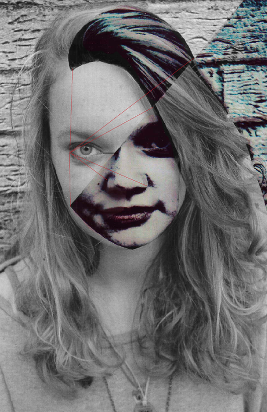
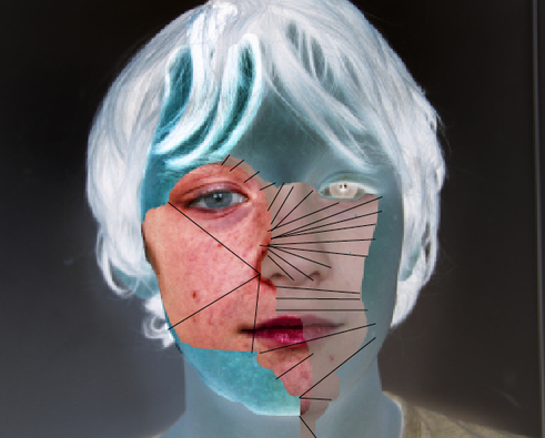
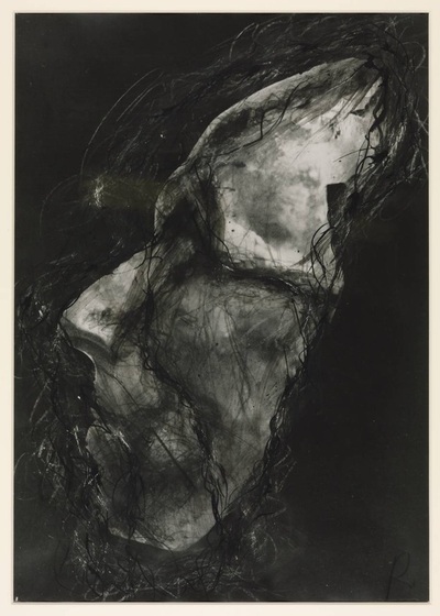
These two were my first attempt at manipulating an image by 'physically - Cut, draw, sew, collage'.
To make these, I copied the same image, took it into photoshop and added a 'grunge' effect. I then printed both images out on acetate and layered them together.
To create the red lines, I sewed through the paper and joined all the edges together-bringing together the contesting effects. This links to the work of John Stezaker as the use of straitly cut lines, both with a different effect or photograph that joins the portrait together. This is particularly reflected in my first attempt.
I enjoyed making these, and decided to create more with other photographs I took.
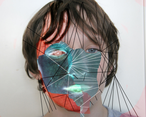
|
|
|
|
|
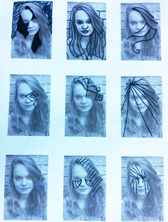
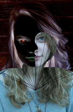
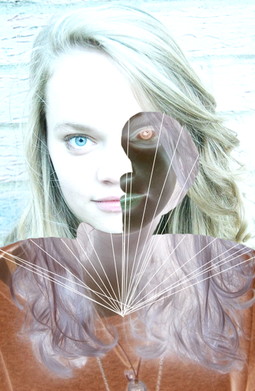
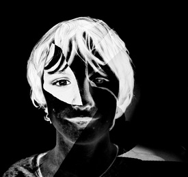
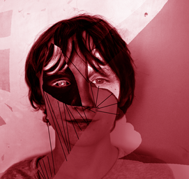
I also was interested in experimenting with the new physically manipulated image (on the right), so when scanning it in, took it into photoshop and added a red filter and a black and white negative. I think the one on the left was the most successful as it reveals the different tones and shape in great contrast; making it more interesting.
|
Digitally - Use photoshop to change image
|
|
|
|
|
|
After looking at all three stands, I will continue to look at Portrait Transformation in order to develop my project. I aim to experiment with sticking, painting, glueing and manipulating photographs in photoshop to create photomontages.
One of the artists I will be looking at for inspiration is Robert Rauschenberg.
(October 22, 1925 May 12, 2008)
Robert Rauschenberg is an American painter and graphic artist who's work relates to 'The Pop-Art Movement'.
The artist works with mixed media, printmaking and photography to create his photomontages.
Robert Rauschenberg was an American painter and graphic artist born on September 2nd 1925 and died on 12th May 2008. He acted as an important bridge between abstract expression and pop-art.
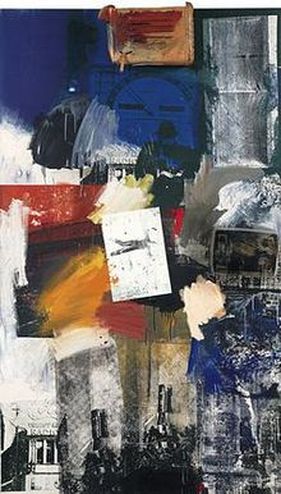
Robert Rauschenberg, untitled "combine," 1963.
This work of his I found especially interesting. Black and white images are contrasted by bight, expressive stokes of blurry paint which gives the effect of blending the photographs together; creating an overall scene. |
In this particular photomontage, I have noticed that Rauschenburg's style contains several types of mixed media such as painting, printing, tracing and making stencils. He also uses a technique that he dips materials and other found objects into paint to create different patterns.The significance of using a variety of media in his artwork is in order to reflect every-day objects in a different light as Rauschenburg saw the beauty in using objects others would 'see as trash' and transforming them.
In my opinion, I think the key things that make the artwork successful is the limited colour. The piece is almost split into two sides; burnt, warm colours, contrasted with cold, blue colours. Although limited, the colours are completely different which creates this strong contrast of complementary colours. Furthermore some images are made negative in order to stand out to the viewer, also adding an interesting contrast to the positive images, much like the dramatic colour change. The painting and the repeating of a particular part of one of the photographs is effective as it brings the piece together and successfully blends the combination of different photos. For example the repeating of the pointing hand. This also enforces and makes the message the artist is typing to portray more powerful. |
Interim Piece
|
|
|
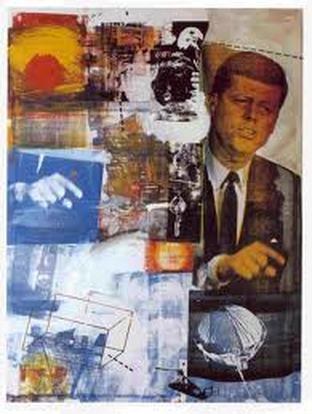
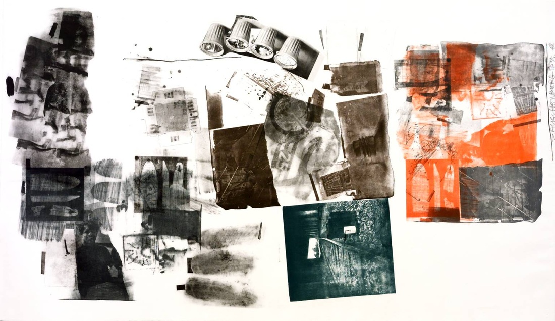
Below is another piece of Rauchenburg's work
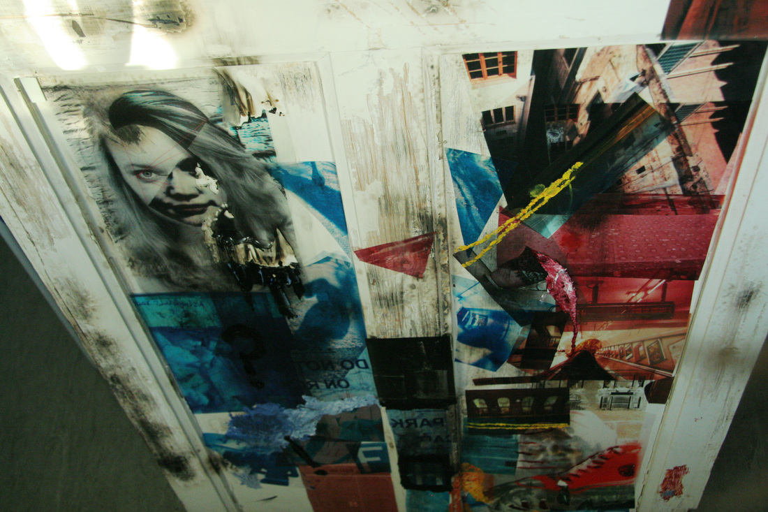
Below, is one of my first responses to Robert Rauschenburg. Attempting to mirror the style of the photomontage, I tried to identify the key aspects of the artists work I found interesting and why.

|
Arnulf Rainer is an Austrian painter who is mostly recognised for printing, drawing and painting back into his photographs. I found it interesting how he has practically taught himself how to create a piece of art, having no training before.
|
The aspect of Rainer's work I was most interested is the work he created in the 1970s where he began the process of painting over portraits. The artist intends to 'challenge your mind' in order to 're-think your own view of the world', manipulating an image for an outcome that gives different impressions each time you look at it.
The focus of his photography is of himself. He believes if he posed for photographs it would bring out 'an element of madness' within him. These somewhat odd and disturbing expressions were meant to draw the viewer in, however repel others away in disgust as his artwork can be viewed as ugly. Rainer then painted violent and expressive streaks of paint over the top of these images, to again, create a different impression of a more melancholy, suffering soul. |
A Nose Adjustment Face Farce 1971 Oil pastel on black and white photograph.
|
Untitled (Death Mask) 1978
Ink drawing on black and white photograph.
|

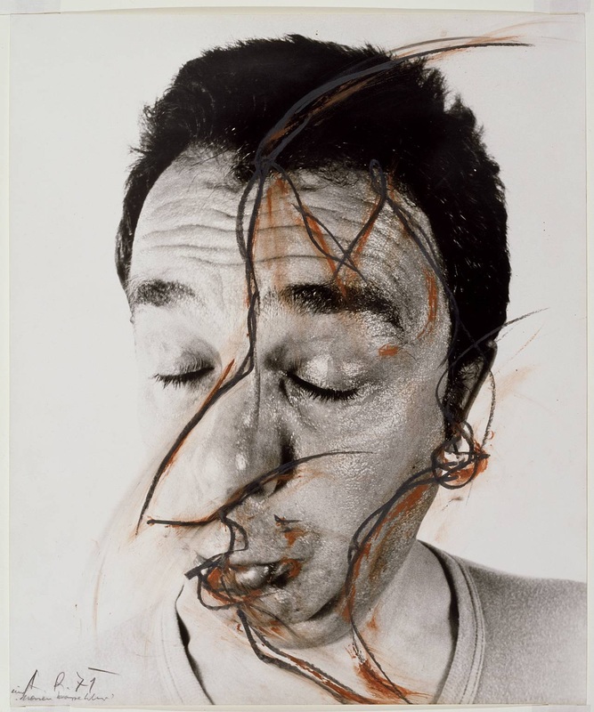
Francis Bacon: was born in 1909 and died in 1992.
He began is expressive paintings in the early 20s and is now known for bold, graphic and emotionally raw imagery.
He began is expressive paintings in the early 20s and is now known for bold, graphic and emotionally raw imagery.
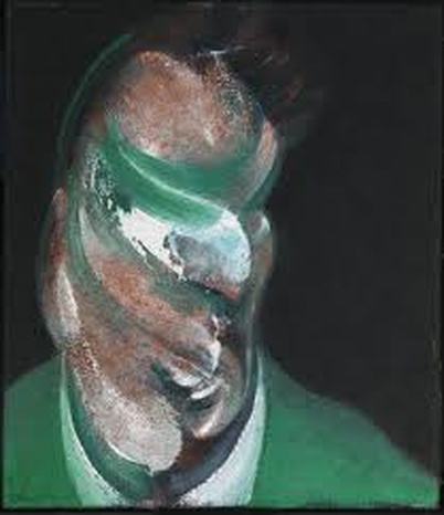
The first thing I noticed about this painting was the limited, complementary colour. Bacon uses lime green, whites and blacks which appear to be smeared across the face. Although the eyes, mouth and nose are distorted, contrasting colours replace them - drawing the viewers' eyes to the centre of the face, leaving it to their imagination as to the actual appearance of these features.
|
|
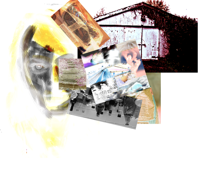
Developing my project:
|
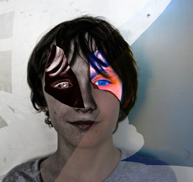
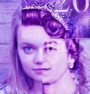
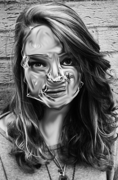
I would like to continue manipulating portraits in different ways. Possibly using different textures and materials to layer over the top rather than changing an image digitally. A material in particular I am interested in experimenting with is plastic bags. When the plastic is stretched, it becomes thin and opaque, meaning the original photograph will show through, creating an interesting outcome.
|
I intend to use several coloured plastic materials, in effect creating an abstract piece to give a different impression; similar to the work of Arnulf Rainer who takes a jolly, happy expression, then contrasts this feeling by manipulating it after.
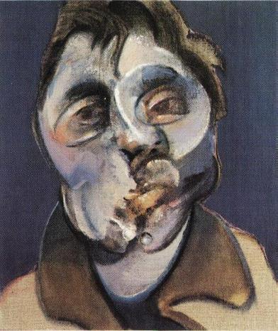
This idea of using plastic bags was inspired the work of Francis Bacon, as if feel his portraits look as if stretched and flexible. The colours he paints with are mostly vibrant and hardly blended together which is contrasted by dark grey tones. I would like to experiment with this; however taking my own black and white portraits and contrasting this with thin coloured plastic. |
|
|
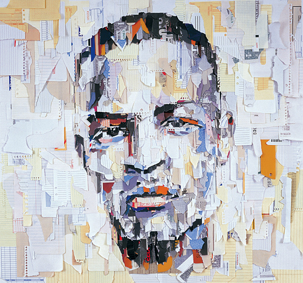
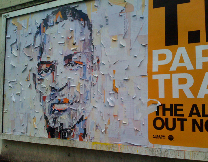
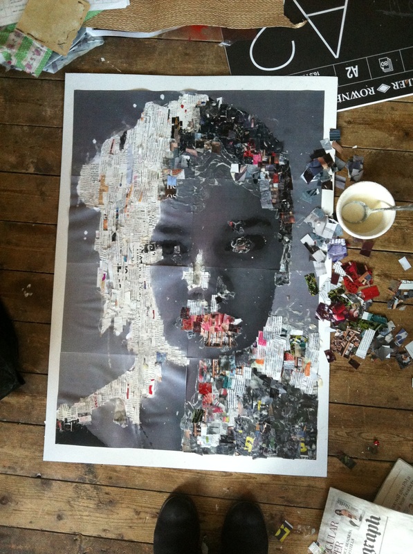
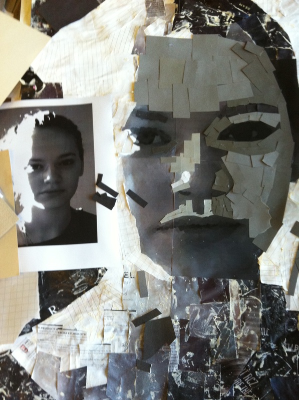
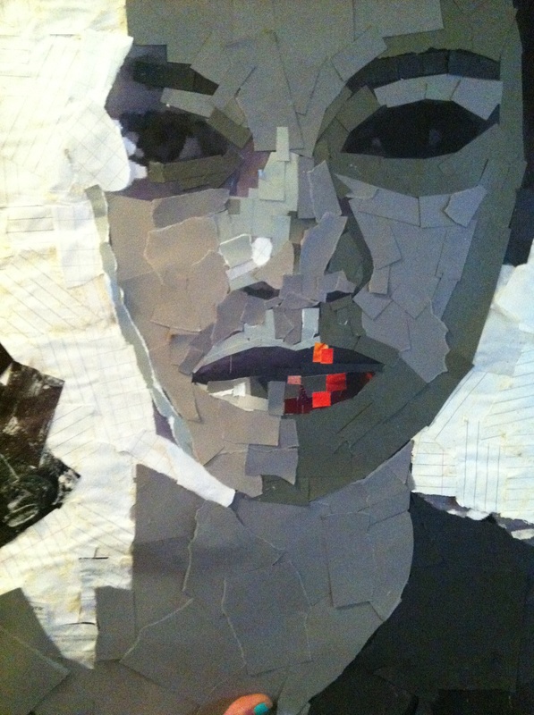
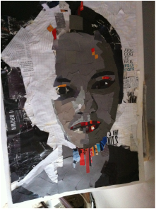
Linking with a theme of different textures and layering them onto a photograph, I decided to look at the work of Ian Wright, who constructed a face with bits of scrap paper, magazines, tags and labels. I am interested in creating a final piece similar to this.
|
Ian Wright
Ian Wright is an artist that produces portraits out of strips of magazines, newspapers, tags and card.
To construct this, he manipulates an image in photoshop by adding a high level of contrast, using the 'curves' tool. He then adds a filter to the picture which enables him to view a simplified version of the image. These steps reveal the different tones in the portrait and therefore making it easier when layering the paper over the top. In Wright's work he aims to construct something new and different by using different materials and technology to influence a piece. Most of the time Ian Wright's work is a 'happy accident' or unexpected as a result. Wright experiments mostly with portraits and this idea of creating them with different materials. I intend to base my future work around this artist as I am interested in creating a final piece based on the type of artwork he generates. |
|
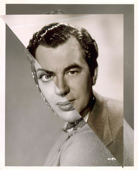
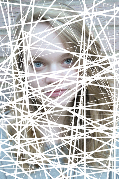
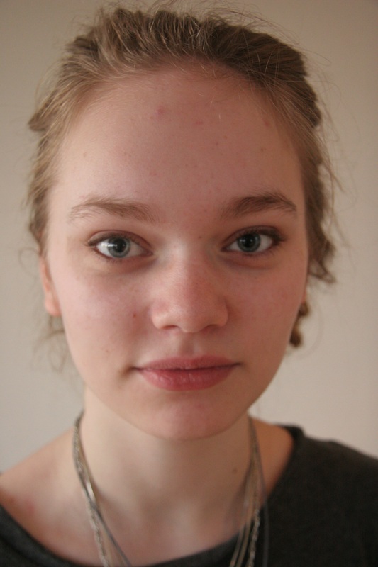
Below, I have taken a range of portraits that I could potentially use as a template for my final piece.
|
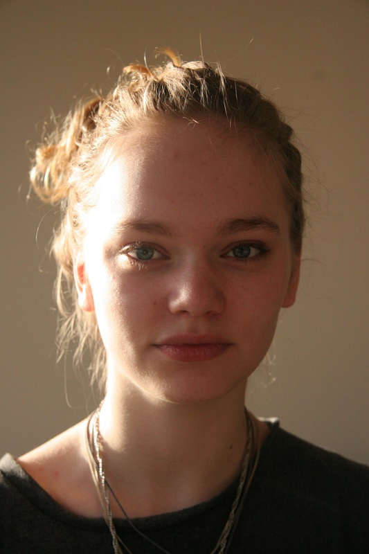
|
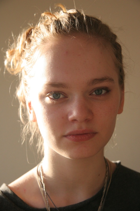
|

|
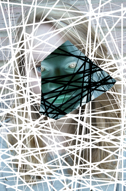
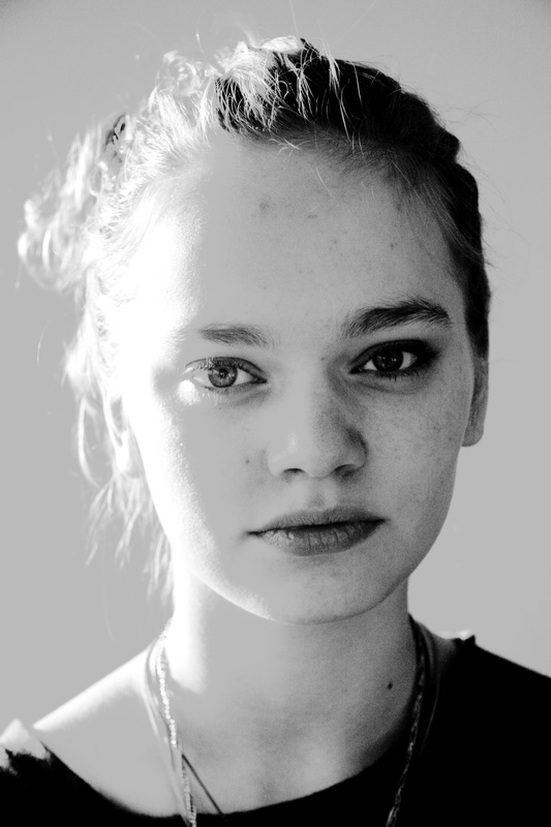
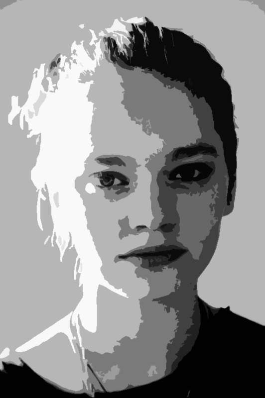
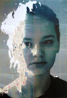
After taking these photographs, I came to the conclusion that this was the most suitable photograph to use. Below I manipulated this photograph, making it black and white, higher contrasted and simplified.
|
|
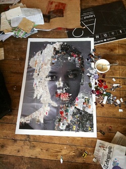
Process: Here I tiled the image, splitting it into many A4 sections in order to print them out, join them together and then mount onto board to form an A1 photograph.
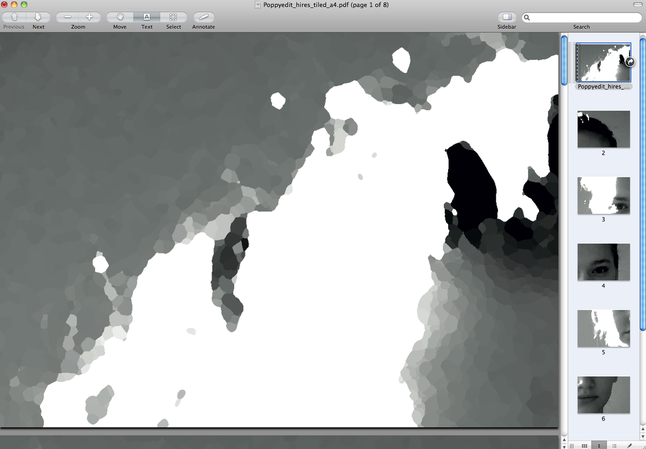
step-by-step:
|
1.)
|
2.)
|
3.)
|
4.)
|
5.)
|
6.)
|
