
Meaning of order: The arrangement or disposition of people or things
in relation to each other according to a particular sequence, pattern
or method.
Meaning of disorder: A state of confusion or the disrupt of the
systematic functioning of a neat arrangement.
in relation to each other according to a particular sequence, pattern
or method.
Meaning of disorder: A state of confusion or the disrupt of the
systematic functioning of a neat arrangement.
mindmap
|
|
dismantling gadgets order & disorder
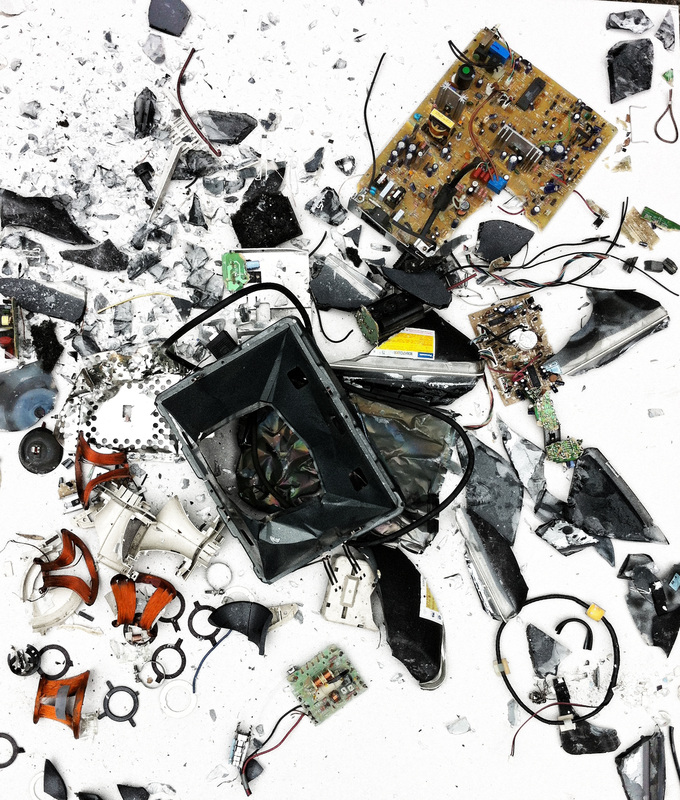
This first idea demonstrates the ordered fragments of shattered electrical items,
which contrasts with the muddled up, disordered pieces.
which contrasts with the muddled up, disordered pieces.

|
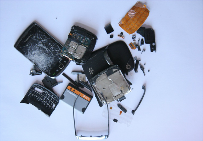
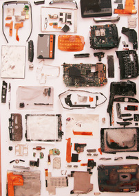
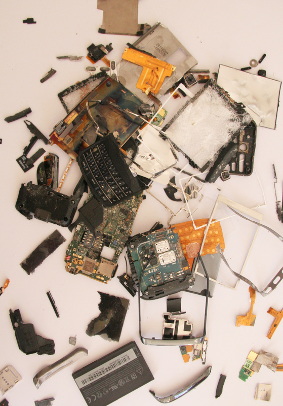
Todd Mclellan is a Canadian photographer that makes visible the workings and construction of everyday products and gadgets by dismantling each fragment and laying them side-by-side. The neat, geometric shapes create a sense of order as every piece is thoughtfully placed and the sheer quantity of parts is astonishing. However this order is then contrasted when the artist muddles up the pieces and scatters them across the page in a disorderly fashion. The parts look almost as if exploding or falling as segments of metal and plastic fly across the screen and overlap with each other.
The artist is inspired by everyday life and the way in which we live. The vintage gadgets he collects allows people to reminisce about childhood or the ways these objects link with memories or how they played a significant role in their life. This makes Mclellan's work appear more personal to individual people that view his work and allow them to make connections with it. 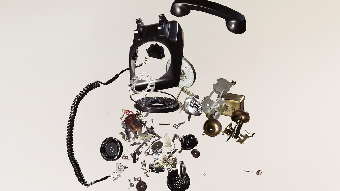
|
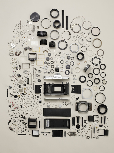
I was particularly inspired by this piece of work which is of a dismantled staple. The bigger, main parts of the staple appear to be in the lower centre of the image and the smaller parts are scattered around. Although very small fragments, each piece seems to be extremely well organised.
|
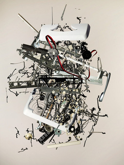
The disordered side to the taken-apart staple almost looks as if exploding in mid-air as the pieces are violently dynamic. The tangled shapes and broken springs add to the feel of drama and disarray as they stick out from the main body parts of the staple. Another intriguing aspect to the image is the fact that the viewer can still appreciate the objects original form although made abstract by being smashed to pieces.
|
my response
|
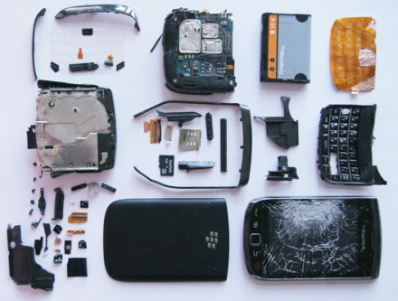
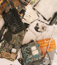
From this I was inspired to deconstruct two old mobile phone and display them on a clean white sheet of A3 paper. This allows the main focus to be on the dark segments of metal, rather than the paper, making it stand out more.
|
I faced some difficulties in physically taking apart the phone which I think effected the outcome as the parts look scratched and damaged compared with the artists work which looks almost brand new. However I think it was successful in the waythe smaller pieces were placed in an organised order.
|
2nd responseThe quantity of pieces I don't think was enough to produce as a dramatic effect as Mclellan's, which is why I then decided to combine the parts of this mobile phone with another one. This was the outcome:
|
I think my second response with a combination of the two mobile phones was much more successful than the first response.
Furthermore the use of one or more object has enabled me to experiment with different compositions and arrangements. It combines different textures and colour combinations. This way of presenting the theme of order and disorder is something I would also like to experiment on a larger object- such as an old t.v, radio, computer, toaster etc..
|
3rd response
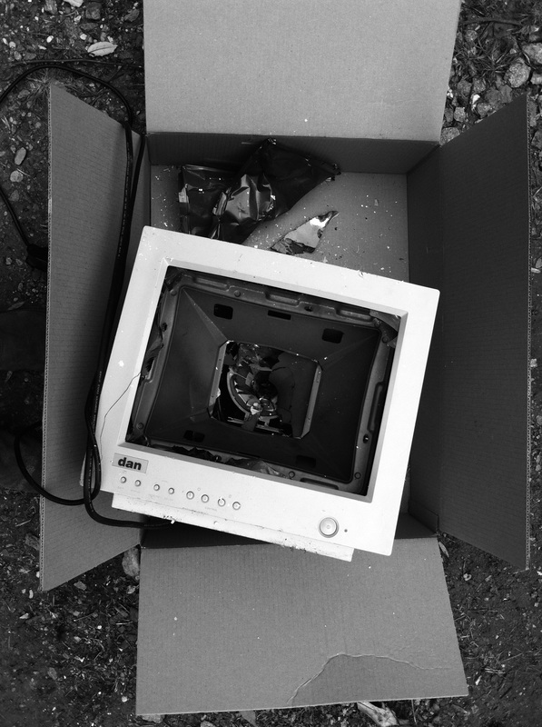
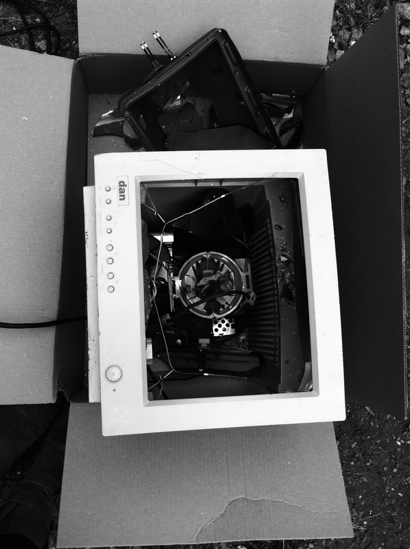
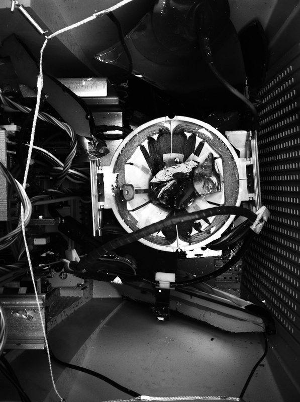
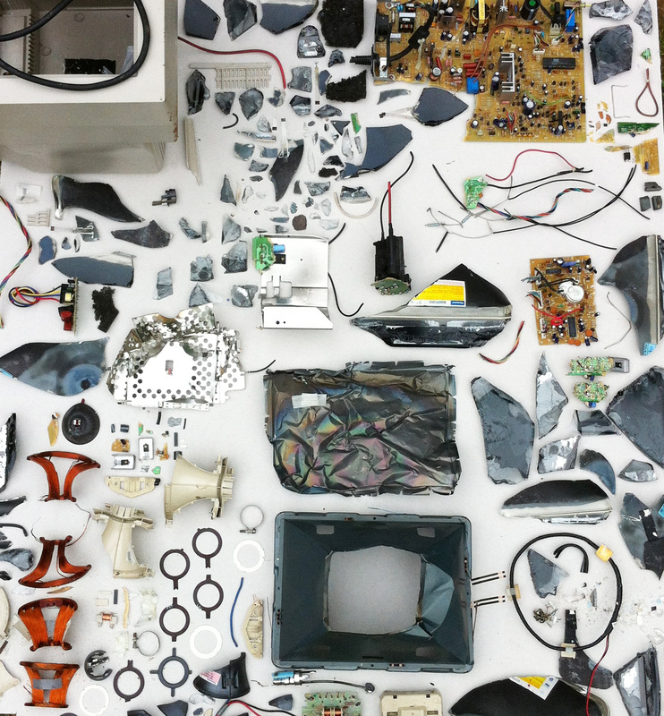
I managed to get hold of an old computer and created this:
|
To the side are some photos I took while in the process of deconstructing the computer. I found the inside of the commuter really interesting as it contained complex wires and different elements of bulbs and screws.
|
|
|
|
|
|
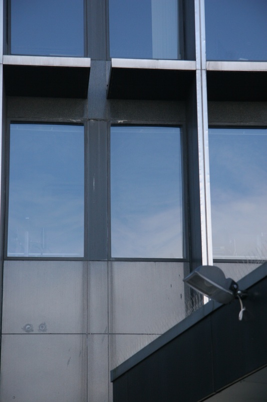
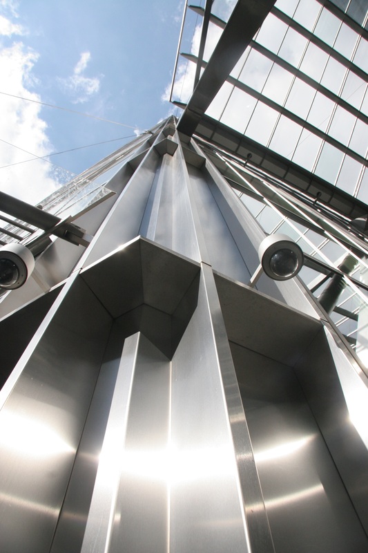
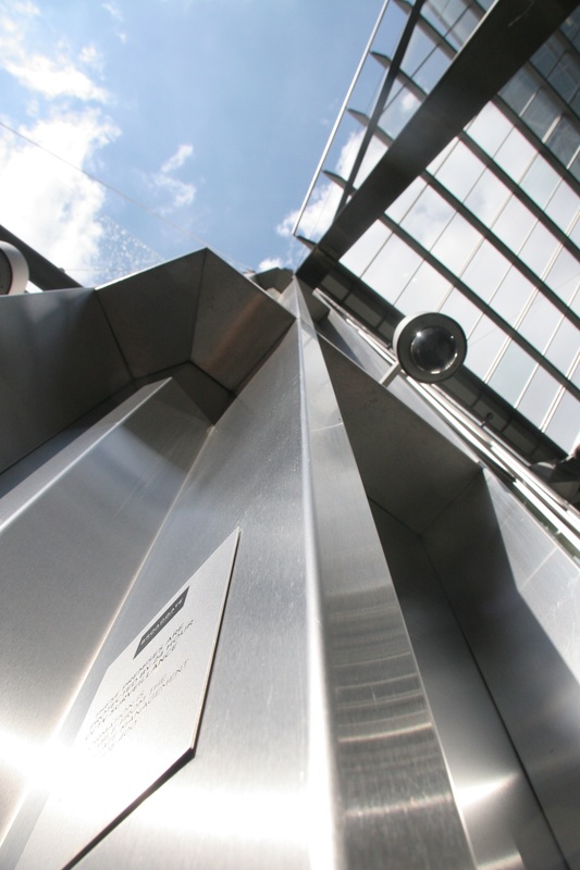
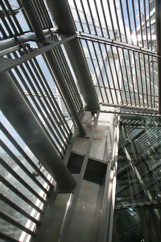
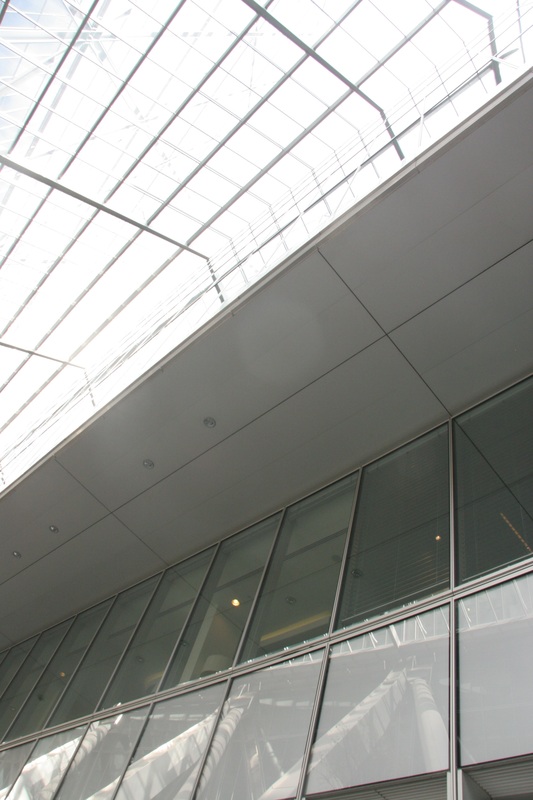
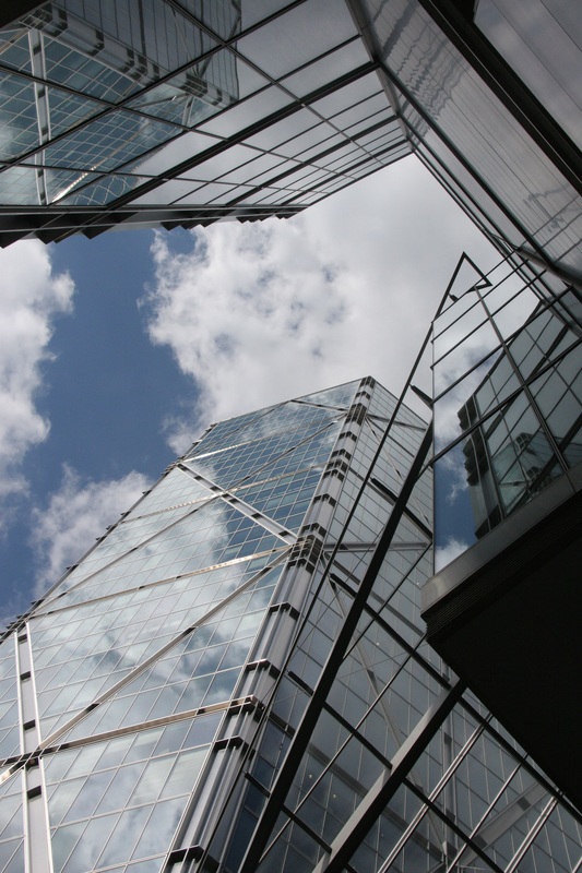
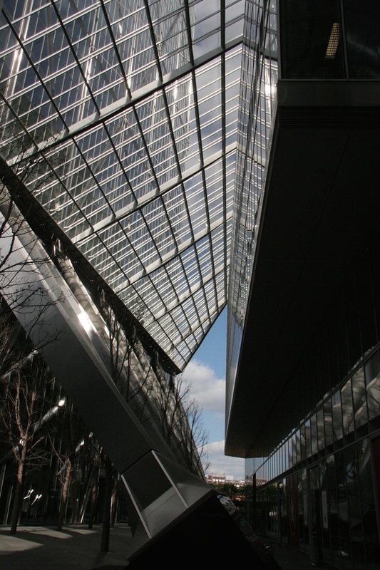
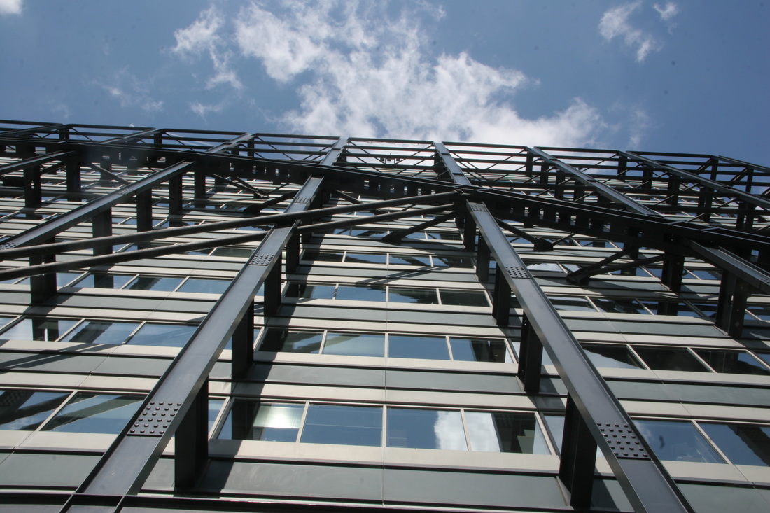
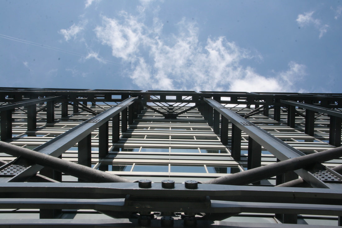
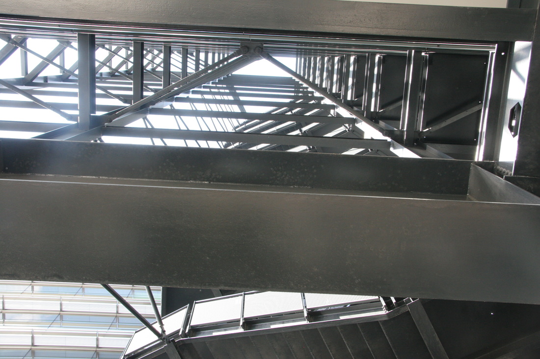
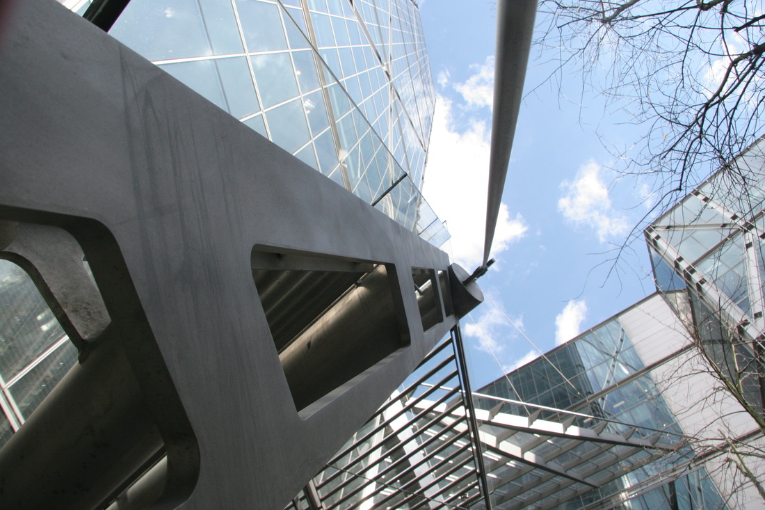
symmetry in architecture
Another way of presenting the theme of order and disorder is through symmetry. For this first
response I decided to travel around Muswell Hill Broadway in order to capture symmetry
within buildings, windows and frames.
response I decided to travel around Muswell Hill Broadway in order to capture symmetry
within buildings, windows and frames.
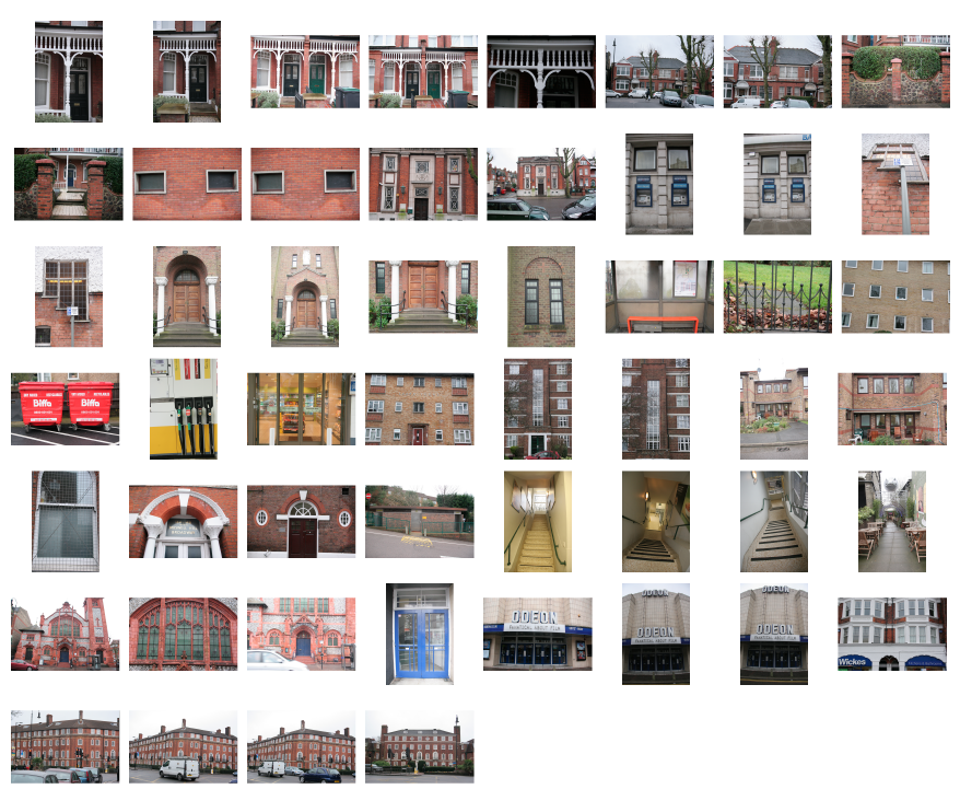
Below, I took my 3 favourite photographs from the shoot and analysed them.
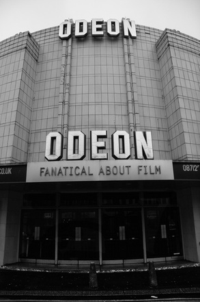
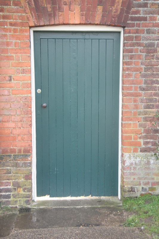
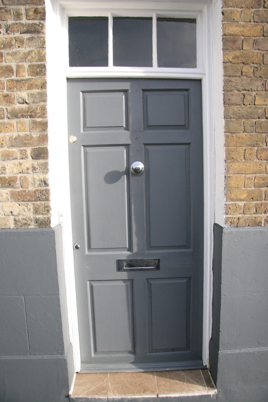
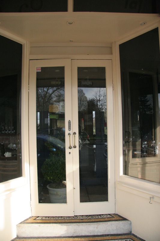
There are two sets of symmetry here. From the four doors at the bottom, to the repeated '`Odeon' sign.
|
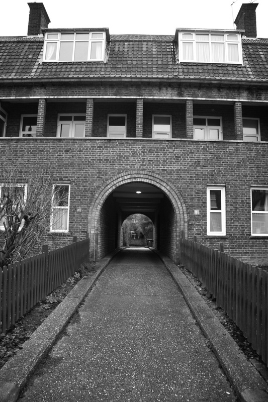
Here. the symmetry is found in the rectangular- shaped windows. The one-point-perspective gives a sense of scale, and draws the viewers eyes into the middle of the photograph. This effect is also created by the dark tunnel- also splitting the image in half where the symmetry line is. It also creates the effect of a fish-eye lens.
|
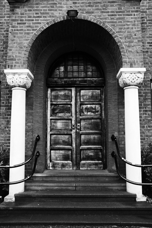
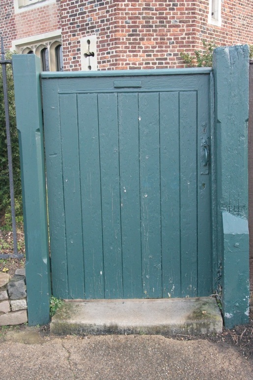
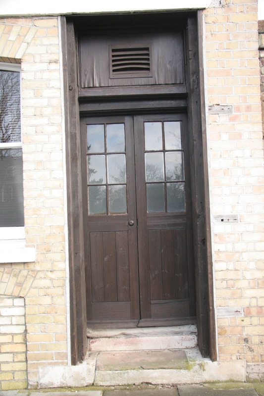
The metal bars weave around the posts, enhancing the symmetry in the door. The door appears old, rusty and warn which heavily contrast with the modern-looking posts and
|
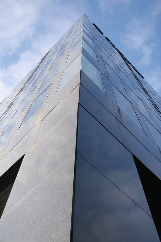
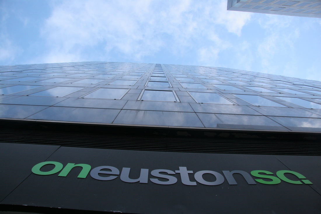
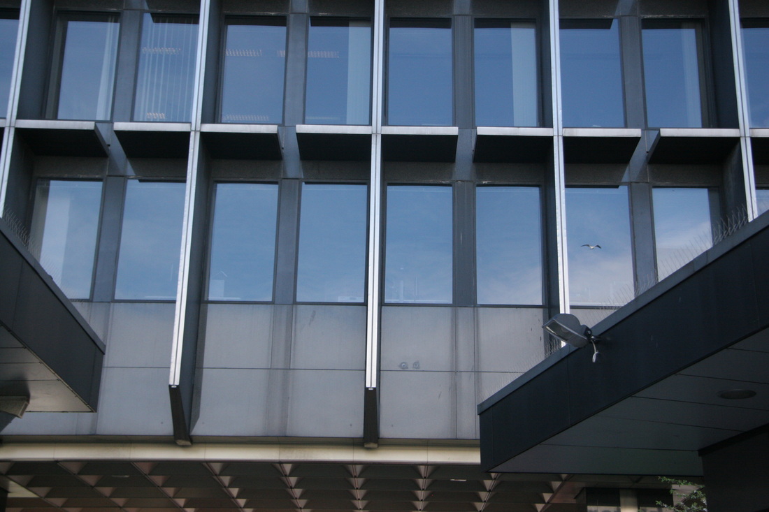
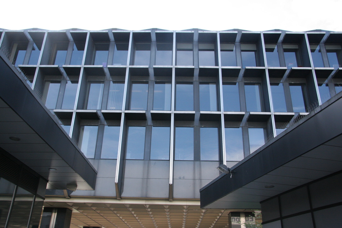
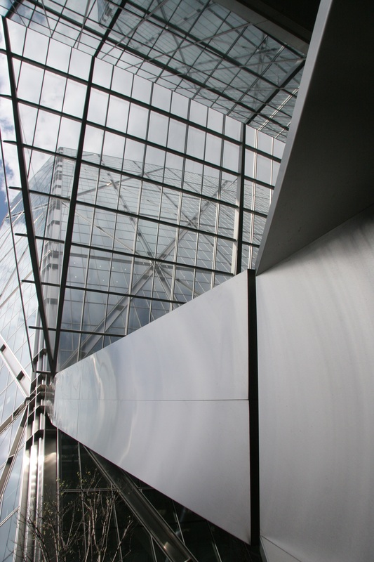
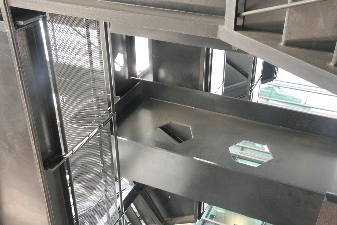
2nd response
I noticed the majority of my photographs from the first response didn't explore a variety
of angles and building structure. So I photographed outside Euston station where there
were some different shapes in a different environment rather than the past response
where I took images around my area.
|
|
|
|
|
I think these images were a lot more successful compared to the pervious ones due to the sharp angles these were taken at. Also the glass buildings create a more complex subject rather than the brick buildings as the glass produces interesting reflections.
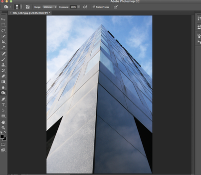
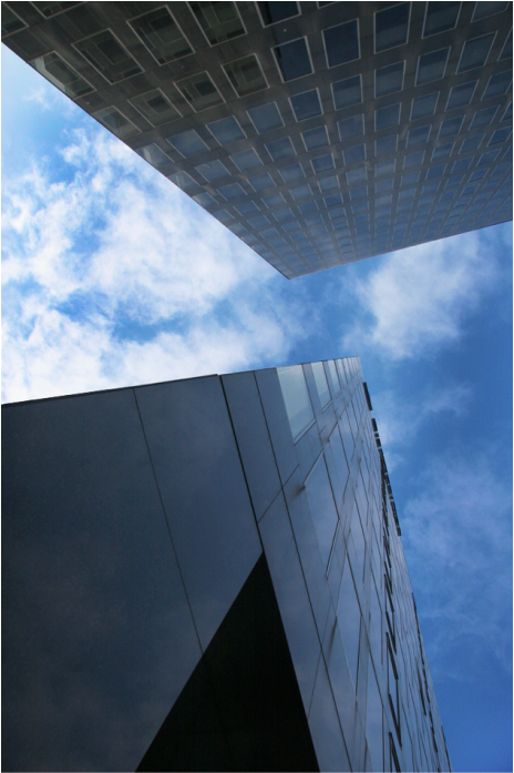
Below I took two images into photoshop and added a high-contast on them to bring out these reflections and the dramatic sky. I did this using the 'curves tool' and the 'burn' tool. |
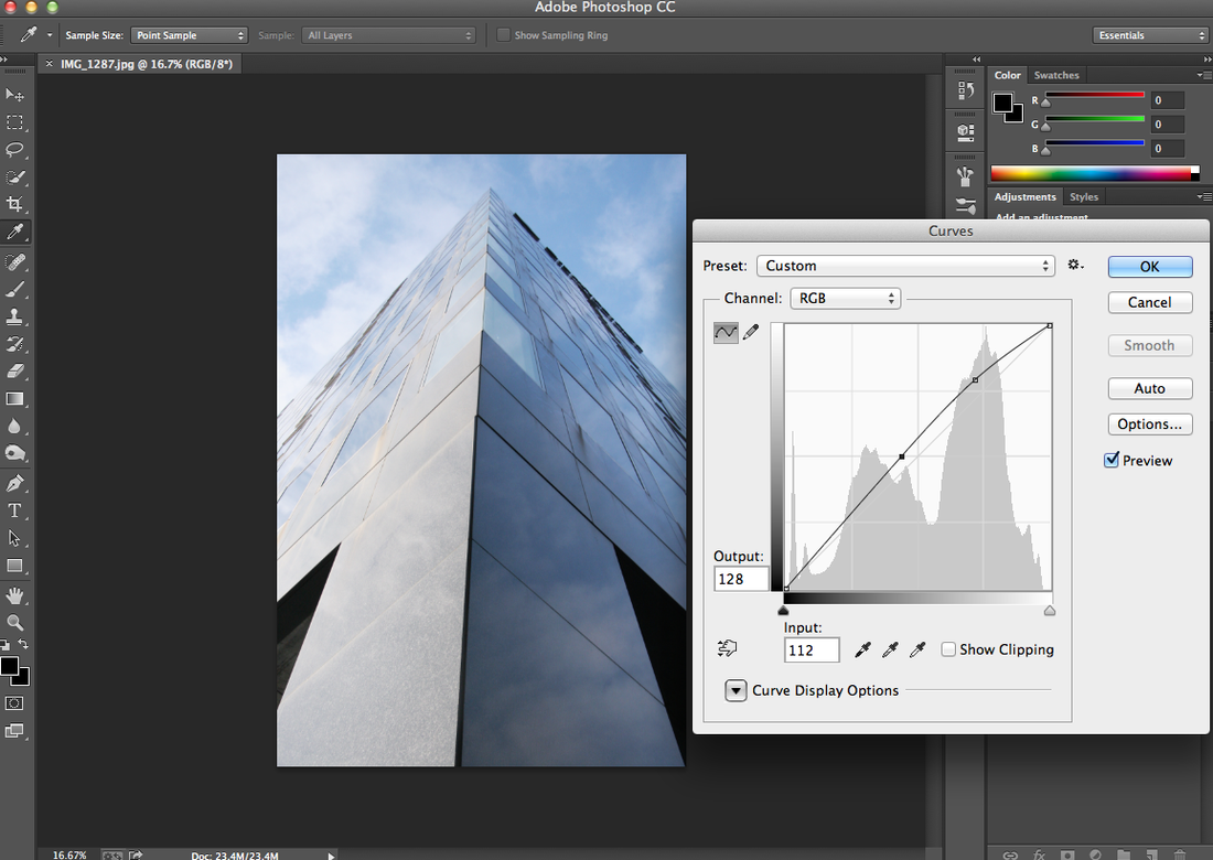
Below are my two finished edited photos:
|
|
|
|
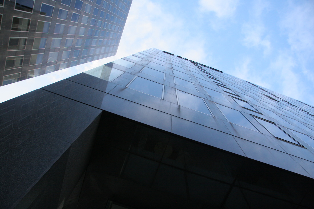
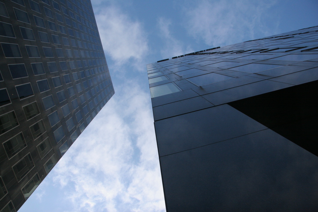
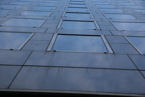
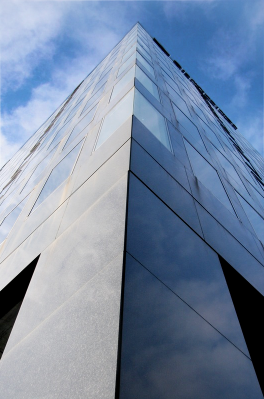
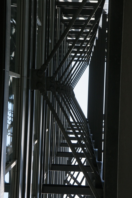
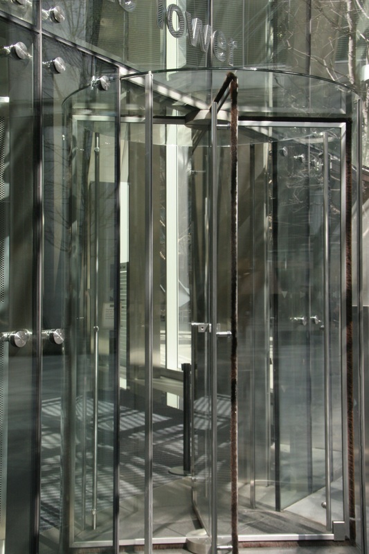
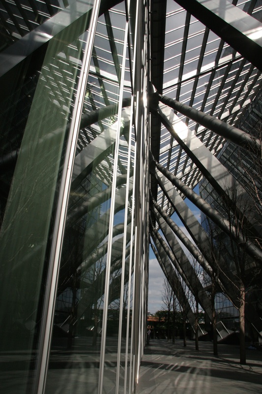
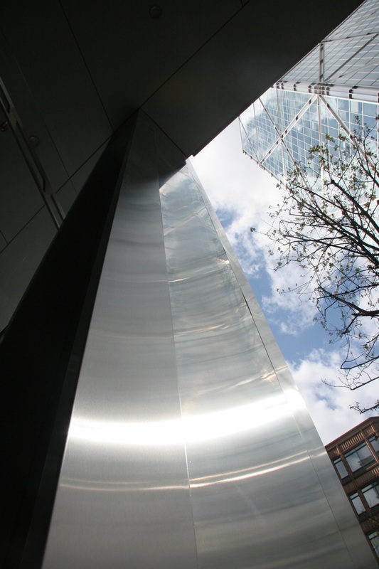
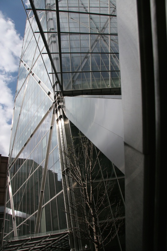
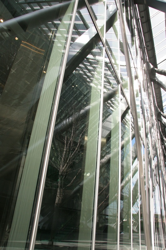
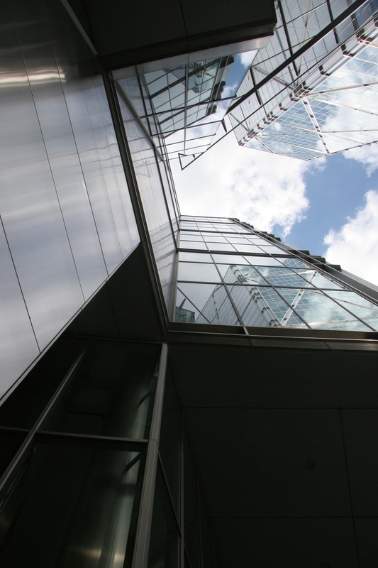
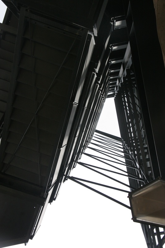
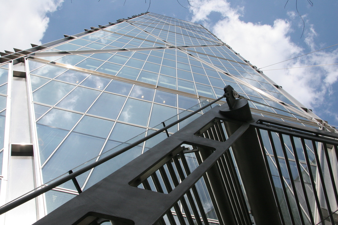
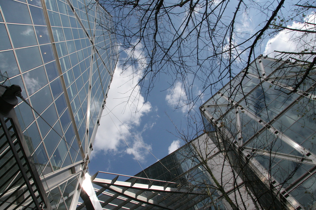
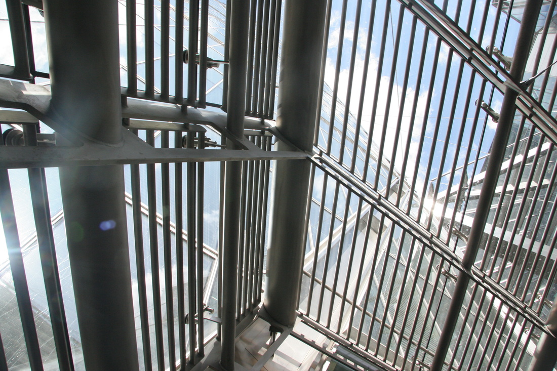
3rd response
I then decided I wanted to experiment further with the idea of symmetry in
architecture so I visited Margate where I found a number of glass buildings
with interesting designs and shapes.
|
|
|
|
|
|
|

|
|
|

|
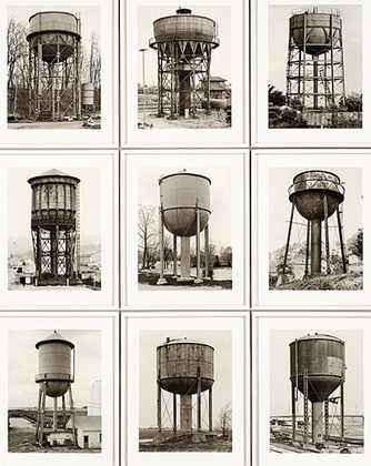
Bernhard and Hilla Becher are German photographers who were intrigued by industrial archeology and photographed old structures. Their work exhibits 'typologies', are girds of black and white photographs of different, single industrial buildings. Each is shown in a separate box and then displayed together. This standard way of presenting the images allows you to easily analyse and compare each strucure.
They both started photographing rusty, industrial-looking sites in the 1950s and described their work as where "buildings were anonymity is accepted to be the style'. The artists visited steel mills and large mines in order to capture prominant structures. 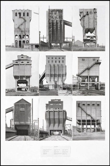
Below are my photographs from my fist response to typology:
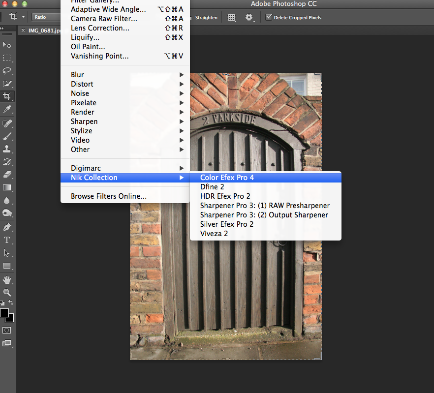
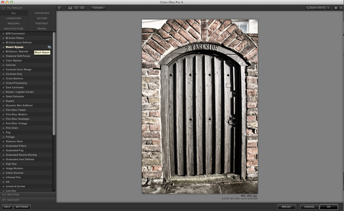
To the right I edited a selection of my photos in photoshop to add a more industrial/old effect to them. Below are my screenshots from working on the images:
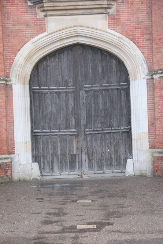
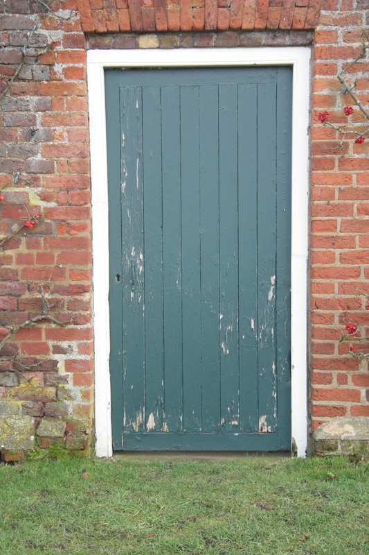
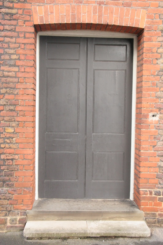
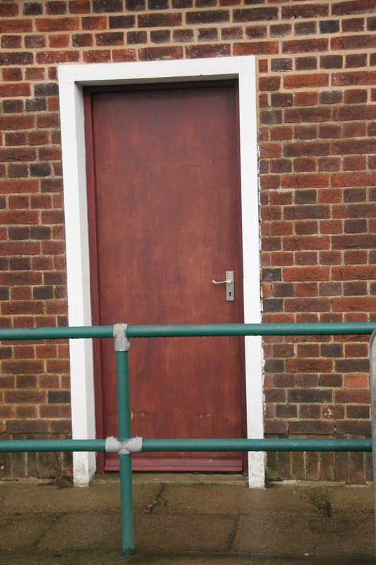
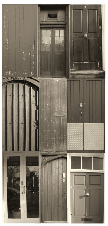
I think overall this response could be improved as although the subject focus (doors) is the same in all images, the angle is not. This makes them less successful. In the next typology I create I will take this into consideration and think about the way in which I photograph the subject matter.
|
Pitheads 1974
The regimented images illustrates a sense of order as they all face the front, and share the same subject matter. Although each structure is unique, they all have a circle shape body- drawing the viewers eyes to the middle of each photograph. The background of each image is against a clear sky, with the Pitheads filling the frame. typologyTypology is a series of photos, sharing a related subject matter, illustrating different forms and types of the same format.
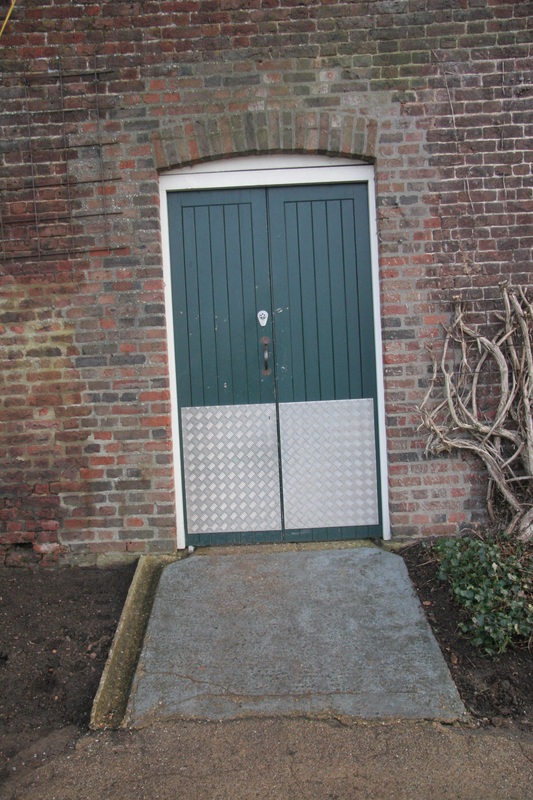
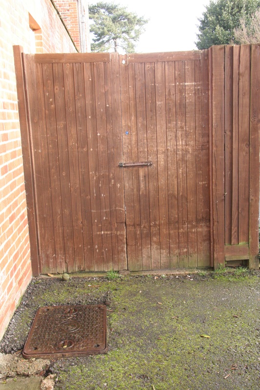
To respond to the artists Bernhard and Hilla Becher, I decided to photograph a series of different doors and display them in the same format.
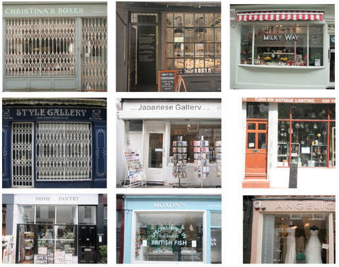
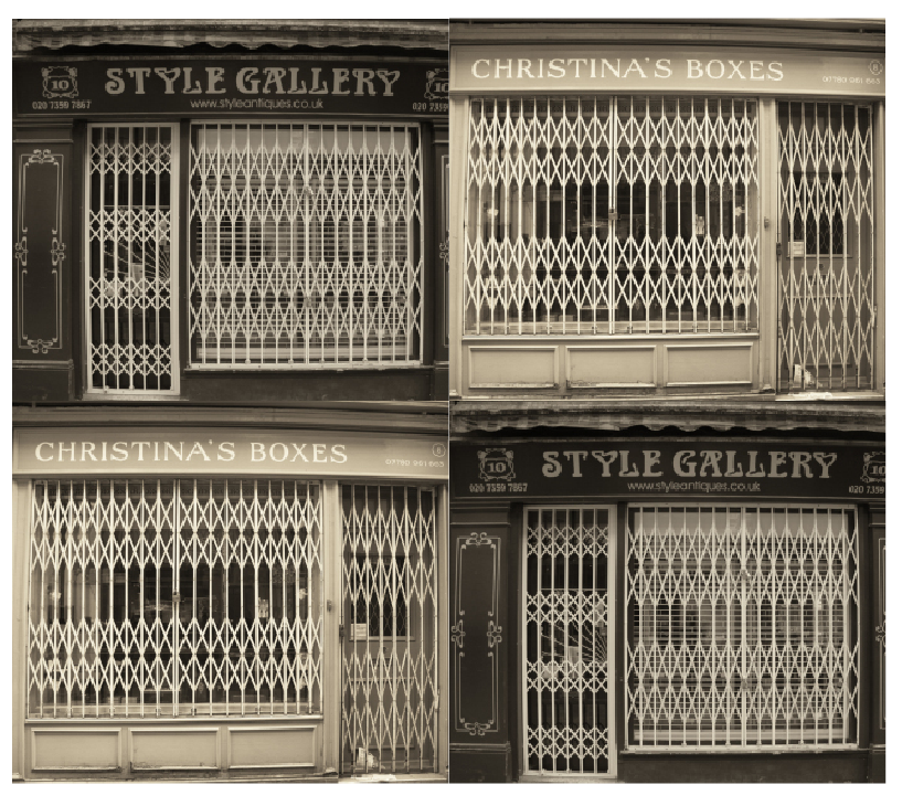
In my next response I went to Islington and photographed a number of different individual shop windows.
Although I think this response was much more successful than the previous one, it still needs refining. The angle of the shot is fairly similar in all of the photos, however the content of the photos is different as some only reveal part of a shop rather than the whole front. If I was to do this again, I would have used a tripod to make sure that the image filled the screen.
|
|
I then picked out two of my photos from the shoot that were fairly similar as they shared the same style of white metal bars and shape. Although only two photos, I think this typology works much better than the other ones I made due to this. I also like the old effect created from the serif fonts on the shop and the decoration. This is also created from the black and white editing effect I put on it.
However if I was to do this strand again, I would use a tripod or something solid to balance my camera when taking multiple photographs. |
3rd response
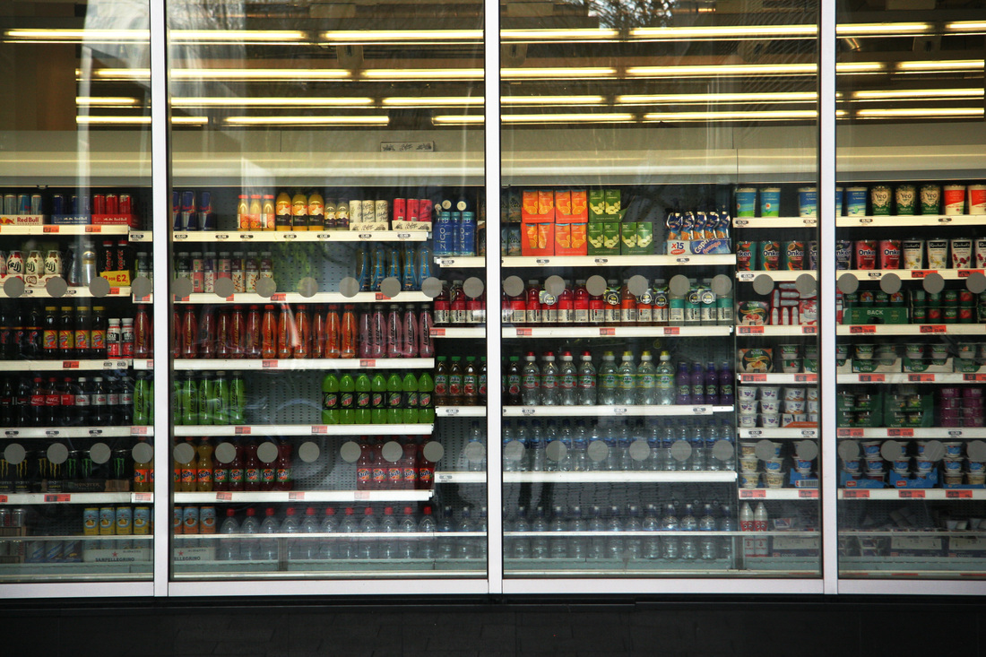
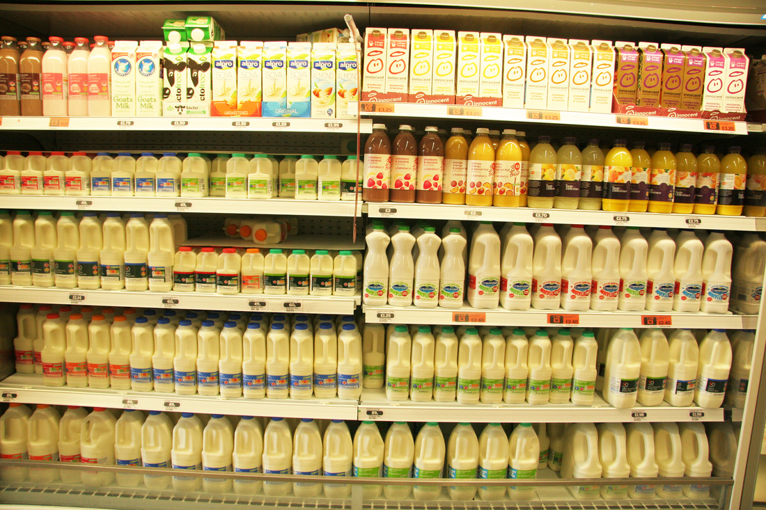
As my typologies weren't that successful, I decided to approach the theme in a different way by photographing an ordered arrangement of objects in shops. Below I experimented with this idea by going into a supermarket and photographing shelves of milk and orange juice. This was from outside and inside the shop.
|
|
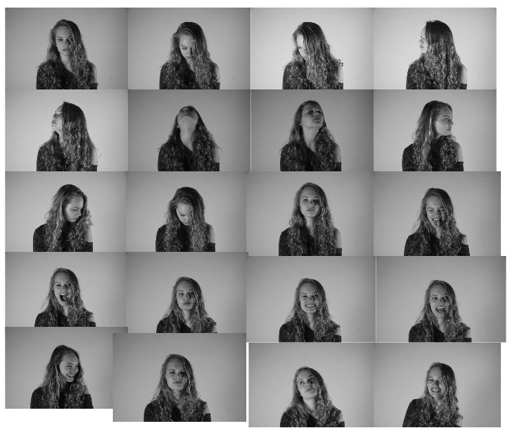
portrait disorder
For this task I will take a number of portraits from different angles and combine them
together in order to form an animation.
together in order to form an animation.
|
|
city disorder
This strand will explore the movement of the chaotic streets in rush hour.
To capture this disorder, the process of creating a stop-motion animation will be used.
In order to respond to this topic, I will go into central London and document the rush and disorder.
To capture this disorder, the process of creating a stop-motion animation will be used.
In order to respond to this topic, I will go into central London and document the rush and disorder.
Below I recorded our trip to a photography gallery where the following artists work was exhibited:

The first difference between the prints Andy Warhol's most famous for and the ones in the exhibition is the limited colour in the gallery. The photographs are all black and white, this contrasts with the artists most recognisable works of which he uses vibrant, block colours. Another difference is illustrated in the stitched photographs- creating a sense of disorder as they don't completely match up, in effect producing a broken effect. This differs with Warhole's original photography where all four images are straight and neatly match up. However, comparing the artists well-known work with the exhibition, a lot of similar themes and subject matter of portraits are seen.
By Warhol sewing into different images changes the way the viewer perceives the artwork as a whole as it almost creates an abstract feel. This is as all the repeated shapes come together as one and a combination of different shapes and patterns are formed. The repeated imagery also makes the piece visually more interesting to look at as is somehow makes it look complex and detailed. The fact that the walls of the exhibition are a pale blue immediately creates associations with summer and holidays, making a sense of excitement. This nicely complements the photographs as the colour makes them stand out more due to the fact a majority of the images are black and white. The set out of the photographs is interesting as there is a complete mixture of small, grouped artworks and a large piece beside. This makes certain images stand out more even though all the photographs are linked together. |
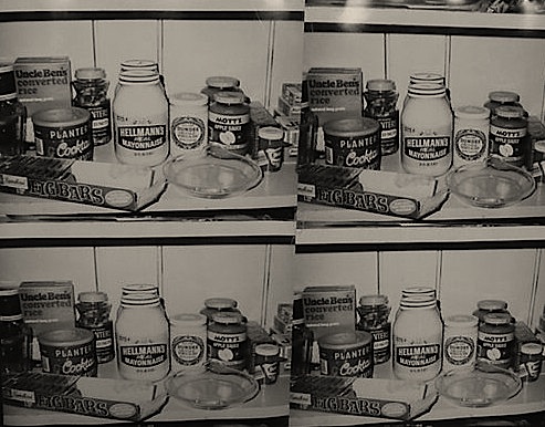
This piece of Warhol's links to the idea of typology in the theme order and disorder. The principle of repeated imagery is here however the image continued illustrates a sense of disorder in the way in which the jars and packets of food are different materials, shapes and sizes which are jumbled up and uneven. Having said this, they look as if placed neatly and in an orderly arrangement. Furthermore the fact that that the photographs are in black and white is interesting as it creates a feel of tonal contrast as opposed to bold colours overpowering the piece. It allows the viewer to notice the subject matter more than get distracted by the colours.
|
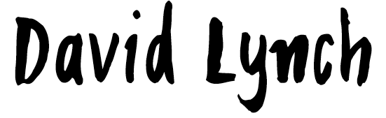
All David Lynch's photographs are shot on a film camera, which differs from a digital camera as the photographs take longer to process and get developed.
The foreboding sound in the background of the exhibition room adds a sense of mystery and brings the scenes to life. The music is atmospheric which also adds a hint of ambiguity to the artists work. If the photographs were in colour, the feel of discovery would be lost. This is because the focus of the image would be on the intensity of the vibrant plants and not on the intended subject matter of dust, decay and smashed objects. In a way, the photographs in the room are just documents of everyday life, however, it is the unusual angles and perspective of this common theme that makes his photographs a piece of artwork. From the quotation ' had the ability to disrupt the space time continuum and expand the viewer's perception of the physical world', the artist could mean that by taking a photograph at a superficial level, at a particular moment or angle, will portray something different, or express a certain viewpoint that would be powerful and influential on the viewer. |
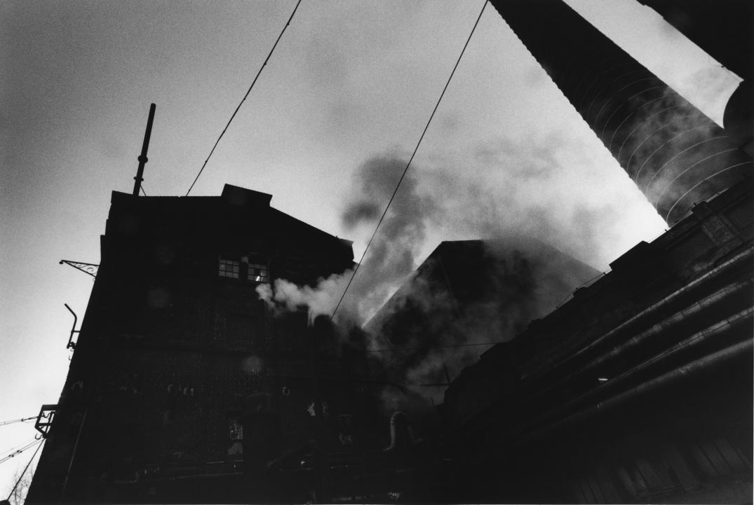
I admire the unusual angle this is taken at - looking up at the industrial factory buildings as it has a powerful impact.
|
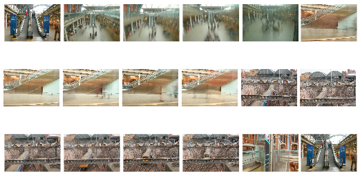
city disorder
I am interested in developing a response around the theme of City Disorder.
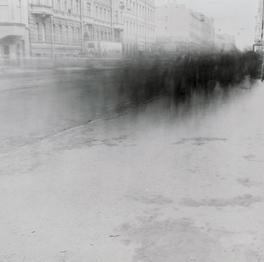
Alexey Titarenko
|
I am interested in going down the root of using long exposures in crowded public areas for the theme of disorder. This will reflect the theme as a sense of unknown is created through the movement.
This piece to the right particularly interested me as a high level of contrast is demonstrated within the light and dark tones. The blurry figures emerge out of the background and fade into the buildings. This gives the image an almost ghostly quality. The fact that the background is sharp and the people are out of focus, highlights this sense of contrast and movement. Furthermore the cars and lorries on the road are also blurred, leaving an interesting light trail behind the people. This technique fabricates a hint of ambiguity as the subjects are so blurred, the viewer is left unknown as to the details of these. |
|
|
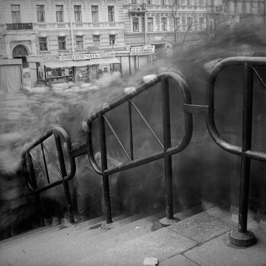
I was also drawn in by this piece which depicts a mass of people going up/down an old-looking staircase in a busy street. I admire the angle at which this was taken at as it looks directly down at the staircase, capturing the extent to the amount of people. Again, all still objects remain sharp and focused.
|
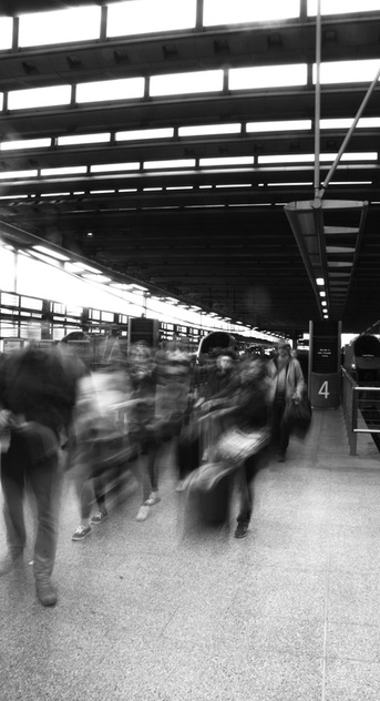
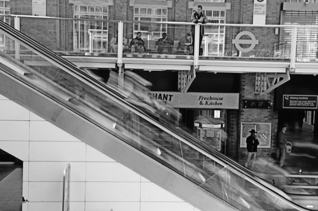
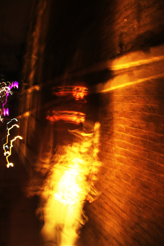
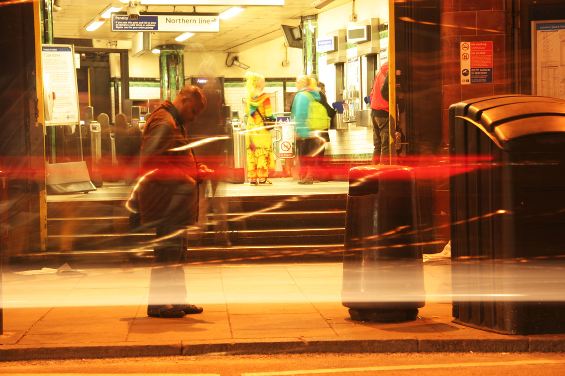
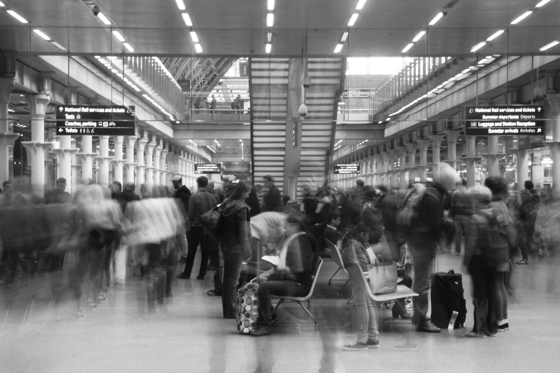
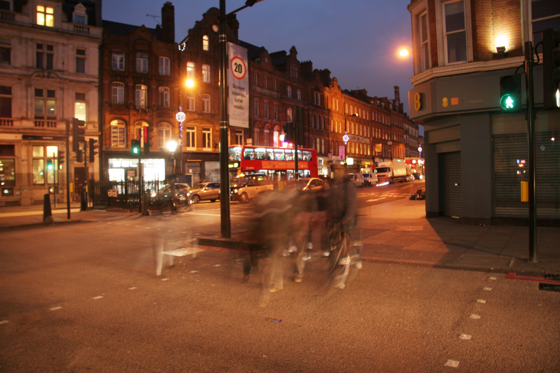
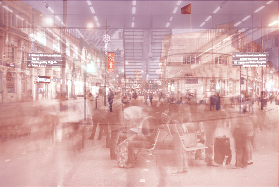
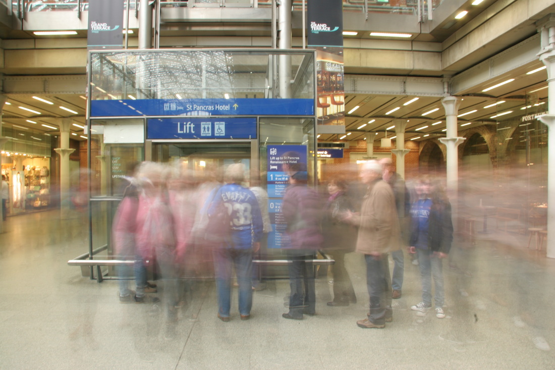
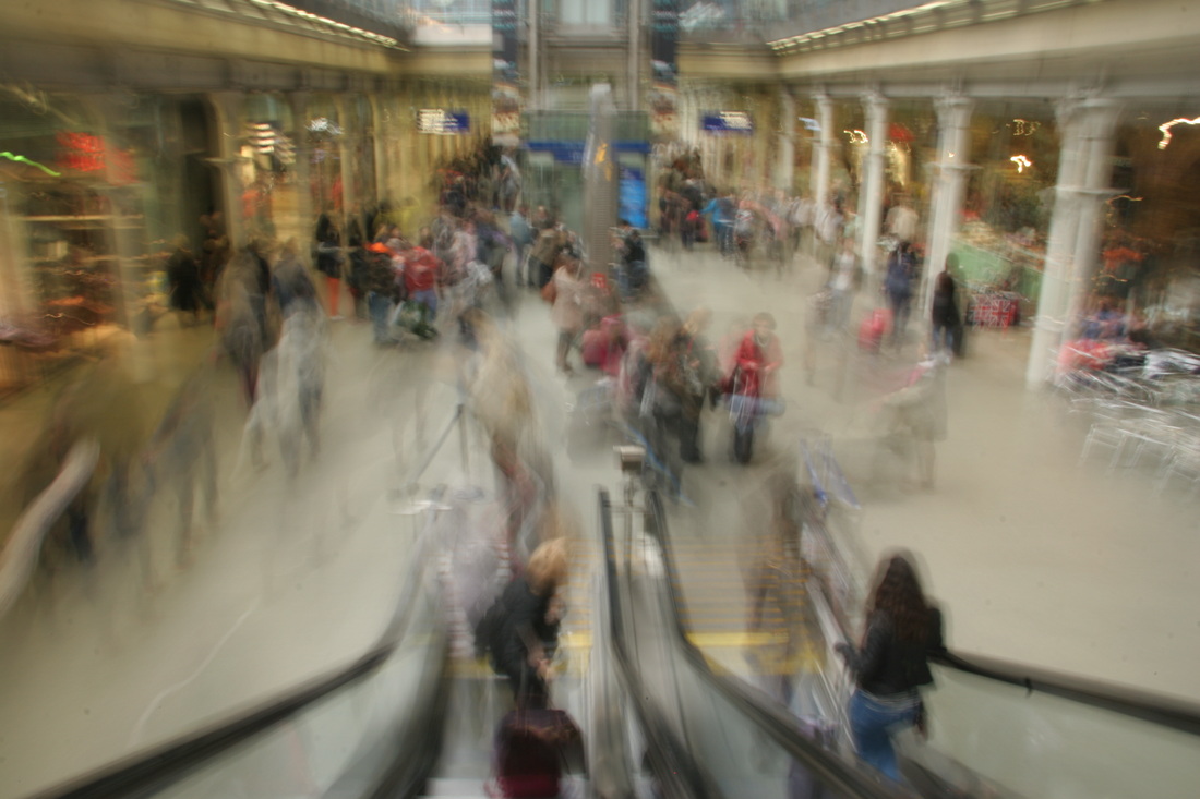
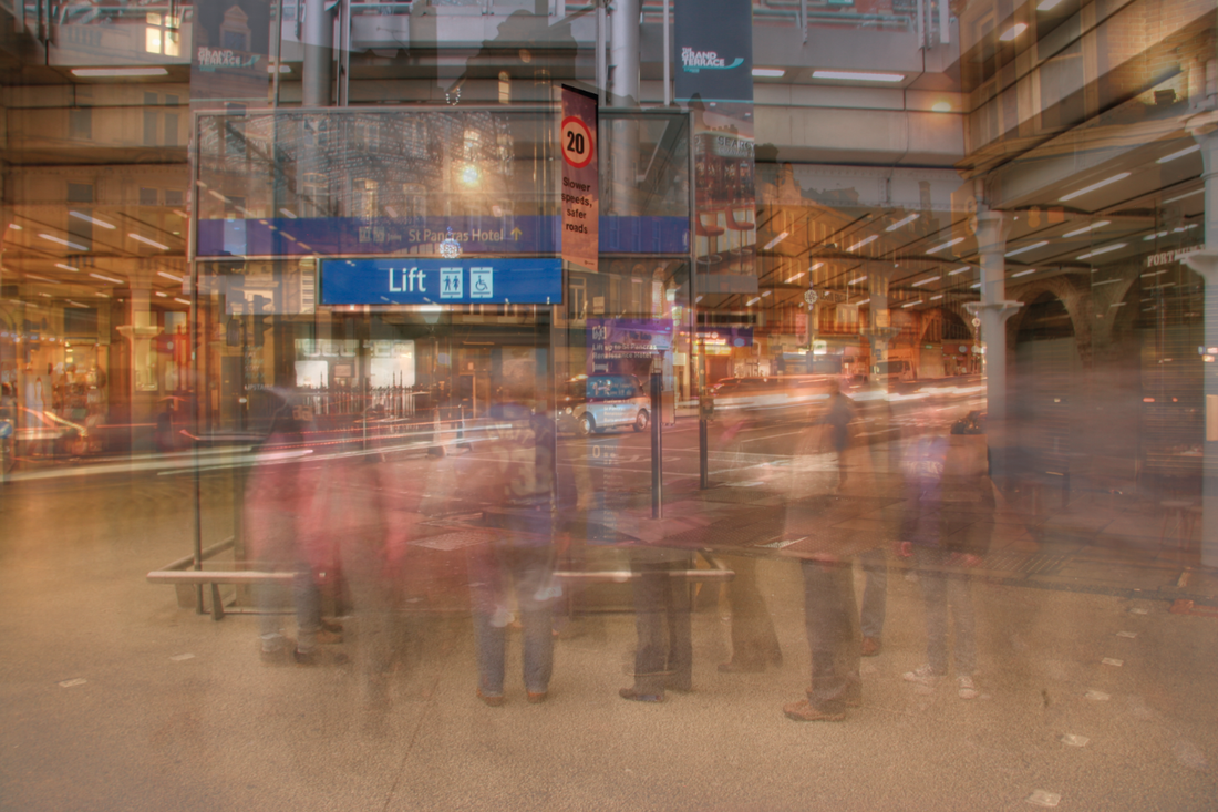
response to alexey titarenko
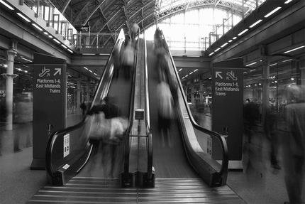
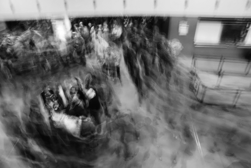
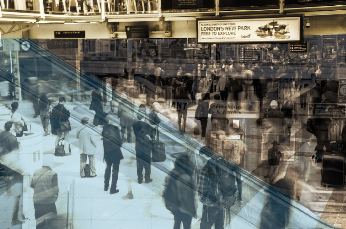
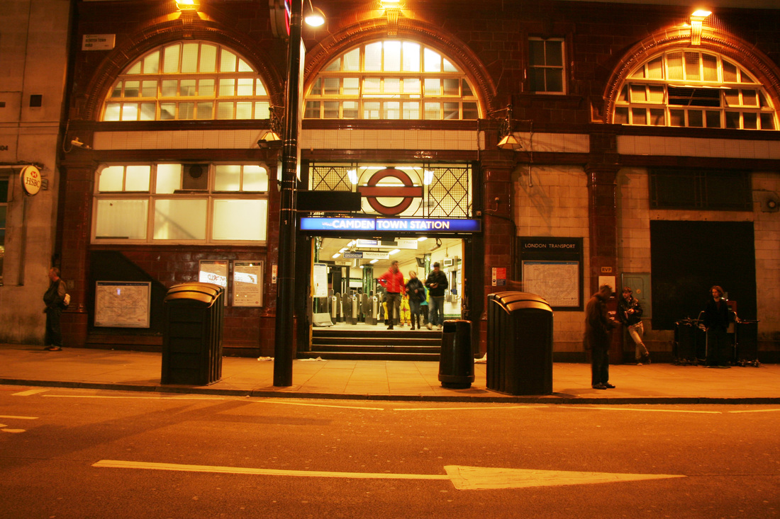
For my next response, I visited Kings Cross Station in order to capture a sense of disorder within the rushing people either getting off trains, or going up escalators to trains. To experiment with this idea i used a long exposure to portray speed and movement.
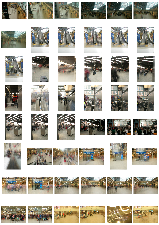
From the photos I took, I also made a moving gif of the chaos of a moving lift. The first image starts off fairly focused and sharp, which contrasts with the main photographs of a disordered blur of people as the frame comes crashing to the station floor.
The third gif I made was on a staircase in a tube station:
|
I also made a moving gif of an escalator in the station in order to capture the gorse of people. The aim was for the background and any other inanimate objects to be in focus, which would then contrast with blurred figures and steps. Overall I think this piece was successful, however it could be improved as the camera moved during the process of photographing which distracted the main focus of the scene.
|
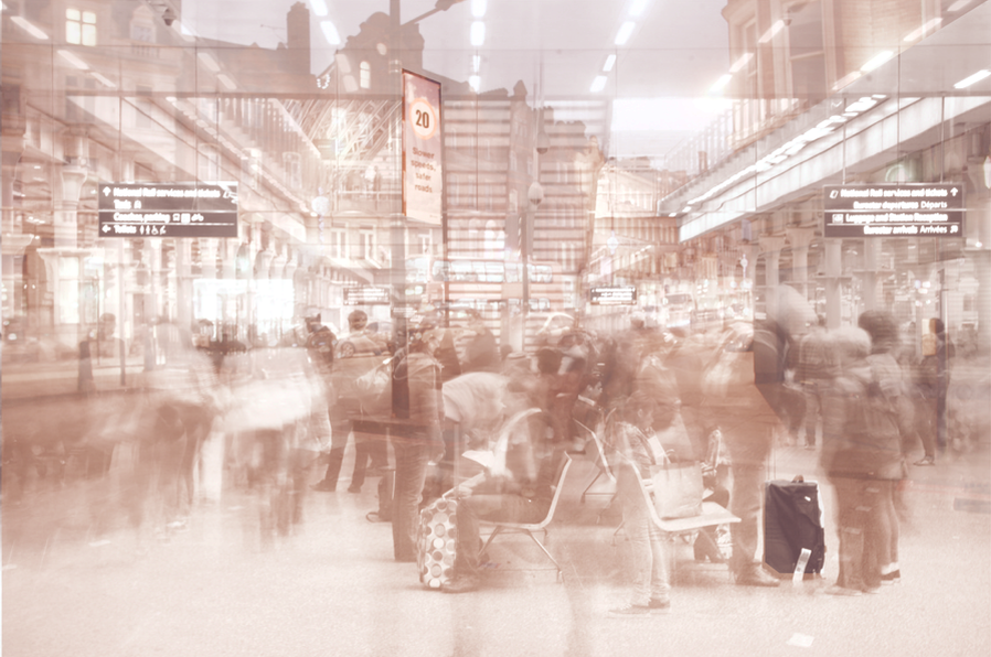
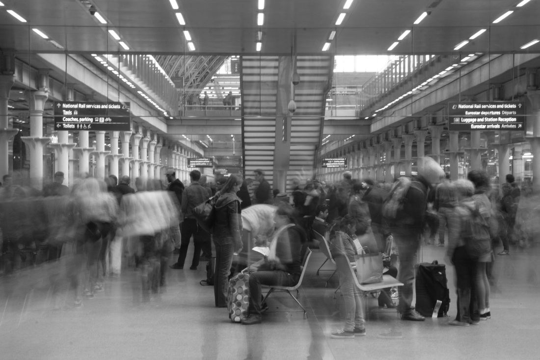
Below I edited a selection of my photographs and made them black and white in order to relate my own images back to the work of Alexey Titarenko. In effect, the black and white creates a tonal photograph, emphasising the different textures and the soft flow of people.
|
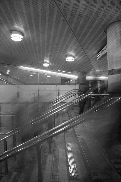
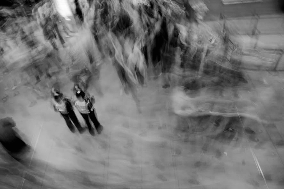
This image exhibits the disordered and frantic crowd in a tube station as people fight their way through. I attempted to use a long exposure to illustrate this which I think was successful as the movement trail of people merge into one another; producing a soft, wavy effect. However, to improve the photograph, I could have con
|
considered the background more in the way in which it should be in focus rather than blurry. This would have made more contrast within the movement and sharp imagery.However, police men in the photograph which are stood still, and therefore slightly more focused than the chaotic people which encompass them portrays the extent to how powerful the rampage of people are. This is as the police somewhat create a sense of order within the amount of disorder.
|
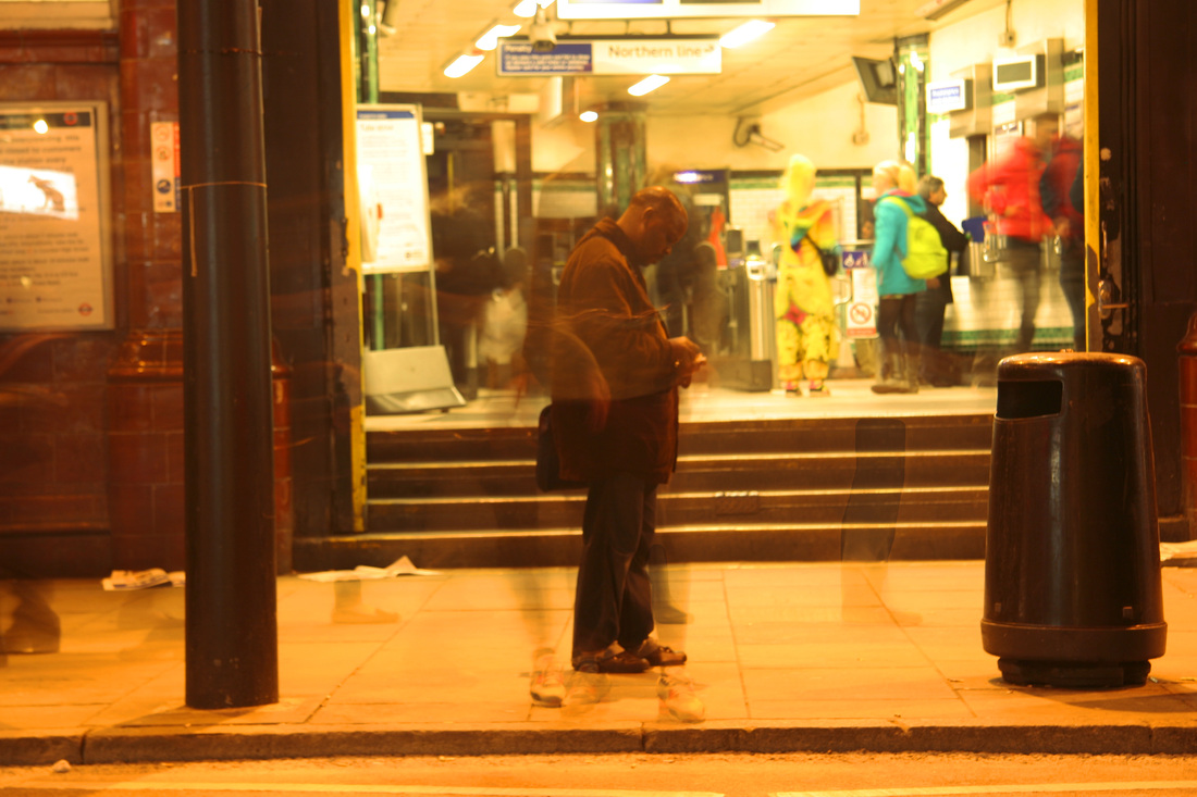
I took this photo in order to capture the contrast between the solidity of the platform ceiling and the fluidity of the moving commuters. The angles of the roof disappearing into the background is shot at a one-point-perspecive whilst the people are the opposite, surging forwards. Furthermore the stripes created from the light trail emphasises the sense of busyness against the static background.
The way the man in the foreground is semi-translucent interests me. It suggests the transience of commuter travel. A brief stage in people's lives. I like the different patterns of the platform structures, lights / bars / rectangles / stripes. However I would have liked to seen more people, a bigger crowd maybe. Possibly taken from a different angle as well. Also the floor space in front of the moving figures could have been too much. |
|
development
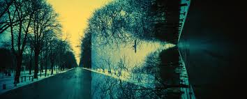
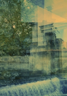
To develop my project I am interested in looking further into the disorder of the chaotic city and experimenting in different ways of creating this. I would like to experiment with the layering of different photographs and images in order to produce a blurry-ghost effect. I could possibly photograph at multiple tube stations and public places and combine these images together to gain a maximum effect. Below I looked at the work of Yenny Hubber who's work inspired me for this idea.
Yenny Huber
I was intrigued by this photograph due to the bold, vibrant contrasting colours. This is created by the dark blue road and tress and the burnt yellow sky. The fast that this is a warm colour draws the viewers eyes into the one-popint-perspective. Although the image is split into two and not scientifically correct, they murge together to form one. The pavement in the first photo carries on into the branches off the tree in the second; looking like a highlight off the blue off the image instead. Overall this produces a surreal effect.
|
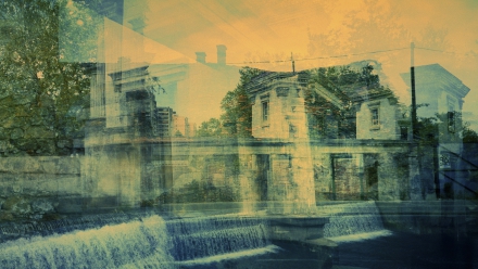
I was particularly drawn in by this piece which seems to exhibit and old building, and several buildings fading out in the foreground. The colours are a mixture of warm, faded orange tones, to cold blue shades. This possibly reflects the atmosphere and memories at this certain place at a particular point in time, then contrasted with now. Interestingly there appears to be a waterfall flowing at the bottom of the artwork. This is significant as it suggests a sense of peace or represents something the artist is trying to say about the place.
|
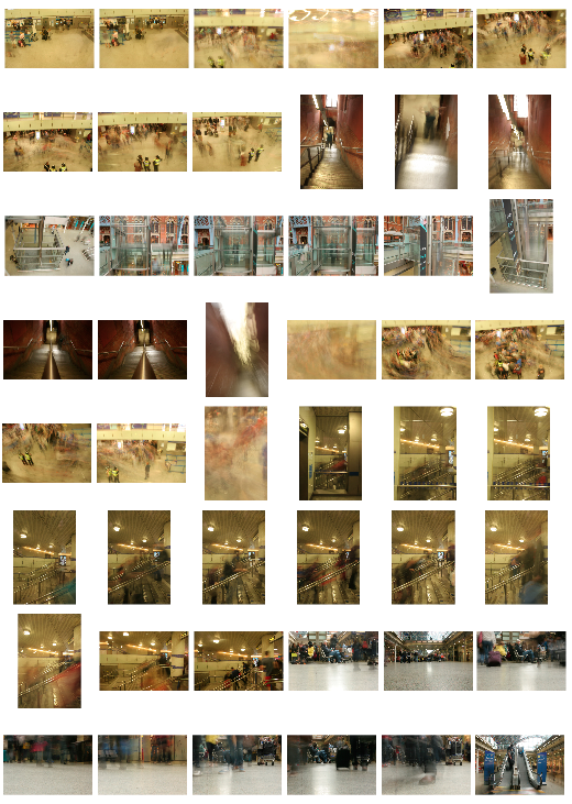
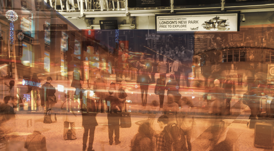
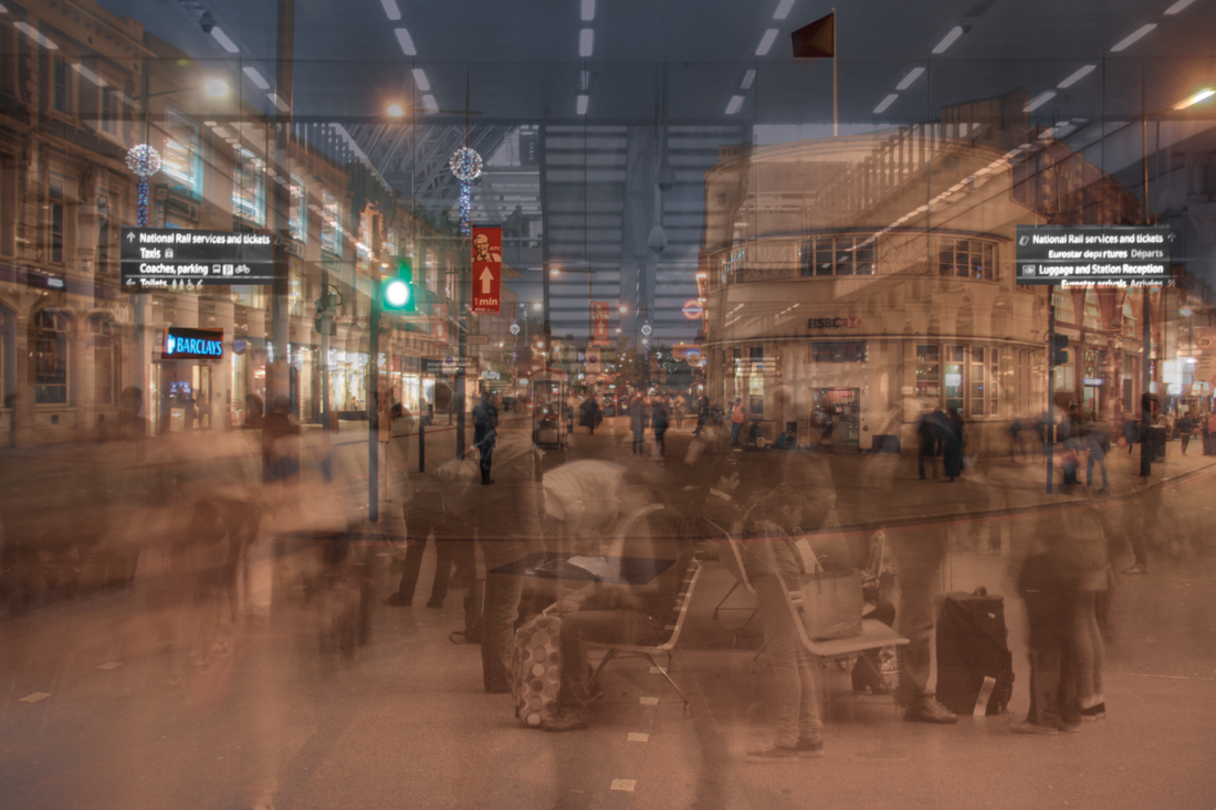
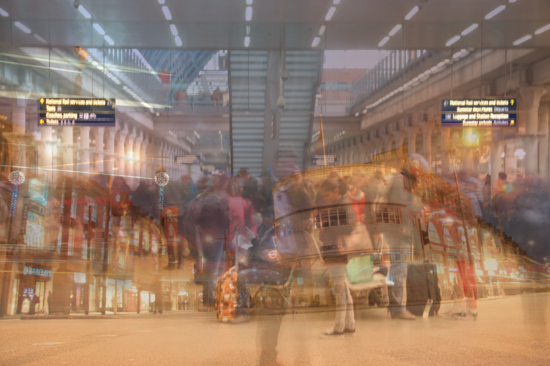
2nd response
I then visited Liverpool street station to express the disordered
movement in train stations and other busy, public places. I intend to use some
of these photographs to combine with each other.
IMAGE 1
movement in train stations and other busy, public places. I intend to use some
of these photographs to combine with each other.
IMAGE 1
my response to yenny huber
COMBINED PHOTO
The image to the right is a section of the artists work I used for reference when making my image.
|
My aim for this edit was to achieve the same quality of faded blue and brown tones- much like the work of Yenny Huber. To did this by splitting half the photograph and colouring it a different shade. I think it could be improved as the section of blue is not just in one place, however spread out and blended in throughout the photograph. I will consider this in my next attempt to combine photos.
|
IMAGE 2
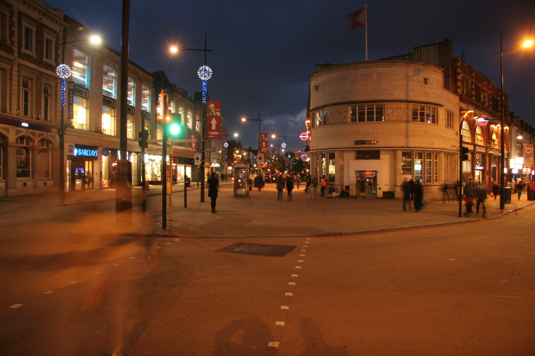
city disorder at night -response 3
|
|
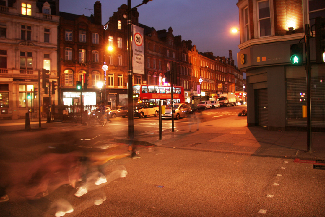
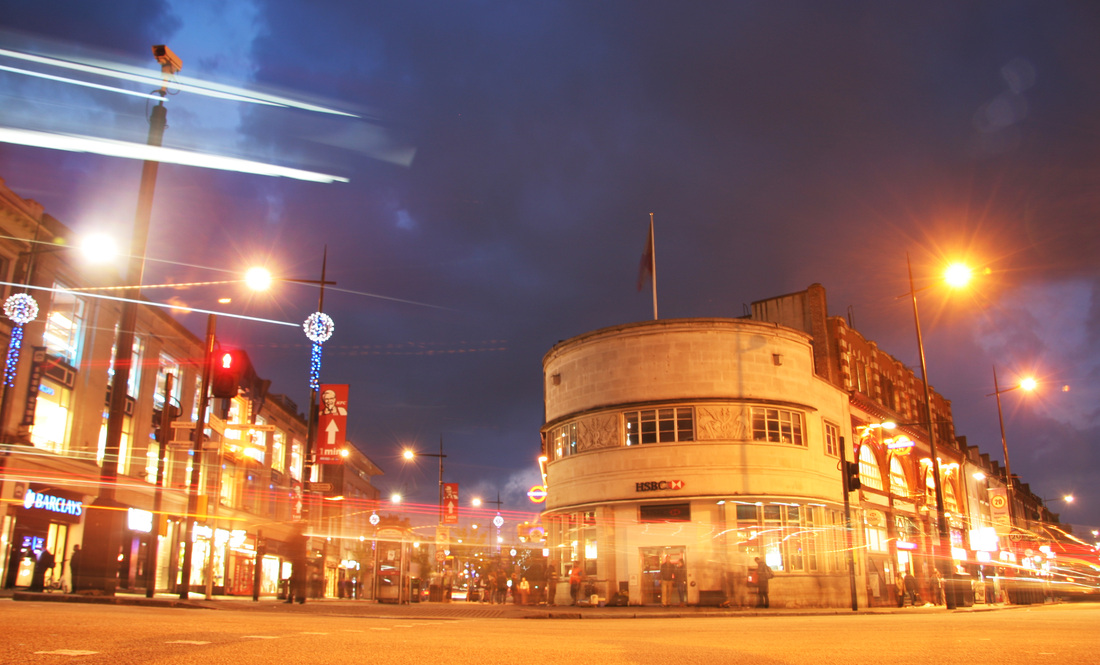
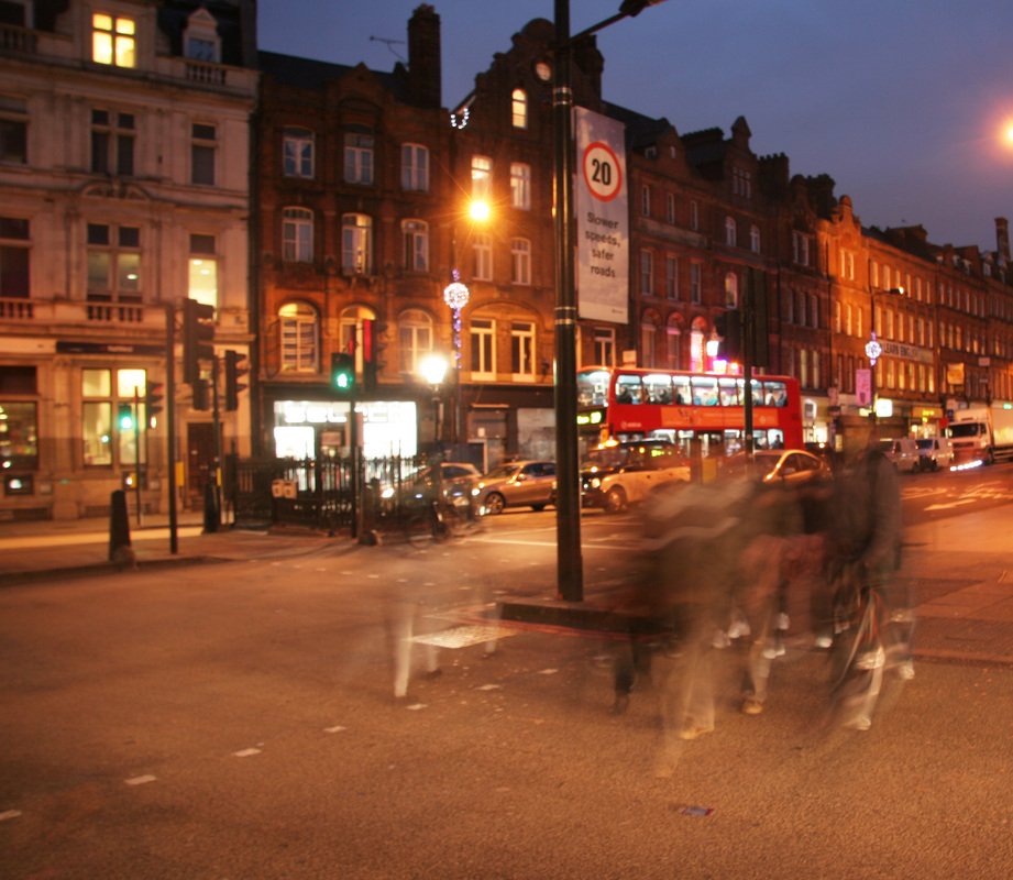
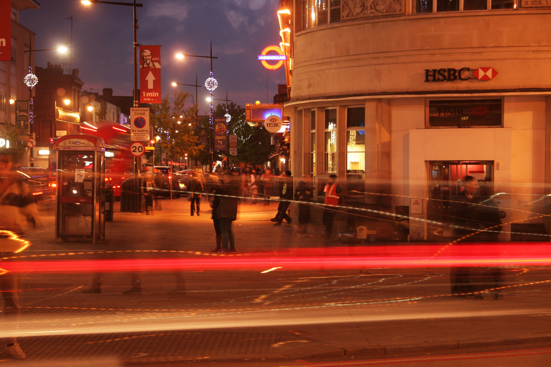
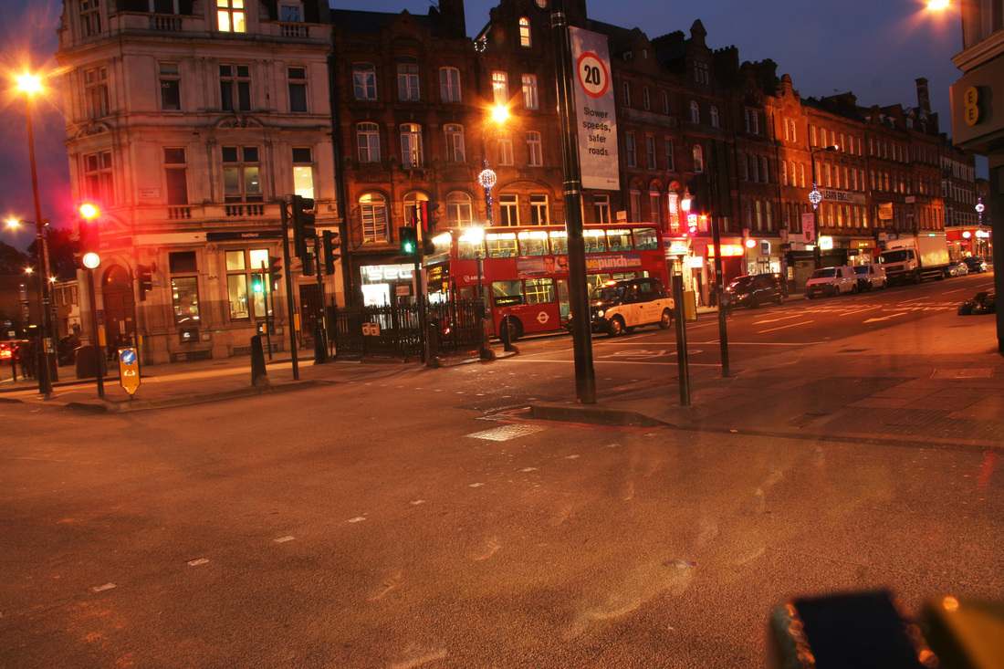
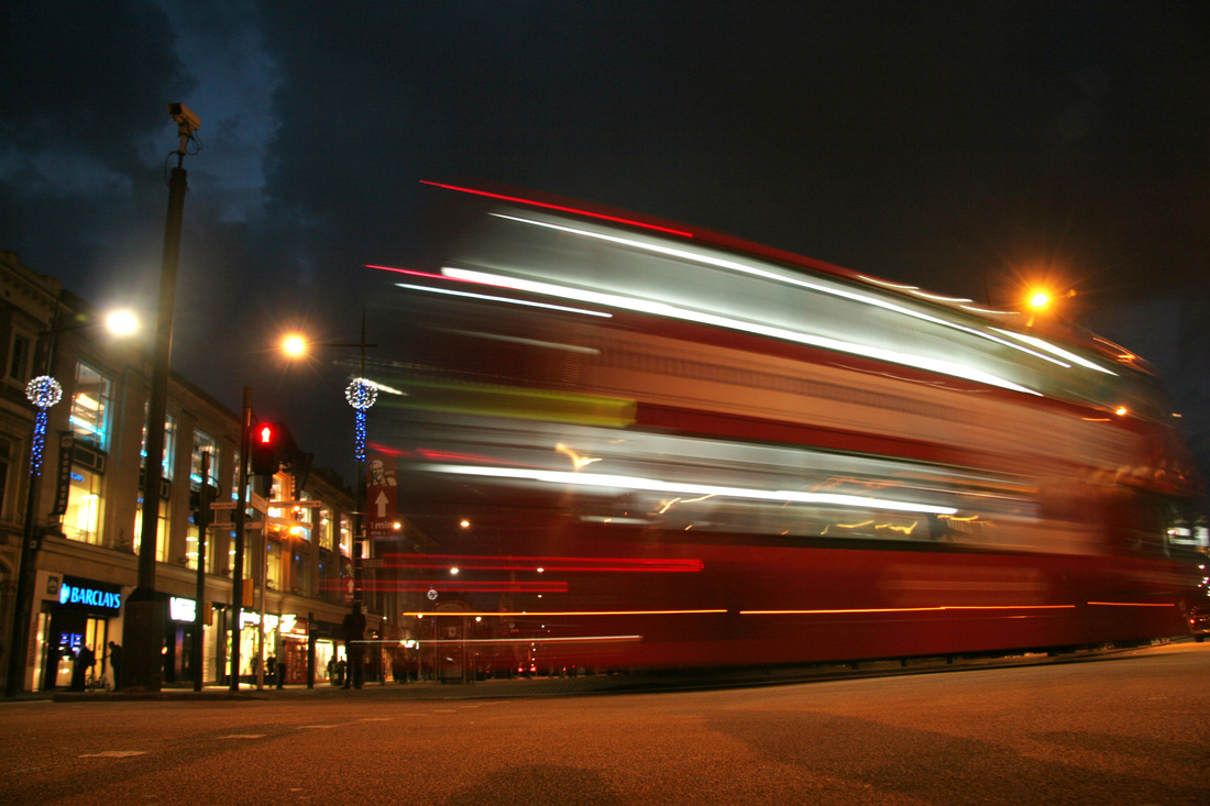
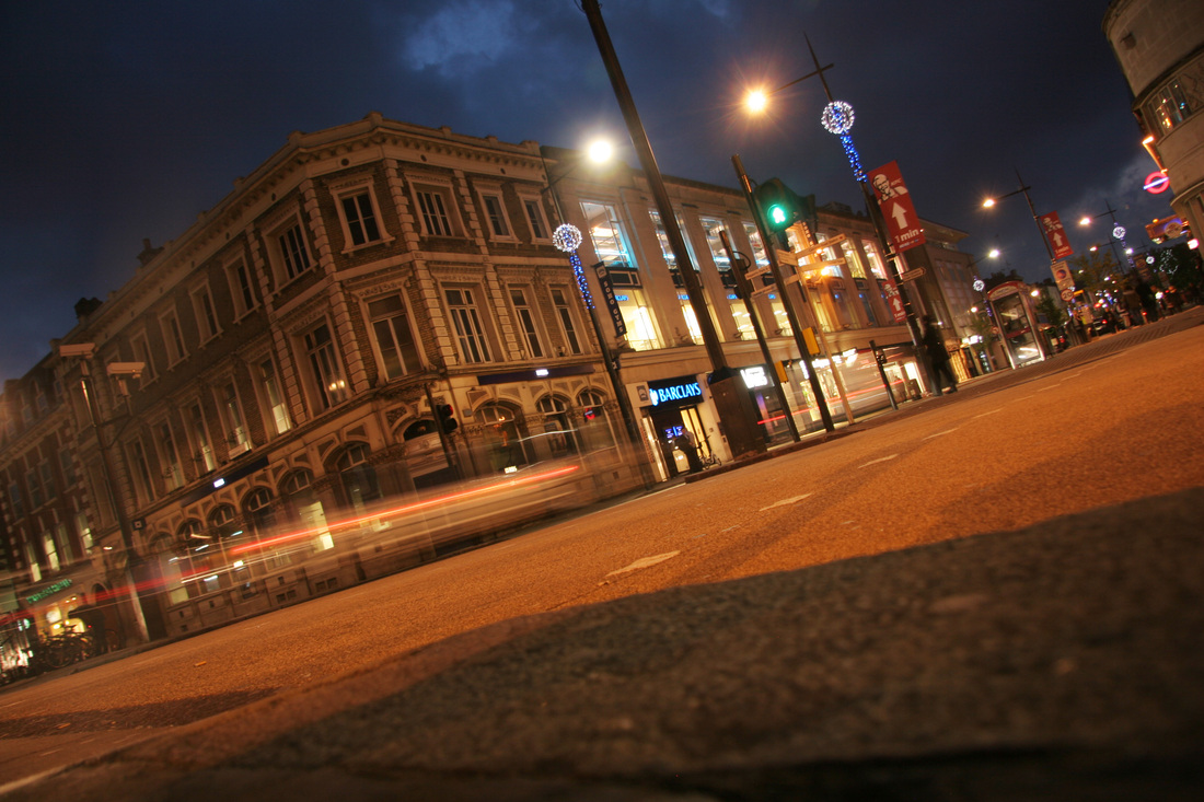
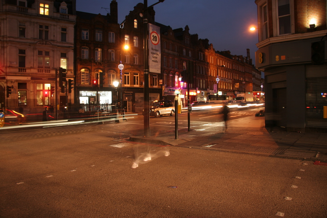
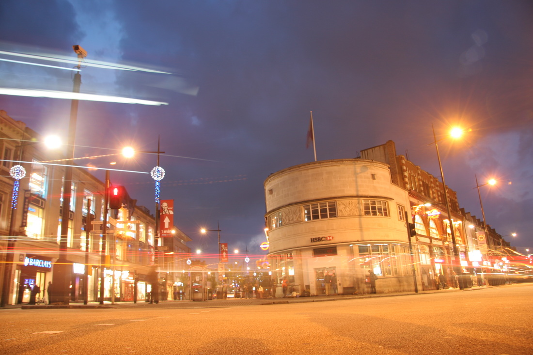
To further develop my project on city disorder, I decided to create a response during the evening to capture the light trail of busses and cars with the movement of people. I went to Camden to do this. Here again I used a long exposure of around 6-10 seconds.
|
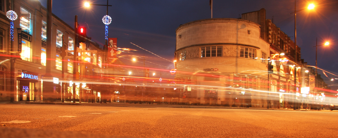
I created an interesting perspective by resting my camera in the middle of the road on a crossing . I like the way in which the light trail encompasses the shops and the tube station as it produces a magical effect. It also suggests a sense of disorder as the blurred streaks of red, yellow and white weave messily around each other as they cut through the centre of the photo. The street lights and decoration also add to this result.
|
|
|
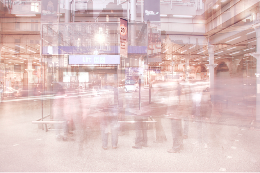
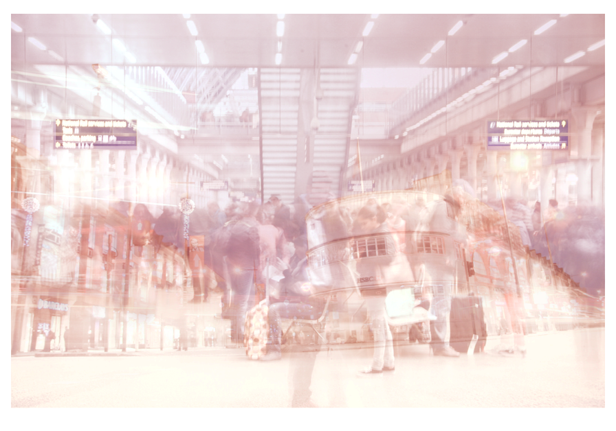
final piece process
I created a new photo out of two of my photos. Here was my process I went through on Indesign:
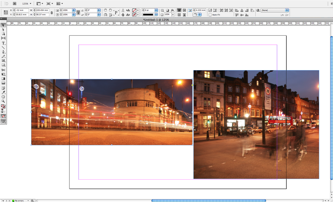
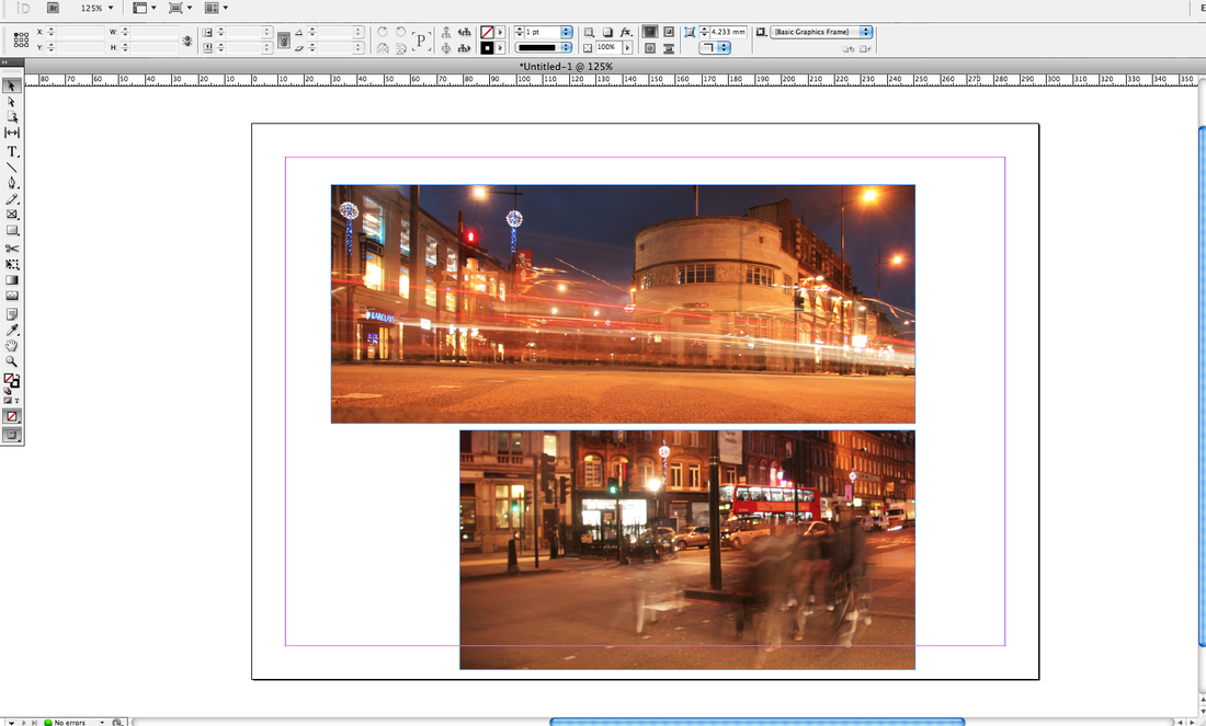
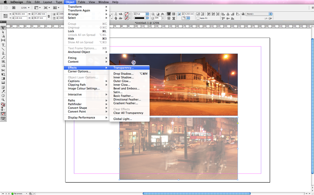
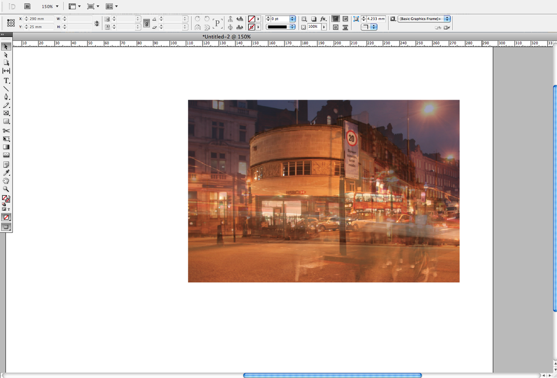

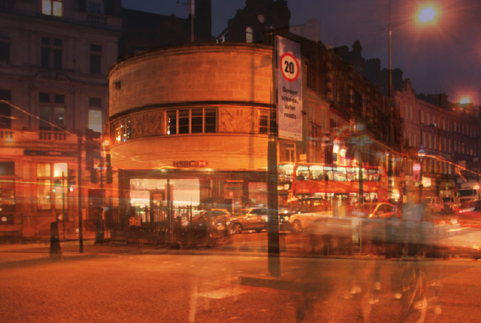
After creating that, I decided to use the same process of using transparency in Indesign to experiment with more of my photos and combining them.
Below are my results: |
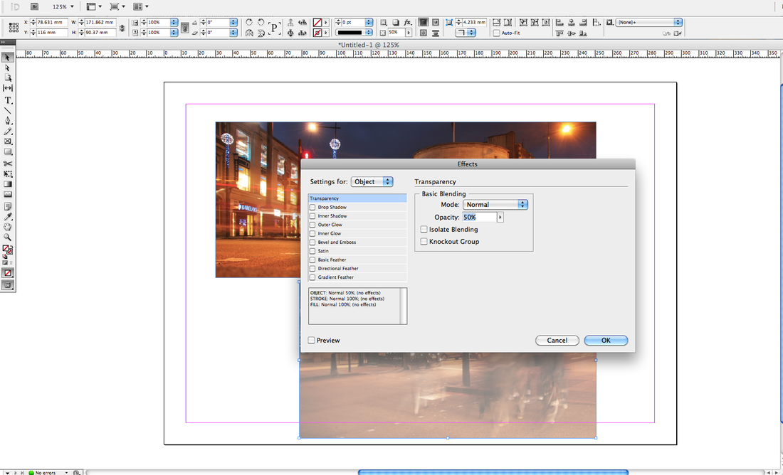
1.)Firstly I imported my chosen images into Indesign and changed the display performance to 'High Quality Display'.
2.)Next I made both my photos the same width by cropping the second image.
3.)I then changed the transparency of the second photo by clicking 'Object', 'Effects', 'Transparency'.
4.)I changed the percentage to 50 for the transparency.
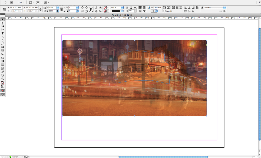
5.)This is the result after placing one photo on top of the other one.
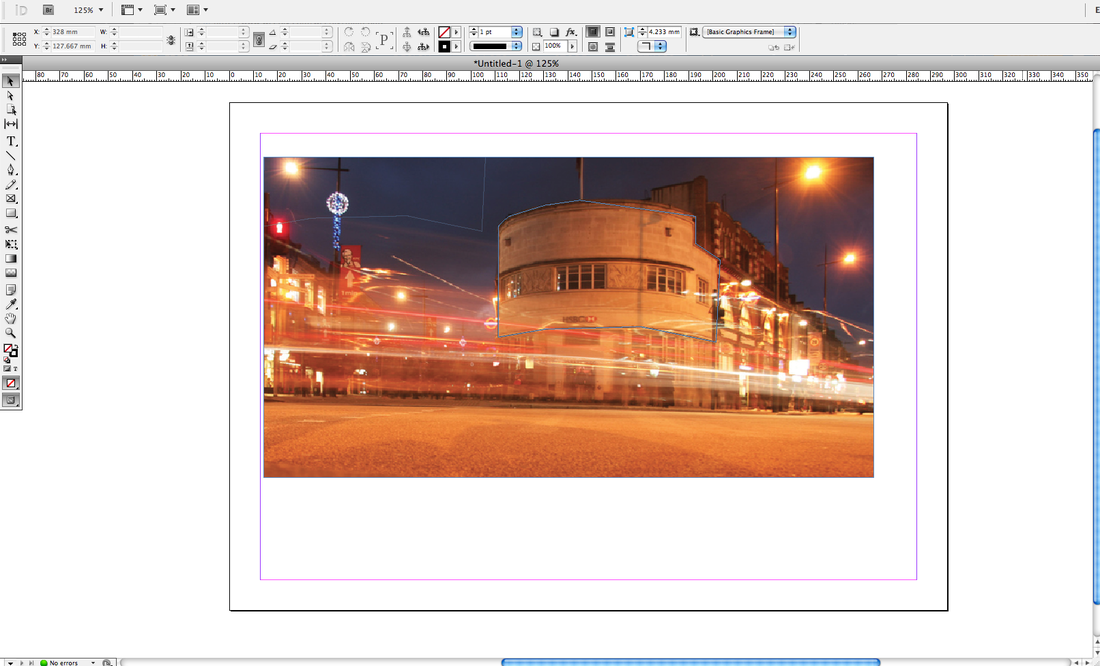
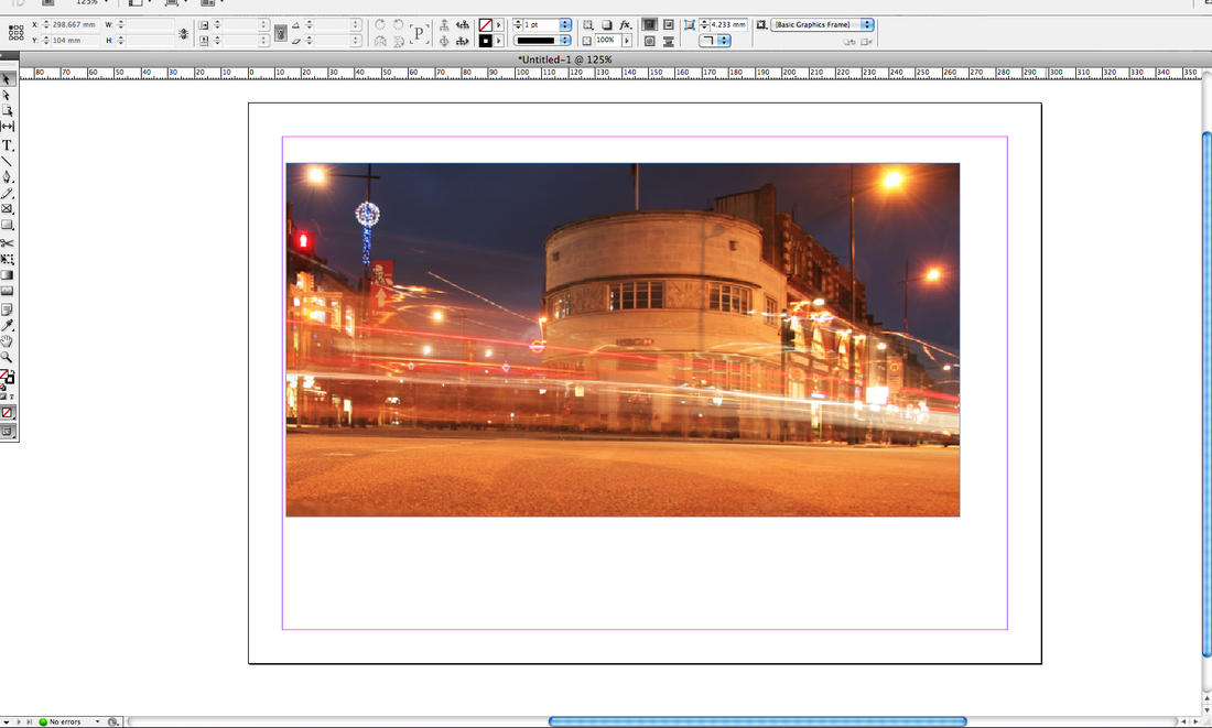
6.)I then clicked the back layer with the 'direct selection tool' to copy the back image. After that I clicked the top selection tool to highlight the first layer. 7.)The next step was to use the pen tool to draw around the tube station. 8.)I then went on 'Edit' and 'Paste Into'. This put the tube station at the front and in 100% focus. 9.)I also repeated those steps on the road sign and increased the contrast of the overall image on photoshop using the 'curves' tool. Outcome |
This links to the work of Yenny Huber as there is a change of colour in part of the photo and demonstrating the idea of past and present.
|
1ST IMAGE
|
2ND IMAGE
|
COMBINED IMAGE
|
1ST IMAGE
|
2ND IMAGE
|
COMBINED IMAGE
|
1ST IMAGE
|
2ND IMAGE
|
COMBINED IMAGE
|
1ST IMAGE
|
2ND IMAGE
|
COMBINED IMAGE
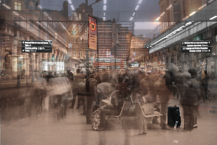
FINAL PIECE
|
|
